CSS subgrid 超级棒
 Play Synthesised Audio
I’m all aboard the CSS subgrid train. Now I’m seeing subgrid everywhere. Seriously, what was I doing before subgrid? I feel like I was bashing rocks together.
I’m all aboard the CSS subgrid train. Now I’m seeing subgrid everywhere. Seriously, what was I doing before subgrid? I feel like I was bashing rocks together.
Consider the follower HTML:
考虑下面的 HTML:
<main>
  <p>I am main content.</p>
</main>
The <main> content could be simple headings and paragraphs.
<main> 内容可以是简单的标题和段落。
It could also be complex HTML patterns from a Content Management System (CMS) like the WordPress block editor, or ACF flexible content (a personal favourite).
它也可以是来自内容管理系统 (CMS) 如 WordPress 块编辑器,或 ACF flexible content(个人最爱)的复杂 HTML 模式。
Typically when working with CMS output, the main content will be restricted to a maximum width for readable line lengths. We could use a CSS grid to achieve such a layout. Below is a visual example using the Chromium dev tools to highlight grid lines.
通常在使用 CMS 输出时,主要内容会限制最大宽度以获得可读的行长。我们可以使用 CSS grid 来实现这样的布局。下面是使用 Chromium 开发者工具突出显示网格线的视觉示例。
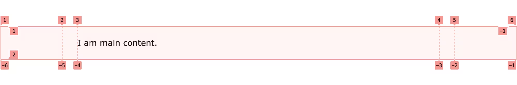
Grid lines marked one through six with a centred paragraph.
Grid lines 标记为一到六,带有居中的段落。
This example uses five columns with no gap resulting in six grid lines.
这个例子使用五列,没有间隙,导致六条 grid lines。
main {
  display: grid;
  grid-template-columns:
    auto
    30px
    min(45rem, calc(100% -  60px))
    30px
    auto;

  :where(&) > * {
    grid-column: 3 / 4;
  }
}
The two outer most columns are auto meaning they can expand to fill space or collapse to zero-width. The two inner columns are 30px which act as a margin. The centre column is the smallest or two values; either 45rem, or the full viewport width (minus the margins).
最外面的两列是 auto,意味着它们可以扩展以填充空间或折叠到零宽度。两个内列是 30px,充当边距。中心列是两个值中的较小者;要么是 45rem,要么是视口全宽(减去边距)。
Counting grid line correctly requires embarrassing finger math and pointing at the screen. Thankfully we can name the lines.
正确计数 grid line 需要尴尬的手指计算和指着屏幕。幸运的是,我们可以命名这些线。
main {
  display: grid;
  grid-template-columns:
    [inline-start]
    auto...