分解亚马逊的巨型下拉菜单
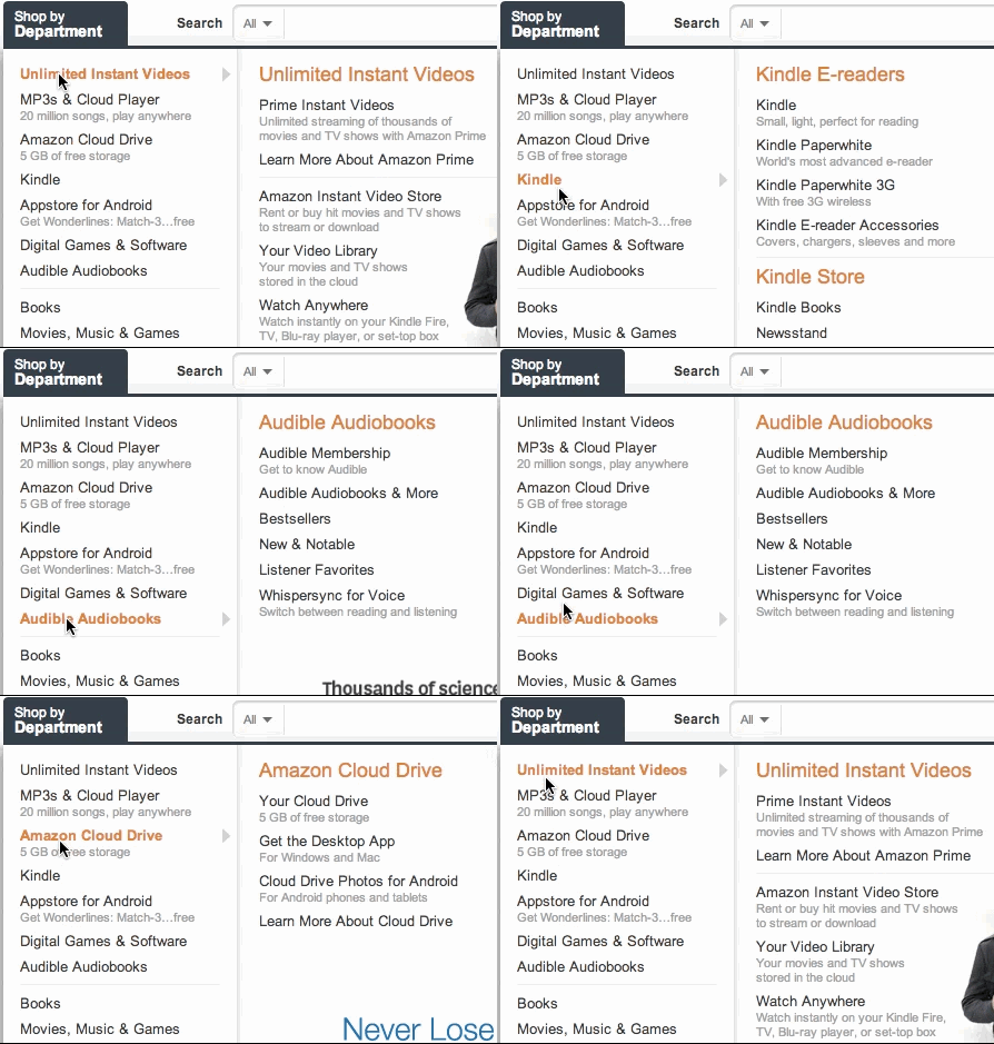
The hover effects on Amazon’s big ‘ole “Shop by Department” mega dropdown are super fast. Look'it how quick each submenu fills in as your mouse moves down the list:
亚马逊的大 "按部门购物 "巨型下拉菜单的悬停效果是超级快的。你看,当你的鼠标向下移动时,每个子菜单的填充速度有多快。

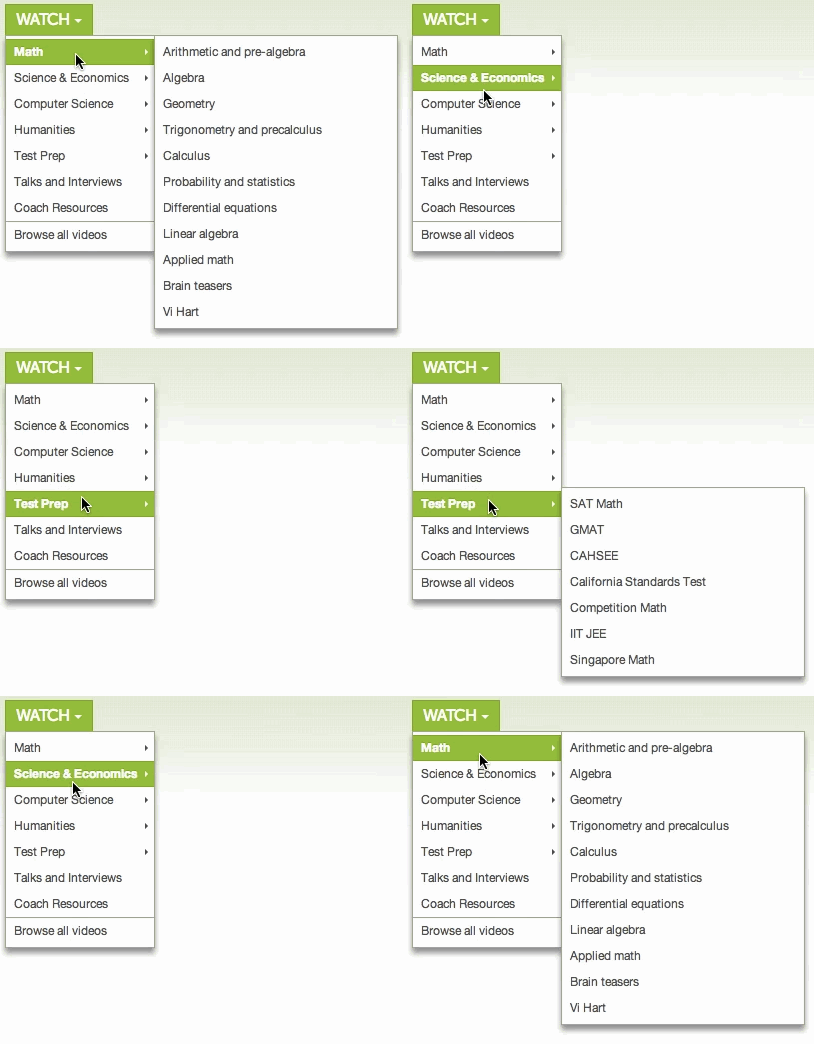
It’s instant. I got nerd sniped by this. Most dropdown menus have to include a bit of a delay when activating submenus. Here’s an old Khan Academy dropdown as an example:
它是即时的。我被这个书呆子狙击了。大多数下拉菜单在激活子菜单时都要包括一点延迟。这里有一个老的可汗学院的下拉菜单作为例子。

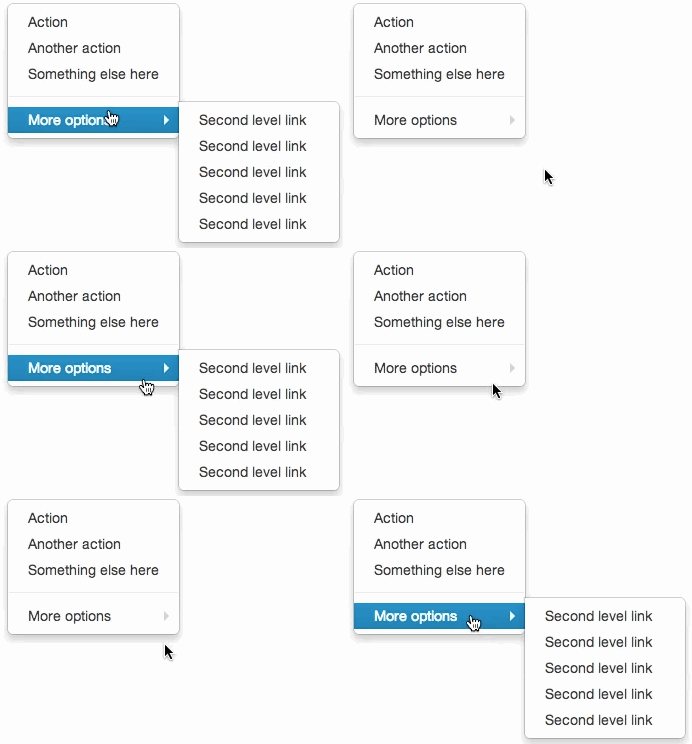
See the delay? You need that, because otherwise when you try to move your mouse from the main menu to the submenu, the submenu will disappear out from under you like some sort of sick, unwinnable game of whack-a-mole. Enjoy this example from bootstrap’s dropdown menus:
看到这个延迟了吗?你需要这个,因为否则当你试图把鼠标从主菜单移到子菜单时,子菜单就会从你脚下消失,就像某种病态的、赢不了的打地鼠游戏。请欣赏这个来自bootstrap的下拉菜单的例子。

I love bootstrap, don’t get it twisted. Just a good example of submenu frustration.
我喜欢bootstrap,不要被扭曲了。只是一个关于子菜单挫折的好例子。
It’s easy to move the cursor from Amazon’s main dropdown to its submenus. You won’t run into the bootstrap bug. They get away with this by detecting the direction of the cursor’s path.
把光标从亚马逊的主下拉菜单移到其子菜单很容易。你不会遇到引导的错误。他们通过检测光标的路径方向来摆脱这个问题。

If the cursor moves into the blue triangle the currently displayed submenu will stay open for just a bit longer.
如果光标移动到蓝色三角形,当前显示的子菜单将保持开放,只是时间长一点。
At every position of the cursor you can picture a triangle between the current mouse position and the upper and lower right corners of the dropdown menu. If the next mouse position is within that triangle, the user is probably moving their cursor into the currently displayed submenu. Amazon uses this for a nice effect. As long as the cursor stays within that blue triangle the current submenu will stay open. It doesn’t matter if the cursor hovers over “Appstore for Android” momentarily – the user is probably heading toward “Learn more about Cloud Drive.”
在光标的每一个位置,你都可以在当前的鼠标位置和下拉菜单的右上角和右下角之间描绘一个三角形。如果下一个鼠标位置在这个三角形内,那么用户可能正在将他们的光标移到当前显示的子菜单中。亚马逊利用这一点达到了一个很好的效果。只要光标停留在那个蓝色三角形内,当前的子菜单就会保持开放。即使光标暂时停留在 "Appstore ...