Designing for Accessibility: How Text Resizing Works in Different Web Browsers

Photo by Alexander Andrews on Unsplash
Have you heard that 33% of mobile users have text size adjustment enabled on their phones? According to this excellent research by Q42 conducted among more than 1 million Dutch users, many mobile users require text resizing in order to properly read on their mobile devices. While this large survey was conducted specifically in the Netherlands, the data are similar to what is observed across other countries around the world. Therefore, ensuring quality text resizing is vital for approximately one third of your users.
Introduction
Hi, I’m Ian, a Web Developer at Zettle, PayPal’s point-of-sale solution.
In one of the recent stories on PayPal Technology Blog my colleagues, James and Kiersten, covered why it is important for modern applications to support text resizing. They also discussed text resizing challenges and solutions in PayPal’s iOS and Android apps, so make sure to check it out.
When it comes to Web, another great reference is the success criterion for text resizing from the Web Content Accessibility Guidelines (WCAG). According to this criterion, content scaling is primarily a user agent responsibility. On the other hand, web content should not prevent user agents from scaling effectively. Thus, web developers need to understand what content scaling techniques are implemented in the browsers.
In our team, we are working on web apps that equally support desktop and mobile clients. Recently, we’ve found several text resizing issues, and as it often happens in web development, solving them for one browser didn’t mean they would be solved for all.
This story covers what our team learned about web browser content resizing techniques and how exactly text resizing settings affect elements on a webpage.
Research setup
When text resizing is applied to elements on a webpage, the effect can be different depending on length units used.
Absolute length units (cm, in, px, etc.) are considered to always be the same size and it is possible to use them interchangeably. In the research, I will showcase px (aka CSS pixel), since it is the most common choice for screen-rendered content.
Absolute length units (cm, in, px, etc.) are considered to always be the same size and it is possible to use them interchangeably. We will showcase px (aka CSS pixel), since it is the most common choice for screen-rendered content.
Relative length units (rem, em, vw, vh, etc.) are relative to some other values such as the font size of the parent element or viewport width. In our case, it makes sense to showcase rem units as they seem to be affected by text resizing settings in the first place (unless a developer overrides font-size of the root element directly). Also, we’ll look at em for certain cases and a more exotic example of vmax unit (larger value of either viewport width or height).
To be able to see what kind of impact text resizing has, I’ve created a small webpage that showcases absolute and relative length units applied both to text elements and non-text elements (an image of a ⭐️ in our case).
Although, we will primarily be looking at upscaling of the text, it’s good to remember that downscaling is also possible.
iOS | Safari: Intro to Page Zoom
Let’s start with the Safari browser for iOS on iPhone SE 2020. As mentioned above, a special webpage was created to be able to track the effect text resizing has. It showcases three options:
-
An image and a text element, dimensions of which are defined in px*.*
-
An image and a text element, dimensions of which are defined in rem.
-
An image and a text element, dimensions of which are defined in vmax.
With the help of ResizeObserver API, we can track their size in pixels as it changes. Also, at the top right corner, we can see the size of the viewport using the same approach.
The only content resizing setting in Safari for iOS is page zoom. We can control its level with the help of the Aa button in the address bar. This is how the page looks initially and with 200% zoom.


iPhone | Safari: 100% and 200% page zoom
If you take a closer look, you will see that after the page zoom, the size of individual elements haven’t changed but the size of the viewport has decreased. This makes the elements look larger (except for vmax unit that depends on viewport size and eventually renders with the same size).
Using page zoom for text resizing has several strong advantages:
- All elements scale consistently, no matter what length units they use.
- The scaling can be easily detected with @media queries in CSS, and the layout of the page can be adjusted.
- Adding new breakpoints for adjusting layout is easy, if the webpage already uses responsive design (and it really should).
In this example, viewport width has shrunk from 375px to 188px. When designing a webpage, one probably doesn’t expect 188px screen width to be a possibility these days but apparently, this can happen with the page zoom. In our team, we decided to add an extra breakpoint for our views at 250px at which we reduced paddings and hid non-essential decorative elements to give more space for content.
Summary
In my opinion, page zoom is the most elegant and robust solution for text resizing. It is also relatively easy to support as a part of a responsive design solution. Unfortunately, it’s not available everywhere.
iOS | Chrome: Intro to Text Zoom
Let’s switch to another browser on iOS — Google Chrome. Although Chrome for iOS is built on top of WebKit developed for Safari, it has a different approach to text resizing — text zoom.
Text zoom means that as a user changes the zoom level, only text elements scale while the others stay of the same size.
You can find the setting in Chrome for iOS at the bottom of the menu that appears when you click the three-dots button. Let’s set it to 200% and see what happens.


iOS | Chrome: text zoom at 100% and 200%
We can observe several peculiar things resulting from 200% text zoom:
- Viewport size hasn’t changed.
- All text elements scaled, no matter what units they used.
- Non-text elements using rem unit (root element font size) didn’t scale up. To explore this behaviour further, a special case of em unit was added, and it is possible to see that non-text element using em did scale up together with the corresponding text element. What is intriguing is that these em units end up referencing the same value as rem above. The case of rem-based elements not scaling looks very much like a bug.
- Text elements using vmax get scaled but not images.
Summary
Besides the issue of non-text elements not scaling with rem unit, Chrome for iOS provides quite consistent implementation of text zoom. We will see both better and worse examples on Android..
Android | Chrome: Text Zoom that doesn’t work
On Chrome for Android text resizing can be done with the “Text scaling” setting that can be found under the “Accessibility” menu option. As the name suggests, only text elements should be affected by it, so this is essentially a text zoom.
Unfortunately, “Text scaling” in Chrome for Android does not seem to be working properly: current implementation of this feature is tied to autosizing (a feature made a long time ago for websites with poor support for mobile devices). The bug was initially reported in 2016 and as of January 2022 it is still not completely resolved.
To describe the severity of the issue, it’s enough to say that initially our test web page didn’t get affected by the text scaling setting at all. Some usages of flexbox had to be removed to make text elements scale properly which affected the way the page elements render.
Let’s see how things look after the necessary adjustments on Pixel 5 running Android 12 with 200% zoom.

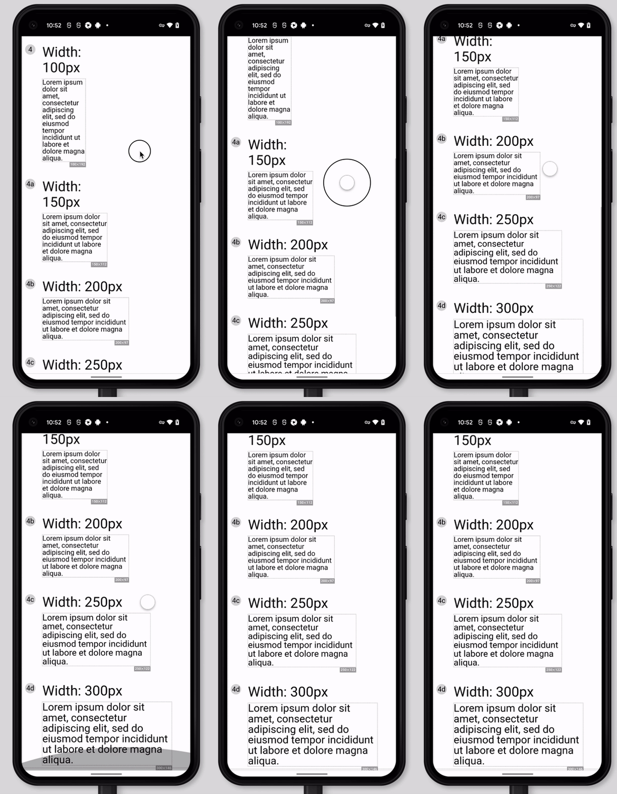
Android | Chrome: 200% text zoom
It is possible to notice that:
- All texts that have no size constraints set by parent and are not part of flex container have scaled up, no matter what units were used.
- Non-text elements didn’t scale up, no matter what units were used.
- Text elements within size-restricted containers didn’t scale up (look at numbers inside circles).
In addition to the observations above, one interesting aspect is that the scaled font size depends on the size of its parent container. In a small container, the text might not scale at all — it gets gradually bigger as the container width increases.

Android | Chrome: text scaling increasing with the size of container
In the thread related to the issue, other behaviors stem from text autoresizing feature, such as text elements only being resized if their length exceeds 217 characters.
Summary
The text scaling feature seems to be non-functional on Google Chrome for Android. This should be fixed since this makes the browser itself not compliant to User Agent Accessibility Guidelines. Unfortunately, there is not much we can do with this as web developers.
Android | Firefox: Predictable Text Zoom
In a similar fashion to Chrome, Firefox for Android has a “Font size” setting under the “Accessibility” option in its settings. It’s equivalent to text zoom.
Let’s see how things look with 100% and 200% zoom on Pixel 5.


Android | Firefox: Text zoom 100% and 200%
Here is what we can see:
- Viewport size hasn’t changed.
- Text with px, rem and em units scaled.
- Rem- and _em-_sized images scaled, px-sized didn’t.
- Elements with viewport-based units (vmax) didn’t scale.
Summary
In my opinion, Firefox for Android provides the most predictable result of a pure text zoom:
- Text using both px and rem/em scales up. This covers most common use cases.
- It is possible to define the size of any element to be in sync with text size by using rem units.
Android | Samsung Browser: Text Zoom with some issues
Samsung Browser for Android has a similar dedicated setting called “Webpage text size” which works like text zoom. It can be found (rather deep) under the “Appearance” option in Settings. Let’s compare its effect with 100% and 200% value.


Android | Samsung Browser: Text zoom 100% and 200%
We can see that:
- All text elements scale, no matter what units are used.
- Value of rem unit is not changed, so it’s hard to keep the size of other elements coordinated with the text.
Summary
“Text size” setting in Samsung browser scales text elements predictably. Unfortunately, there is no way to make other types of elements scale at the same time, from what I’ve seen..
Desktop | Firefox: One Browser to Rule All the Settings
When it comes to content scaling in general, Firefox developers “did their homework,” as this browser offers the widest range of configuration options. Let’s go through them and check how they affect the test page.
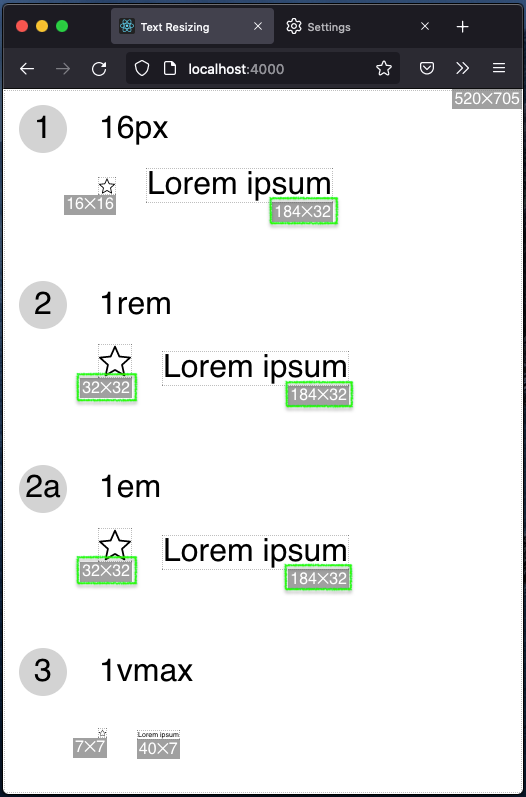
In the image below you can see a reference webpage without any scaling settings applied.

Desktop | Firefox: Original page with no text resizing enabled
Let’s start with page zoom (can be triggered with CTRL or CMD key + plus/minus key).

Desktop | Firefox: 200% page zoom
We can see the expected behavior: viewport is shrinking, and all the elements are increasing on the screen respectively, except for vmax-sized elements.
Let’s try something else: the “Zoom text only” checkbox in “Language and Appearance” section of settings. This setting essentially turns page zoom into text zoom.

Desktop | Firefox: 200% zoom with “Zoom Text Only” checkbox
Again, the behavior is very much expected for text zoom: px and rem text elements scale up, non-text elements using rem/em units as well. However, interestingly, vmax-based text didn’t scale up. This is not right or wrong, in my opinion, as there is no clear standard regarding the priority of text zoom setting.
Additionally, in Firefox another parameter can be used to tweak the size of the text: default font size. Let’s increase it from 16 to 32 and see what happens.

Desktop | Firefox: Default font size setting increased by 200%
As we can see, default font size is affecting only the size of rem/em units, both for text and non-text elements, which is expected.
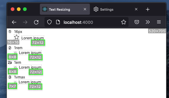
Another interesting setting worth mentioning is the minimum font size. Let’s set it to 12 and try scale down the page by 50% with the “Zoom text only” checkbox checked.

Desktop | Firefox: Text zoom at 50% with minimum font size set at 12px
As expected, all text elements don’t get smaller than 12 pixels, even the ones using vmax units. This does not apply to non-text elements using rem/em size as they continue to shrink, which can be a potential source of inconsistencies.
Summary
When it comes to text resizing, Firefox can be your go-to browser during development. It offers all possible content resizing settings and they work as expected.
Desktop | Chrome, Edge, Opera: Page Zoom and Font Size Settings
When it comes to the desktop version of Google Chrome and its Chromium-based “siblings” Edge and Opera, the behavior is identical to Firefox, but the browsers do not offer all the configuration options.
It is possible to set a default and minimum font size, affecting the size of rem unit and all text elements, respectively.
But there is no “Zoom text only” checkbox so only a regular page zoom is available.
Desktop | Safari: Page Zoom is the Way
Safari for macOS does not feature a variety of special text resizing options. Apart from a standard page zoom, which works the same way as in other browsers, you can find an accessibility setting called “Never use font sizes smaller than” which is similar to the minimum font size in Firefox and Chrome.
Summary
We’ve seen several ways to achieve text resizing in web browsers.
Page Zoom
Controls the size of the viewport without changing size of individual elements. The consequence of a page zoom is that the on-screen dimensions of all elements change at the same time.
Handling of page zoom is straightforward and can be partially done by responsive design techniques like @media queries in CSS.
Page zoom is a primary content resizing feature for all desktop browsers and Safari for iOS, given how easy it is to reach this setting for the user.
Catch: Older iPhones have only 320px screen width. Thus, in Safari with 200% zoom, a webpage ends up having just 160px width. Make sure that your layouts can handle this.
Text zoom / text scaling
Affects the resulting dimensions of text elements only. Rem units can be used to scale other types of elements as well, but implementation varies across browsers. In some of them, rem-based dimensions won’t scale for non-text elements (see Samsung Browser or Chrome for iOS).
Text zoom is the primary resizing setting for all Android browsers and Chrome for iOS. The desktop version of Firefox can have such behaviour enabled as well — this can be handy during development and testing.
Note: Chrome for Android has long-running issues with text resizing (as of time of writing). It is nearly impossible to overcome them without major impacts to the design and layout of the page.
Default font size setting
Offered by Firefox and Chromium-based desktop browsers, it allows the user to change the default value of rem unit. Thus, elements using absolute units like px won’t be affected.
It’s hard to say how often this setting is tweaked, as many websites do not respond to it being changed. Most likely, if your designs work well with the above-mentioned text zoom, they will handle default font size setting as well.
Conclusion
Text resizing is a hard problem in web development: there are multiple settings affecting text size (page zoom, text zoom, default font size), varying implementations across browsers and no single formula to make things work consistently.
The closest you can get to a universal solution is using relative length units like rem for font size and for dimensions of elements that should scale together with text. But even in this case, expect minor inconsistencies.
The good part is that by using Firefox during development and tweaking available settings you’ll be able to test the behavior of all existing text resizing techniques.
Did I miss anything important? Please, let me know in the comments or reach out to me on Twitter.
Special thanks for peer reviews go to my colleagues Gabriel Gomes and Mikael Hallendal, as well as James Carleton and Kiersten Lammerding.