我们完全错过了 width/height: stretch
The stretch keyword, which you can use with width and height (as well as min-width, max-width, min-height, and max-height, of course), was shipped in Chromium web browsers back in June 2025. But the value is actually a unification of the non-standard -webkit-fill-available and -moz-available values, the latter of which has been available to use in Firefox since 2008.
stretch 关键字可用于 width 和 height(当然也包括 min-width、max-width、min-height 和 max-height),已于 2025 年 6 月在 Chromium 浏览器中发布。但该值实际上是对非标准 -webkit-fill-available 和 -moz-available 的统一,后者自 2008 年起就已在 Firefox 中可用。
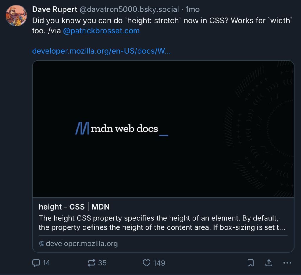
The issue was that, before the @supports at-rule, there was no nice way to implement the right value for the right web browser, and I suppose we just forgot about it after that until, whoops, one day I see Dave Rupert casually put it out there on Bluesky a month ago:
问题是,在 @supports 出现之前,没有优雅的办法为合适的浏览器实现合适的值,我猜后来我们就忘了这回事,直到——哎呀——一个月前我看到 Dave Rupert 在 Bluesky 上随口一提:
Layout pro Miriam Suzanne recorded an explainer shortly thereafter. It’s worth giving this value a closer look.
Layout pro Miriam Suzanne 随后录制了一段讲解视频,值得仔细研究这个值。
The quick answer is that stretch does the same thing as declaring 100%, but ignores padding when looking at the available space. In short, if you’ve ever wanted 100% to actually mean 100% (when using padding), stretch is what you’re looking for:
简而言之,stretch 与声明 100% 效果相同,但在计算可用空间时会忽略 padding。一句话,如果你曾希望 100% 真的就是 100%(当使用 padding 时),stretch 正是你想要的:
div { padding: 3rem 50vw 3rem 1rem; width: 100%; width: stretch; }
The more technical answer is that the stretch value sets the width or height of the element’s margin box (rather than the box determined by box-sizing) to match the width/height of its containing block.
更技术的说法是,stretch 值会将元素的 margin box(而不是由 box-sizing 决定的盒子)的宽度或高度设置为其包含块的宽度/高度。
Note: It’s never a bad idea to revisit the CSS Box Model for a refresher on different box sizings.
注意:重温一下 CSS 盒模型 总没坏处,可以刷新对不同盒尺寸的理解。
And on that note — yes — we can achieve the same result by declaring box-sizing: border-box, something that many of us do...