Decision Trees For UI Components
Imagine finally resolving never-ending discussions about UI decisions for good. Here are some practical examples of decision trees for UI components and how to use them effectively. An upcoming part of Smart Interface Design Patterns.
How do you know what UI component to choose? Decision trees offer a systematic approach for design teams to document their design decisions. Once we’ve decided what UI components we use and when, we can avoid never-ending discussions, confusion, and misunderstanding.
Let’s explore a few examples of decision trees for UI components and how we can get the most out of them.
This article is part of our ongoing series on design patterns. It’s also an upcoming part of the 10h-video library on Smart Interface Design Patterns ? and the upcoming live UX training as well. Use code BIRDIE to save 15% off.
A fantastic example of a form design component decision trees comes from the Doctolib team. (Image source) (Large preview)
B2B Navigation and Help Components: Doctolib #
Doctolib Design System is a very impressive design system with decision trees, B2B navigation paths, photography, PIN input, UX writing, and SMS notifications — and thorough guides on how to choose UI components.
One of the many decision trees on Doctolib: from B2B navigation to help components. (Large preview)
I love how practical these decision trees are. Each shows an example of what a component looks like, but I would also add references to real-life UI examples and flows of where and how these components are used. A fantastic starting point that documents design decisions better than any guide would.
Decision Trees For UI Components: Workday #
The team behind Workday’s Canvas design system created a fantastic set of design decision trees for notifications, errors and alerts, loading patterns, calls to action, truncation, and overflow — with guidelines, examples, and use cases, which can now only be retrieved from the archive:
A decision tree for notifications: it’s not as straightforward as one might think. (Large preview)
For each decision tree, the Workday team has put together a few context-related questions to consider first when making a decision before even jumping into the decision tree. Plus, there are thorough examples for each option available, as well as a very detailed alternative text for every image.
Form Components Decision Tree: Lyft #
A choice of a form component can often be daunting. When should you use radio buttons, checkboxes, or dropdowns? Runi Goswami from Lyft has shared a detailed form components decision tree that helps their team choose between form controls.
A decision tree for form controls: notably, use dropdown as a method of last resort, with many long options. (Large preview)
We start by exploring whether a user can select more than one option in our UI. If it’s indeed multi-select, we use toggles for short options and checkboxes for longer ones.
If only one option can be selected, then we use tabs for filtering, radios for shorter options, a switch for immediately applicable options, and a checkbox if only one option can be selected. Dropdowns are used as a last resort.
Choosing Onboarding Components: NewsKit #
Onboarding comes in various forms and shapes. Depending on how subtle or prominent we want to highlight a particular feature, we can use popovers, badges, hints, flags, toasts, feature cards, or design a better empty state. The Newskit team has put together an Onboarding Selection Prototype in Figma.
A decision toolkit for onboarding UX: the more integrated the onboarding is, the more effective it is. (Large preview)
The choice depends on whether we want to interrupt the users to display details (usually isn’t very effective), show a feature subtly during the experience (more effective), or enable discovery by highlighting a feature within the context of a task a user tries to accomplish.
The toolkit asks a designer a couple of questions about the intent of onboarding, and then suggests options that are likely to perform best — a fantastic little helper for streamlined onboarding decisions.
Design System Process Flowcharts: Nucleus #
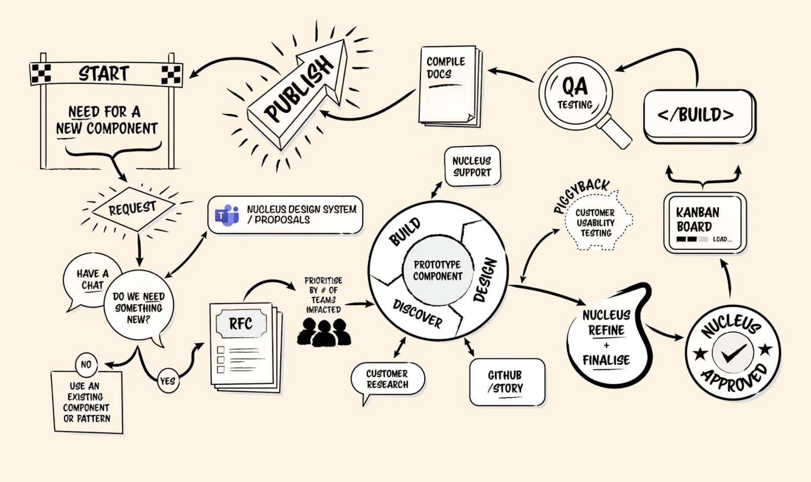
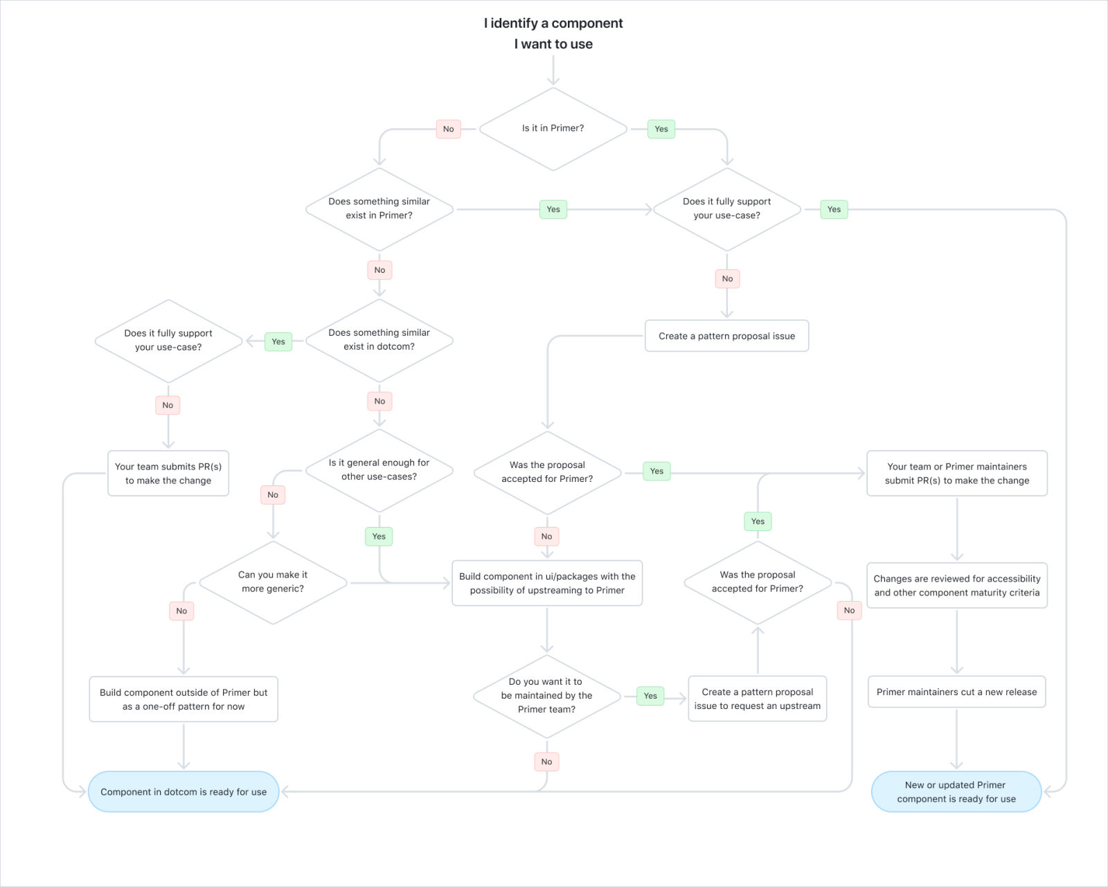
How do you decide to add a new component to a design system or rather extend an existing one? What’s the process for contributions, maintenance, and the overall design process? Some design teams codify their design decisions as design system process flowcharts, as shown below.
The design system maintenance process by British Gas design system. (Large preview)
And here are helpful decision trees for adding new components to a design system:
Make Decision Trees Visible #
What I absolutely love about the decision tree approach is not only that it beautifully visualizes design decisions but that it also serves as a documentation. It establishes shared standards across teams and includes examples to follow, with incredible value for new hires.
Of course, exceptions happen. But once you have codified the ways of working for design teams as a decision tree and made it front and center of your design work, it resolves never-ending discussions about UI decisions for good.
The entire process at GitHub summarized as a flowchart. (Large preview)
So whenever a debate comes up, document your decisions in a decision tree. Turn them into posters. Place them in kitchen areas and developer’s and QA workspaces. Put them in design critique rooms. Make them visible where design work happens and where code is being written.
It’s worth mentioning that every project will need its own custom trees, so please see the examples above as an idea to build upon and customize away for your needs.
Meet Smart Interface Design Patterns #
If you are interested in similar insights around UX, take a look at Smart Interface Design Patterns, our 10h-video course with 100s of practical examples from real-life projects — with a live UX training later this year. Everything from mega-dropdowns to complex enterprise tables — with 5 new segments added every year. Jump to a free preview.
Meet Smart Interface Design Patterns, our video course on interface design & UX.
100 design patterns & real-life examples.
10h-video course + live UX training. Free preview.
 (yk)
(yk)


