使用锚点定位实现动态工具提示位置
October 06, 2025
2025年10月06日
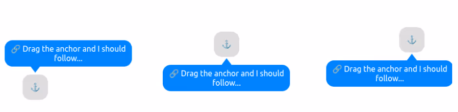
With anchor positioning, we can anchor an element to another and also ensure it remains visible on the screen regardless of the anchor's position. Now, imagine the element you want to anchor is a tooltip. What about its tail? We can also adjust its position to always point to the anchor.
借助锚点定位,我们可以将一个元素锚定到另一个元素,并确保无论锚点位置如何,它都始终可见。现在,假设你要锚定的元素是一个提示框,那么它的尾巴怎么办?我们也可以调整它的位置,使其始终指向锚点。
#anchor { position: absolute; anchor-name: --anchor;}#tooltip { --d: 1em; --s: 1.2em; position: absolute; position-anchor: --anchor; position-area: top; bottom: var(--d); margin-top: var(--d); position-try-fallbacks: flip-block; anchor-name: --tooltip;}#tooltip:before { content:""; position: fixed; z-index: -1; width: var(--s); background: inherit; top: calc(anchor(--tooltip top ) - var(--d)); bottom: calc(anchor(--tooltip bottom) - var(--d)); left: calc(anchor(--anchor center) - var(--s)/2); margin: inherit; clip-path: ;}
Here is an interactive demo where you can drag the anchor and see how the tooltip behaves:
下面是一个交互式演示,你可以拖动锚点并观察提示框的行为:
Click the "debug mode" to understand the trick. Both arrows are always visible, but the margin will update the position to simulate the "hide" effect.
点击“debug mode”来了解其中的技巧。两个箭头始终可见,但 margin 会更新位置以模拟“隐藏”效果。
- 3D Box using Modern CSS Combining corner-shape and modern CSS features to create a 3D box. September 27, 2025
- 3D Box using Modern CSS 结合 corner-shape 与现代 CSS 特性来创建一个 3D 盒子。2025年9月27日
- CSS Shapes using corner-shape Recreate all the common CSS shapes using corner-shape and border-radius. September 24, 2025
- CSS Shapes using corner-shape 使用 corner-shape 和 border-radius 重新创建所有常见的 CSS 形状。2025年9月24日
开通本站会员,查看完整译文。