Animating Responsive Grid Layout Transitions with GSAP Flip
Hello everyone, I’m Iqbal Muthahhary, a freelance creative web developer based in Indonesia. It’s a pleasure to have the opportunity to inspire, teach, and learn in collaboration with Codrops.
In this tutorial, we’ll explore how to build interactive grid layout transitions triggered by buttons using the GSAP Flip plugin, along with vanilla JavaScript and basic CSS Grid concepts. The interaction itself will remain simple: switching grid configurations and updating active button states, while GSAP handles the visual continuity.
The aim is to show how we can smoothly change the size of grid items and reorder them. This is a pattern that is very interesting, especially for portfolio layouts and interactive galleries.
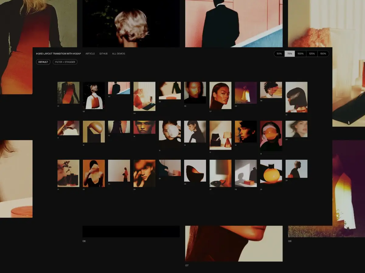
This HTML is split into two sections, each with a specific role in controlling and displaying the grid gallery.
The first section acts as a configuration panel. It includes a set of buttons that let the user choose different grid layout scales. Each button has a data-size attribute that stores the target grid size value (such as 50%, 75%, 100%, etc.). The currently selected button receives the active class, which visually indicates the current choice and determines which value is applied to the gallery below.
The second section is the grid gallery itself. It uses a custom attribute, data-size-grid, to store the currently active grid size value. When the user clicks a button in the configuration panel, this attribute is updated accordingly. Changing data-size-grid updates the CSS grid layout, allowing the gallery to smoothly adapt to the selected configuration.
Inside the grid gallery, each item is represented by a .grid_gallery_item. Every item contains an image block (using a background-image) and a <p> element that displays the item’s index in the gallery. Each grid item also defines a custom CSS variable, --aspect-ratio, which controls the image’s aspect ratio. This makes it possible to keep proportions consistent across layouts while still allowing each item to have its own unique shape.
<nav class="options_grid_container"> <div class="configuration_grid_size"> <button data-size="50%">50%</button> <button class="active" data-size="75%">75%</button> <button data-size="100%">100%</button> <button data-size="125%">125%</button> <button data-size="150%">150%</button> </div>
</nav>
<section class="grid_gallery_container" id="grid-gallery" data-size-grid="75%"> <div class="grid_gallery_item" style="--aspect-ratio: 1 / 1"> <div class="image" style="background-image: url(public/1.webp)"></div> <p>01</p> </div> <div class="grid_gallery_item" style="--aspect-ratio: 4 / 5"> <div class="image" style="background-image: url(public/2.webp)"></div> <p>02</p> </div> <div class="grid_gallery_item" style="--aspect-ratio: 16 / 9"> <div class="image" style="background-image: url(public/3.webp)"></div> <p>03</p> </div> </section>
The gallery uses CSS Grid. The main container defines the grid layout, spacing, padding, and overall width, while the data-size-grid attribute controls how compact or spacious the grid feels.
Each data-size-grid value adjusts the number of columns. Smaller values fit more items on screen, while larger values give each item more room. This makes it easy to see how the layout responds to the selected option.
Image proportions are handled with the aspect-ratio property, using a CSS variable defined inline in the HTML. This way, each image can keep its own shape while the grid stays clean and consistent.
.grid_gallery_container { display: grid; gap: 1.5rem; padding: 2rem 0; width: 100%; max-width: 1200px; margin: 0 auto;
} .grid_gallery_container[data-size-grid='50%'] { grid-template-columns: repeat(16, 1fr);
} .grid_gallery_container[data-size-grid='75%'] { grid-template-columns: repeat(10, 1fr);
} .grid_gallery_container[data-size-grid='100%'] { grid-template-columns: repeat(8, 1fr);
} .grid_gallery_container[data-size-grid='125%'] { grid-template-columns: repeat(6, 1fr);
} .grid_gallery_container[data-size-grid='150%'] { grid-template-columns: repeat(4, 1fr);
} .grid_gallery_item { will-change: auto; display: flex; flex-direction: column;
} .grid_gallery_item p { font-size: 0.6745rem; text-align: left;
} .image { width: 100%; aspect-ratio: var(--aspect-ratio, 1 / 1); background-size: cover; background-position: center; filter: brightness(0.8); transition: filter 0.3s cubic-bezier(0.25, 0.1, 0.25, 1);
} .image:hover { filter: brightness(1);
} @media screen and (max-width: 768px) { .grid_gallery_container[data-size-grid='50%'], .grid_gallery_container[data-size-grid='75%'], .grid_gallery_container[data-size-grid='100%'], .grid_gallery_container[data-size-grid='125%'], .grid_gallery_container[data-size-grid='150%'] { grid-template-columns: repeat(3, 1fr); }
} @media screen and (min-width: 768px) and (max-width: 1024px) { .grid_gallery_container[data-size-grid='50%'] { grid-template-columns: repeat(10, 1fr); } .grid_gallery_container[data-size-grid='75%'] { grid-template-columns: repeat(8, 1fr); } .grid_gallery_container[data-size-grid='100%'] { grid-template-columns: repeat(6, 1fr); } .grid_gallery_container[data-size-grid='125%'] { grid-template-columns: repeat(5, 1fr); } .grid_gallery_container[data-size-grid='150%'] { grid-template-columns: repeat(3, 1fr); }
}
Alright, let’s make it interactive.
Each button controls how dense the grid layout feels. When a button is clicked, the code first checks whether an animation is already running. If it is, the click is ignored to keep everything stable. Next, it reads the target grid size from the button’s data-size attribute. If that size is already active, the click is also ignored since there’s nothing to update.
When a real change is needed, interaction is temporarily locked and the current layout of all grid items is captured. The grid size is then updated by changing the data-size-grid attribute, which triggers a new CSS grid layout.
The active button state is updated to reflect the new selection, and GSAP Flip animates the grid smoothly from the previous layout to the new one. Once the animation finishes, interaction is unlocked and the grid is ready for the next input.
 let animated = false, currentGridSize = gridGallery.dataset.sizeGrid || "75%"; triggerButtons.forEach((btn) => { btn.addEventListener("click", () => { if (animated) return; const targetSize = btn.dataset.size; if (targetSize === currentGridSize) return; animated = true; const state = Flip.getState(allGridItem); gridGallery.dataset.sizeGrid = targetSize; currentGridSize = targetSize; triggerButtons.forEach((btn) => { btn.classList.remove("active"); }); btn.classList.add("active"); Flip.from(state, { duration: 0.8, ease: "expo.inOut", onComplete: () => { animated = false; }, }); });
});
Compared to the simpler version, the core logic stays exactly the same: button clicks, state checks, layout updates, and the Flip animation all work in the same way. The main difference here is how the transition feels visually.
This version adds a visual effect to the grid container itself. While the items are rearranging, the entire grid briefly blurs and becomes brighter, then smoothly returns to its normal state. This effect runs in parallel with the Flip animation and helps soften the moment when the layout changes, making the transition feel more polished and intentional.
This version also uses a stagger with a random order, so items don’t all move at the same time. Because of the staggered motion, the total transition time is calculated by combining the Flip duration and the stagger amount. The interaction lock (animated) is still released only after the main Flip animation finishes, ensuring everything stays stable before the next interaction.
In short, this version doesn’t change how the grid works, but it enhances how it feels by adding depth, rhythm, and subtle visual feedback during the transition.
 let animated = false, currentGridSize = gridGallery.dataset.sizeGrid || "75%"; triggerButtons.forEach((btn) => { btn.addEventListener("click", () => { if (animated) return; const targetSize = btn.dataset.size; if (targetSize === currentGridSize) return; animated = true; const state = Flip.getState(allGridItem); gridGallery.dataset.sizeGrid = targetSize; currentGridSize = targetSize; triggerButtons.forEach((btn) => { btn.classList.remove("active"); }); btn.classList.add("active"); const flipDuration = 1; const staggerAmount = 0.3; const totalFlipDuration = flipDuration + staggerAmount; Flip.from(state, { absolute: true, duration: flipDuration, ease: "expo.inOut", onComplete: () => { animated = false; }, stagger: { amount: staggerAmount, from: "random", }, }).fromTo( gridGallery, { filter: "blur(0px) brightness(100%)", willChange: "filter", }, { duration: totalFlipDuration, keyframes: [ { filter: "blur(10px) brightness(200%)", duration: totalFlipDuration * 0.5, ease: "power2.in", }, { filter: "blur(0px) brightness(100%)", duration: totalFlipDuration * 0.5, ease: "power2", delay: 0.5, }, ], }, 0 ); });
});
This example highlights just one of many possible directions. By keeping the core logic the same and only adjusting animation details, the grid transition can feel subtle, dynamic, or more expressive. Small tweaks to timing, stagger, or visual effects can already open up a wide range of variations.
This flexibility makes the setup easy to adapt and extend, encouraging experimentation without adding unnecessary complexity.
And that’s it! We’ve built an interactive grid layout transition using the GSAP Flip plugin. I hope this tutorial was useful. Thanks for reading 😃