全新的CSS子网格布局
When CSS Grid layout was first released, it came with a big asterisk: only the grid’s direct children could participate in the layout. “Subgrid” is a newer addition to CSS Grid which allows us to extend the grid layout down through the DOM tree.
当 CSS Grid 布局首次发布时,它带有一个大星号:只有网格的 直接子元素 可以参与布局。“子网格”是 CSS Grid 的一个新功能,它允许我们 扩展 网格布局到 DOM 树中。
When I first heard about subgrid, it seemed to me like a convenience, a way to make it a bit simpler to accomplish the same stuff I was already doing. As it turns out, subgrid is way more interesting than that. It opens whole new doors in terms of the UIs we can build!
当我第一次听说子网格时,我觉得这是一种便利,让我可以更简单地完成我已经在做的事情。 结果证明,子网格 远 比这更有趣。 它为我们可以构建的用户界面打开了全新的大门!
In this tutorial, I’ll show you some of the exciting new things we can do with subgrid. Along the way, you’ll learn the basic mechanics of subgrid. We’ll even go over the most common gotchas!
在本教程中,我将向您展示一些我们可以使用子网格做的令人兴奋的新事物。在此过程中,您将学习子网格的基本机制。我们甚至会讨论最常见的陷阱!
Intended audience
目标受众
This blog post assumes that you understand the basics of CSS Grid layout. If you’re not super comfortable with grid, you can learn the fundamentals here:
这篇博客文章假设您了解CSS网格布局的基础知识。如果您对网格不太熟悉,可以在这里学习基础知识:
Credit to Kevin Powell
感谢 Kevin Powell
Link to this headingThe fundamentals
链接到这个标题基础知识
We’ll get to the interesting stuff soon, but first, let’s start with the basics.
我们很快就会进入有趣的内容,但首先,让我们从基础开始。
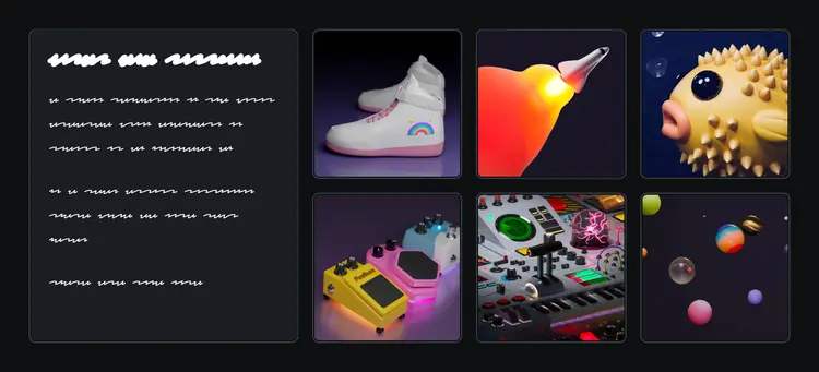
Suppose we want to implement the following mockup:
假设我们想要实现以下模型:
We can create this layout using a flat grid, no subgrid required. Here’s a quick implementation:
我们可以使用一个平面网格创建这个布局,不需要子网格。以下是一个快速实现:
Code Playground
代码游乐场
Format code using Prettier
使用 Prettier 格式化代码
Not a responsive layout
不是响应式布局
To keep things as simple as possible, this layout is not responsive at all. Since you’re viewing this on a device with a smaller screen, you may have to scroll horizontally to view some of the layouts in this tutorial.
为了尽可能简单,这个布局完全不响应。由于您在小屏幕设备上查看,您可能需要水平滚动才能查看本教程中的某些布局。
If we check the “Grid” devtools, we see that this is a 4x2 ...