CSS subgrid is super good
 Play Synthesised Audio
I’m all aboard the CSS subgrid train. Now I’m seeing subgrid everywhere. Seriously, what was I doing before subgrid? I feel like I was bashing rocks together.
Consider the follower HTML:
<main>
  <p>I am main content.</p>
</main>
The <main> content could be simple headings and paragraphs.
It could also be complex HTML patterns from a Content Management System (CMS) like the WordPress block editor, or ACF flexible content (a personal favourite).
Typically when working with CMS output, the main content will be restricted to a maximum width for readable line lengths. We could use a CSS grid to achieve such a layout. Below is a visual example using the Chromium dev tools to highlight grid lines.
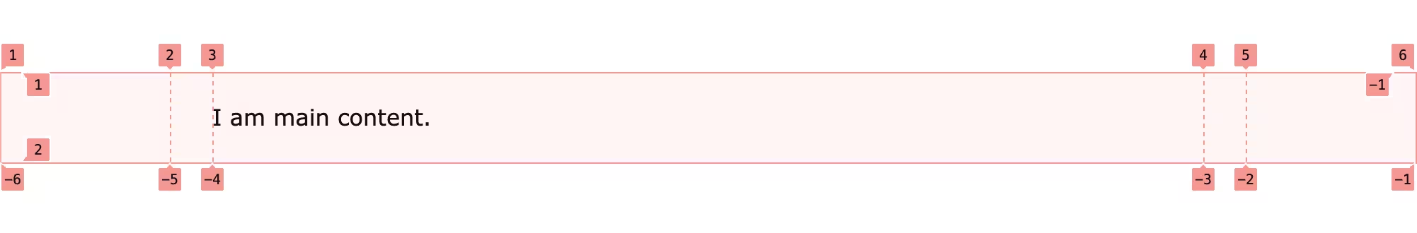
Grid lines marked one through six with a centred paragraph.
This example uses five columns with no gap resulting in six grid lines.
main {
  display: grid;
  grid-template-columns:
    auto
    30px
    min(45rem, calc(100% -  60px))
    30px
    auto;

  :where(&) > * {
    grid-column: 3 / 4;
  }
}
The two outer most columns are auto meaning they can expand to fill space or collapse to zero-width. The two inner columns are 30px which act as a margin. The centre column is the smallest or two values; either 45rem, or the full viewport width (minus the margins).
Counting grid line correctly requires embarrassing finger math and pointing at the screen. Thankfully we can name the lines.
main {
  display: grid;
  grid-template-columns:
    [inline-start]
    auto
    [margin-start]
    30px
    [main-start]
    min(45rem, calc(100% -  60px))
    [main-end]
    30px
    [margin-end]
    auto
    [inline-end];

  :where(&) > * {
    grid-column: main;
  }
}
I set a default column of main for all child elements.
Of course, we could have done this the old fashioned way. Something like:
main {
  margin-inline: auto;
  max-inline-size: 45rem;
  padding-inline: 30px;
}
But grid has so much more potential to unlock!
What if a fancy CMS wraps a paragraph in a block with the class full-width.
<main>
  <p>I am main content.</p>
  <div class="full-width">
    <p>I am subgrid.</p>
  </div>
</main>
This block is expected to magically extend a background to the full-width of the viewport like the example below.

Two paragraphs. The second has white text with a red background extending to the edge of the viewport.
This used to be a nightmare to code but with CSS subgrid it’s a piece of cake.
.full-width {
  display: grid;
  grid-column: inline;
  grid-template-columns: subgrid;

  :where(&) > * {
    grid-column: main;
  }
}
We break out of the main column by changing the grid-column to inline — that’s the name I chose for the outer most grid lines. We then inherit the parent grid using the subgrid template. Finally, the nested children are moved back to the main column.
The :where selector keeps specificity low. This allows a single class to override the default column. CSS subgrid isn’t restricted to one level. We could keep nesting full-width blocks inside each other and they would all break containment.
If we wanted to create a “boxed” style we can simply change the grid-column to margin instead of inline. This is why I put the margins inside.

Two paragraphs. The second now has a background that does not extend.
In hindsight my grid line names are probably confusing, but I don’t have time to edit the examples so go paint your own bikeshed :)
On smaller viewports below 45rem the outer most columns collapse to zero-width and the “boxed” style looks exactly like the full-width style.
This approach is not restricted to one centred column. See my CodePen example and the screenshot below. I split the main content in half to achieve a two-column block where the text edge still aligns, but the image covers the available space.

This may look funny on an ultra-wide monitor. See my post on Figma betrayals where I cover that topic.
CSS subgrid is perfect for WordPress and other CMS content that is spat out as a giant blob of HTML. We basically have to centre the content wrapper for top-level prose to look presentable. With the technique I’ve shown we can break out more complex block patterns and then use subgrid to align their contents back inside. It only takes a single class to start!
Here’s the CodePen link again if you missed it.
Look how clean that HTML is! Subgrid helps us avoid repetitive nested wrappers. Not to mention any negative margin shenanigans.
Powerful stuff, right?
Browser support? Yes. Good enough that I’ve not had any complaints. Your mileage may vary, I am not a lawyer. Don’t subgrid and drive.