Anomaly Detection in Time Series Using Statistical Analysis
Setting up alerts for metrics isn’t always straightforward. In some cases, a simple threshold works just fine — for example, monitoring disk space on a device. You can just set an alert at 10% remaining, and you’re covered. The same goes for tracking available memory on a server.
But what if we need to monitor something like user behavior on a website? Imagine running a web store where you sell products. One approach might be to set a minimum threshold for daily sales and check it once a day. But what if something goes wrong, and you need to catch the issue much sooner — within hours or even minutes? In that case, a static threshold won’t cut it because user activity fluctuates throughout the day. This is where anomaly detection comes in.

What exactly is anomaly detection? Instead of relying on simple rules, it involves analyzing historical data to spot unusual patterns. There are various ways to implement anomaly detection, including machine learning and statistical analysis. In this article, we’ll focus on the statistical approach and walk through how we built our own anomaly detection system for time series data from scratch at Booking.
The Naïve Approach
One common mistake I’ve seen across different companies and teams is trying to detect anomalies by simply comparing a business metric to its value exactly one week ago.

This week vs previous week
At first glance, this approach isn’t entirely useless — you can catch some anomalies, as shown in the image above. But is it a reliable long-term solution? Not really. The big flaw is that today’s anomaly becomes next week’s baseline. That means if the same issue occurs again at the same time next week, it may go completely unnoticed because we’re now comparing against a flawed reference point.

Outage in previous week
That doesn’t look right, our simplistic approach doesn’t know that last week’s data was compromised. Another limitation of this method is that it only considers a single week at a time. But what if performance is gradually declining over multiple weeks? That kind of slow-moving issue would likely slip right through the cracks.
Statistics
At this point, I started asking myself: How hard would it be to build an anomaly detection system from scratch_?_ I knew there were plenty of machine learning solutions for this, but could a simple statistical approach do the job? And more importantly — would it be good enough? Let’s dive in and find out.
First, let’s take a look at one of the most fundamental statistical measurements: standard deviation.

Standard deviation
You’ve probably seen this bell curve before, but how exactly can standard deviation help us? The key idea is to measure the fluctuations in our time series data.
For example, if we zoom into a small time window, e.g. the last 20 minutes, and compare it against historical data from the past four weeks at the exact same time of day, we might see something like this:

This week (green) vs multiple previous weeks (blue)
As you can see, these metrics are quite volatile, and we can quantify this fluctuation by calculating the standard deviation over a given period. To make this more practical, let’s visualize the data by plotting a graph that includes the mean along with one standard deviation above and below it.
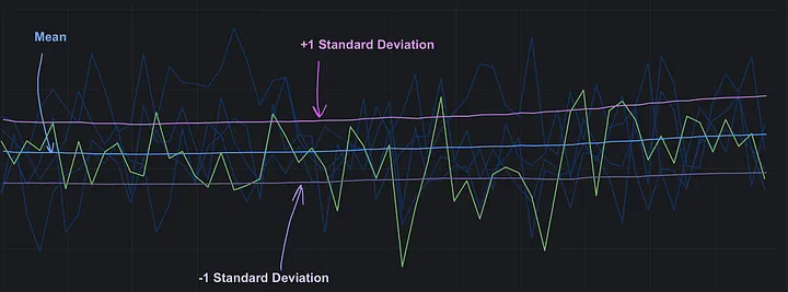
Standard deviation over time
If we zoom out further and compute the standard deviation over a larger time period, we can observe broader patterns in variability.

Standard deviation over time (zoomed out)
With both the mean and standard deviation at hand, we can now construct a z-score, a powerful statistical tool for identifying outliers and detecting anomalies in the data.
What is a Z-Score?
From Wikipedia:
In statistics, the standard score or z-score is the number of standard deviations by which the value of a raw score (i.e., an observed value or data point) is above or below the mean value of what is being observed or measured. Raw scores above the mean have positive standard scores, while those below the mean have negative standard scores.
Here’s the formula for calculating a Z-Score:

Z-score formula
Simply put, the Z-score measures how far a particular data point is from the mean. And this can be extremely useful for us! In fact, it provides a straightforward way to detect anomalies or outliers in time series data. This was our first approach to anomaly detection, and here’s how it worked.
Imagine we want to build an anomaly detection system for the following metric:

Current week
At first glance, it’s hard to say whether the drop towards the end is an actual anomaly or just normal behavior. But let’s plot the same metric for previous weeks on the same graph:

Current week (green) vs multiple previous weeks (blue)
Now, it’s much clearer that something is off. So how do we turn this into an alert? That’s where the Z-score comes in. The first step is to calculate the average value. Typically, we’d do this within a specific time window, but for simplicity, let’s calculate it for the entire dataset excluding the current week.

Mean of multiple previous weks
Next, we calculate the standard deviation:

Standard deviation of previous weeks
Once we have the mean and standard deviation of the historical metric, we can compute the Z-score for each point in the current metric.

Z-scores for current week metric
Notice a pattern? All the “anomalous” points have a Z-score below -3. That’s actually a good threshold for setting up alerts. To better understand Z-score values, we can refer to the Z-Score table:

Z-score table
Using this table, we can look up what each Z-score represents. A Z-score of -3 means that only 0.135% of data points fall below this value, making it a rare event. That makes it a strong candidate for an anomaly threshold.
However, we soon realized that relying solely on Z-scores for alerting has its own drawbacks…
Problems with Z-Score Based Alerting
The biggest challenge we faced with Z-score alerting was that our business metrics were stored in Graphite, which doesn’t provide a straightforward way to define time windows for calculations. The closest available function was movingAverage, but that wasn’t very helpful. If we tried to calculate the standard deviation based on four weeks of data, we ended up with something like this:

Standard deviation based on historical metric with an anomaly
Even if we managed to solve the sliding window issue and filter out past incidents, there were still other problems to deal with.
When we started using the Z-score for alerts, we quickly noticed a spike in alerts during nighttime. The reason? Business metrics in a single country or continent naturally drop at night because users are less active — they’re sleeping! With fewer transactions, there’s also less deviation, making Z-scores more volatile and prone to false alarms during low-activity periods.
Another big drawback of Z-score-based alerting is that it’s not human-readable. It’s difficult to estimate the actual impact of an incident when alerts are based on abstract statistical values. Imagine getting woken up in the middle of the night by this alert: “Low Z-score value (-3.1) for processed orders in the last 10 minutes.”

Even if you check the dashboard, you might still struggle to understand how bad the situation really is. A much more useful alert would be something like: “We have lost N orders in the last 10 minutes.”
That’s actionable information and you don’t even need to look at the dashboard to get the numbers.
Considering all these issues, we realized that Z-score alerting alone wasn’t the right solution for us — we needed to find a better approach.
Alternative Approach
Given the readability issues with Z-score-based alerting, we thought it might be better to predict what the metric should be rather than just flagging anomalies statistically. But since many business metrics fluctuate significantly, predicting a single value wouldn’t be ideal. Instead, we decided to build a range — an upper and lower bound — allowing us to account for uncertainty in highly variable metrics.
Another challenge was that Graphite alone wasn’t powerful enough for the calculations we needed. That’s when we decided to develop a small service whose sole responsibility would be computing the prediction range and sending it back to Graphite. This way, the service wouldn’t handle alerting or anomaly detection itself — other tools, like Grafana, could take care of that. Our focus would remain on fine-tuning the prediction range algorithm, while Grafana would handle detection and notifications.
We called this service “Granomaly”, and here’s a high-level overview of how our anomaly detection system works:

Granomaly overview
How Granomaly Works
Granomaly service works in a following way:
- Reads historical data from Graphite (e.g., 4–5 weeks of data for a specific metric).
- Filters out outliers from past incidents.
- Calculates the prediction range (upper and lower bounds).
- Writes the range back to Graphite as two separate metrics.
The actual anomaly detection and alerting happens in Grafana, based on the prediction range produced by Granomaly. Since Grafana still does a lot of heavy lifting when visualizing these metrics, we realized the need to manage dashboards as code — but this topic is outside of the scope of this article.
How Do We Calculate the Prediction Range?
There are many anomaly detection algorithms, but we wanted to start with something simple. Our first approach was to use a sliding window to determine the upper and lower bounds based on past data.
Here’s how it works:
- For each new data point, we take a time window (e.g., 20 minutes) and look at historical values for the same day of the week over the past 4–5 weeks.
- We then calculate the Nth percentile as the lower bound and the (100-N)th percentile as the upper bound.
For example, if we are evaluating a metric at 12:00, we gather values from 11:50 to 12:10 from the last few weeks. If we choose 5 as a percentile parameter, then we set the 5th percentile as the lower bound and the 95th percentile as the upper bound of the prediction range.

Granomaly algorithm (animated)
We tested this approach on several metrics, and it worked surprisingly well. By tweaking the percentile parameter, we even managed to generate a smooth prediction range, effectively accounting for past anomalies without letting them distort future predictions.
However, we soon discovered that this method struggled in cases of major outages or multiple overlapping incidents…
Overlapping Outages in Previous Weeks’ Metrics
While rare, we occasionally ran into a problem where our prediction range became distorted due to multiple overlapping incidents occurring at the same time of day on the same day of the week. Here’s an example:

Predication range with an artifact caused by anomalies in the past
As you can see, there were two weeks where the metric experienced a drop around the same time. In these cases, our percentile-based approach struggled to generate a reliable prediction range. This made it clear that we needed a way to adjust for past incidents in our historical data.
But how?
We didn’t want to manually track incidents and exclude them — our goal was to keep Granomaly as simple as possible. Instead, we decided to take another statistical approach: what if we automatically excluded the most deviant data points?
First Attempt: Excluding the Most Deviant Week
Our initial idea was to remove the week that caused the biggest deviation from the rest. The logic was simple:
- Take the past N weeks of data.
- Generate N-1 combinations, each time excluding one week.
- Calculate the standard deviation for each combination.
- Choose the combination that produces the smallest standard deviation.
This approach effectively filtered out large anomalies, even in cases of severe incidents. But there was a major flaw:

Multiple artifacts in the prediction range after excluding the outliers
So what is happening? This method always assumes that there is an outlier to exclude — even when there isn’t. This led to an unstable prediction range, making it unreliable for general use.
Clearly, this wasn’t the right solution. So we went back to the drawing board and came up with something much better.
Outlier Exclusion
For this approach, we decided to use a bit of statistical trickery — which I’ll explain using two examples.
At any given interval, we analyze data points from the same time and day of the week for a number of previous weeks. Imagine we’re looking at the following dataset:

Metric values at the same time of a day in multiple weeks
At a glance, it’s easy to spot the outlier. The metric consistently hovered around 600, but one week ago, it suddenly dropped to 200. That looks like an incident or anomaly, meaning it shouldn’t be included in our prediction range calculations.
Step 1: Calculating Z-Scores
To handle this, we first compute the standard deviation for these values and then determine the absolute z-score for each data point:

Z-score per week
As expected, week #1 has the highest z-score, making it an obvious outlier. But instead of simply applying a z-score cutoff, we take an extra step:
Step 2: Z-Score Normalization
This is where things get interesting. Instead of filtering based on a fixed z-score threshold, we perform z-score normalization by calculating the median of all z-score values:

Z-score “normalization”
Next, we subtract each z-score from the median and keep any data point whose normalized z-score stays within a threshold of 0.6. This threshold was chosen empirically, but it can be adjusted as needed.

Final step — detecting the outlier and removing it from the dataset
What was the purpose of this so-called “normalization” of z-score values? Why not simply apply a fixed threshold to the raw z-scores? In the example above, that approach would likely work just fine. However, to truly understand the value of normalization, let’s examine how the algorithm performs in a scenario where there are no obvious anomalies.
A Case with No Obvious Outliers
Consider the following dataset, where no anomalies are present:

No obvious outliers for the same time of a day in multiple weeks
At first glance, nothing seems unusual — this looks like a normal dataset. Ideally, our method shouldn’t exclude any data points in this case.
Now, let’s apply the same steps as before. First, we calculate absolute z-scores:

Z-score per week
Notice that week #1 and week #4 have the highest and lowest values, which results in high z-scores. However, from a human perspective, these fluctuations aren’t actually anomalies. This is exactly why we normalize the z-score using the median. Here is how it looks like after normalization:

“Normalized” z-score per week
Here, none of the data points exceed the 0.6 threshold, meaning no points get filtered out — which is the correct behavior.
Real-World Data
So how does this method hold up in real-world scenarios? Here’s how the prediction range appears for the example we discussed earlier.

Smooth prediction range after exluding anomalies in the historical metrics
Now, let’s take a look at another case with overlapping anomalies.

Smooth prediction range after excluding multiple anomalies in the historica l metrics
As you can see, the prediction range remains smooth even when anomalies occur in two separate weeks. Now that we’ve eliminated past anomalies, we can move on to detecting actual anomalies in real-time.
Detecting the Anomalies
As mentioned earlier, the Granomaly service doesn’t directly detect anomalies — it simply generates the prediction range metric. However, once we have that metric, we can easily detect anomalies using any tool that has access to it.
We decided to implement anomaly detection directly in Grafana. This approach gave us a quick feedback loop, allowing us to experiment rapidly with different detection strategies. Below is an example of the anomaly detection dashboard that we used in our team:

Anomaly detection dashboard in Grafana
We have configured the dashboard and alerts so that whenever a value falls outside the predicted range, it is considered an anomaly. For each metric, we set up two alerts: one for significant drops and another for a gradual decline over an extended period. This approach enables us to detect both sudden outages and slow, gradual declines (we typically call them “slow-burning” incidents). Naturally, the thresholds vary for each metric. To simplify configuration in Grafana and reduce the complexity of Graphite queries, we introduced the “offset” metric, which is calculated in the Granomaly service.
The “Offset” Metric
The “offset” represents the difference between the current metric and the prediction range:
- If the current value is within the range, the offset is 0.
- If the value exceeds the upper bound, the offset is calculated as a difference between the current value and the upper bound of the prediction range.
- Similarly, if the value drops below the lower bound, the offset is calculated as a difference between the current value and a lower bound of the prediction range.

Offset metric
This makes alert configuration much easier:
- Simply sum all the latest offset values over a given period.
- Compare the sum to a threshold value to decide if an alert should be triggered.
Correcting for Events
For a while, we relied on anomaly detection, but we soon encountered another challenge. When using Grafana for all alerting, it becomes difficult to fine-tune alerts for specific events such as holidays, weekends, or major occasions like the Super Bowl or World Cup. We know that certain business metrics behave differently during these times, and we wanted to ensure that our expectations were properly adjusted. Configuring all of this within Grafana’s alerting system is not an easy task, so we took a different approach. We wanted to allow for specifying a particular time range and either adjusting the alerting threshold or modifying the prediction range metric for that period. That’s how we came up with the “correction” metric.

Correction metric
How the Correction Metric Works
The correction metric is highly flexible and is configured in the Granomaly service:
- By default, its value is 0, meaning no corrections are applied.
- For special events, we define an arbitrary correction value (e.g., 10).
- This value is then treated as a percentage adjustment for expanding the prediction range.
- The “offset” metric is calculated based on the adjusted prediction range.
This approach allowed us to prepare for known events upfront, ensuring peace of mind while maintaining accurate anomaly detection.
Detecting Anomalous Drop While Outperforming
Another interesting problem we encountered involved unexpected overperforming in a business metric. During this period, we experienced 15–20% more traffic than predicted, and at the same time, a small incident caused a slight drop in the metric.

Example of a dip in the outperfoming metric
As you can see in the picture above, this incident would go unnoticed because the metric barely touched the lower bound of the prediction range. Technically, this could be seen as a double anomaly:
- The overall increase in traffic itself is an anomaly.
- The small drop within that period is another anomaly, but it’s hidden because of the higher-than-predicted traffic.
We could have used the correction metric to address this case, but since it was an unexpected situation, we wanted a more flexible approach.
Introducing the “Adjustment Factor” Metric
To better handle this, we decided to introduce an additional component in our anomaly detection dashboard called the “adjustment factor”. The concept is simple:
- Look back at the metric for the last couple of hours.
- Determine a single adjustment factor that, when multiplied by the current metric, would position it better within the prediction range.

Adjusted metric
Once we had the adjustment factor, we plotted the “adjusted origin” metric. Then, we configured the alert system to trigger in cases when either the original metric or the adjusted metric drop.
This allowed us to detect sudden declines even when the overall metric was performing far better than expected, ensuring we didn’t miss anomalies due to outperforming traffic.
Simulating Anomalies and Outages
As you can see, there are numerous components in the anomaly detection process described above, and setting the right values or tuning the outlier exclusion algorithm can be very challenging. Every time there was an incident, we were happy because it allowed us to test how our solution worked on real data. But, unfortunately, we don’t always have the luxury of dealing with an actual incident. To address this, we came up with a simulation approach.
The idea is that, before setting up an anomaly detection dashboard in Grafana and configuring it in the Granomaly service, you could first test how it would behave for the metric of your choosing.

Granomaly simulation interface
So, we built the simulation page in our service, allowing us to configure all the parameters and test what kind of prediction range it would produce for the chosen metric. Additionally, we added simulations of anomalies in various metrics to test how well the outlier exclusion algorithm worked. This was incredibly useful, as we were able to polish the prediction range calculation algorithm and test it in various situations, even those with two overlapping anomalies in different weeks. Anyone could simply plug in their chosen metric and instantly see the results. This drastic reduction in the feedback loop made it much easier to fine-tune the prediction range for each metric, ensuring more accurate anomaly detection.
Understanding the Anomaly
So, we built all of that, and you might have a question: was it helpful? Did we manage to detect anomalies effectively? It turns out that detecting the anomaly itself is actually not that difficult. The real challenge comes afterward.
You see, when you’re dealing with an increase of errors in your system, you can often trace it back to a failing component. But what if you don’t have any errors at all? What if there’s just a decline in the number of orders on your website, and there are no indications of any changes or problems in your system? What are you going to do once you detect this anomaly?
- Is it just good weather or some kind of big event that you forgot about and all your users are offline?
- Or is it some problems with your marketing campaign that went silent?
- Could it be an issue with your business partner, and they have no idea about it yet but it is already affecting you?
- Or maybe there is an ongoing A/B test that broke the click handler for the order button for a small percent of the users, and they simply aren’t able to submit the form?
Anything can happen.
You see, most of the time, detecting the anomaly is actually not that difficult. It’s a lot trickier to figure out what to do next with that information. One thing that helps a lot is breaking your business metric into components. Instead of just tracking orders on your website, try tracking them per region. Or by device, like iPhone, Android, tablet, desktop browser, etc. Or by marketing channels. That one is very important, actually, because your company attracts users in a lot of ways, and oftentimes it relies on a third-party service. You want to make sure you don’t lose users due to a misconfiguration or issues on the other side.

Breaking down a single metric into multiple sub-metrics
Once you manage to break your core vital metrics into smaller components, you can scale up your anomaly detection dashboards to cover all of them. This approach will help you narrow down the scope when dealing with unexplained behavior in your data.
Conclusion
Anomaly detection can be remarkably effective even with basic statistical tools like z-score, standard deviation, percentiles etc. You don’t need to be a machine learning expert to build an anomaly detection system for time-series data, but there are a few key challenges that stand out: accounting for past anomalies, reducing the feedback loop through simulation, and making sense of detected anomalies.
As shown in this article, statistical methods can successfully identify outliers, but their effectiveness depends heavily on historical data quality. If past anomalies distort the baseline, predictions suffer, making it essential to filter them out — a challenge we addressed with our approach.
Interactive simulation played a crucial role in reducing the feedback loop from days to seconds, allowing for rapid experimentation with historical data. This made it easier to fine-tune parameters and assess whether a given metric was even suitable for anomaly detection. Not all metrics are predictable enough to work with this approach, so if you’re building an anomaly detection system, optimizing the feedback loop is critical.
The most challenging aspect, however, is interpreting anomalies. A sudden, severe drop in a metric is usually easy to diagnose — it’s often accompanied by other alerts pointing to a clear system failure. But what if you notice a steady 10% decline in orders with no errors, no complaints, and no obvious technical issues? It could be a subtle business issue, a problem with marketing campaigns, or even something as simple as changes in weather patterns affecting user behavior. This uncertainty makes anomaly interpretation difficult. Breaking metrics down by region, device, or marketing channel can help narrow the cause, but it’s obviously not a complete solution.
Ultimately, before you can analyze an anomaly, you need to detect it first — and I hope this article has shown that it’s possible to do so with relatively simple statistical techniques.