A better segmented control

Old segmented control does not spark joy
A few years ago, we built a segmented control component for the Lyft Product Language (LPL) design system. You may have read our guide to designing and using selection controls. However, when we recently looked at our component adoption and usage metrics, we found very few teams actually used our segmented control when building products and features ?.
Our rule of thumb is that at least two products or features need to use a component for it to belong in the system. Product and feature-specific components live in their own, child libraries which inherit attributes from LPL. Segmented control was dangerously close to getting booted from the system. Luckily, we decided to take a closer look at the root of the problem — and ended up improving our entire ecosystem of selection controls. Here is that story.
Problem definition
We started from first principles and asked “what the heck is a segmented control anyway?” Apple says they’re a “linear set of two or more segments, each of which functions as a mutually exclusive button.” They think it’s ok to use segmented controls to navigate between different views. Google disagrees about using segmented controls for navigation and says it’s ok to select multiple segments sometimes — unlike Apple. Google also doesn’t think segmented controls are selection controls at all ?.
When designing an interusable design system with rules that apply across iOS, Android, and Web interfaces, contradictory platform guidelines like these make it tricky to know which conventions will be the most familiar to users across all devices.
When we first built our segmented control component in LPL, we didn’t necessarily consider this convention confusion. We optimized for internal consistency — choosing to match the visual style of our pill-like toggle buttons.

Previous selection controls
In theory, we thought it might be likely for toggle buttons and segmented controls to appear frequently in the same contexts since they were functionally analogous to checkboxes and radio buttons. In practice, however, feature designers and engineers took matters into their own hands and created all sorts of permutations of custom segmented controls. When we audited our products, we found 14 distinct segmented control components across 10 different products. Obviously, our existing component didn’t meet the needs of our system users. We didn’t need to remove segmented control from the system, we needed a better segmented control.

A different segmented control for every occasion
Upon closer inspection, we saw the custom permutations differed from the system segmented control in one of two ways:
- Stylistic differences: Controls with different selection and background colors, container shapes, and/or text styles from the existing component.
- Semantic differences: Controls used for navigation or filtering content (like Apple allows) instead of selection as intended.
Tackling one problem at a time
The first bucket of stylistic discrepancies was relatively straightforward to address. We redesigned the control to be less similar to its pill-like cousin, toggle button, and more similar to our visually lightweight input fields instead.

New, lightweight, segmented control styles
One of the big reasons product and feature teams created their own components was because ours wasn’t flexible enough to adapt to a wide variety of use cases. So we also introduced 3 new stylistic variants of the component:
- Text with detail text — for when the extra information helps users better understand the options and make decisions
- Icon — only for when there is enough context for each icon option to convey meaning and not when short text would suffice.
- Primary text — for when the segmented control is the only or primary action on the screen.
To close the loop and encourage adoption, we replaced the custom components in all of the screens we collected during our audit and showed off the new variants in situ. Just like it’s better to use real copy and data over auto-generated Lorem Ipsum, we found it more effective to use real screen designs to stress test our component.
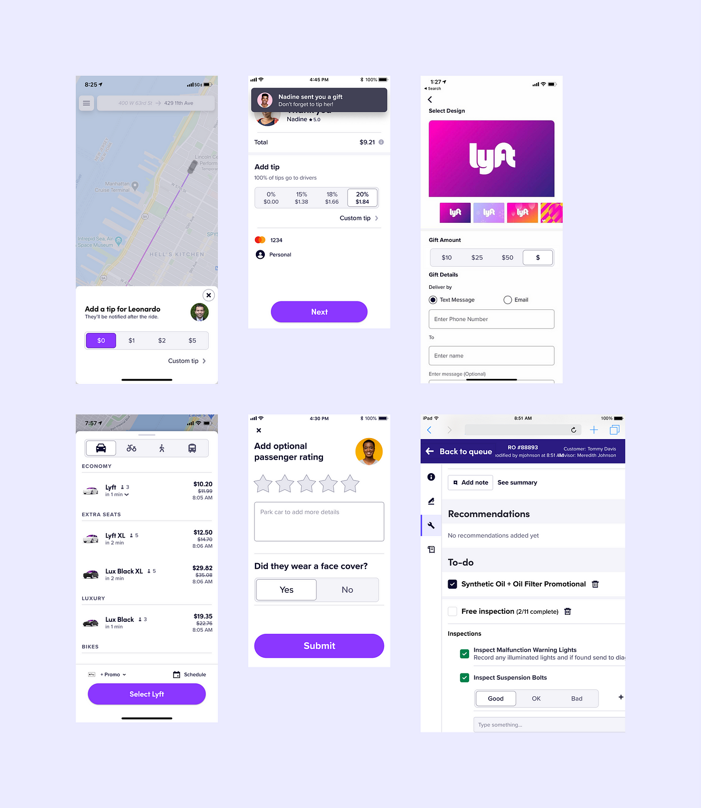
Variants in situ
For the semantic discrepancies, meanwhile, we looked across other systems… and found more discrepancies ?♀️. For starters, there is no consensus on what to name this pattern. In addition to segmented control, we’ve seen it called a button group, toggle buttons, radio bar, or content switch in different systems. And for each new name, there is a slightly different usage guideline. Turns out, this isn’t just a platform convention problem, it’s a meta-problem across all design systems. It’s no wonder that we saw so many different custom implementations of it across our feature teams!
Needless to say, tackling inter-system consistency problems was well beyond the scope of this project. So instead, we focused on making our own system as clear and internally consistent as possible. We created a new component in the system (Tabs!) to handle the filtering and navigation use cases and we updated our decision trees along with component definitions to make the new distinction clear. To further reinforce the semantic difference between segmented controls and tabs, we made the selection states, container shapes, and motion guidelines different between the two.
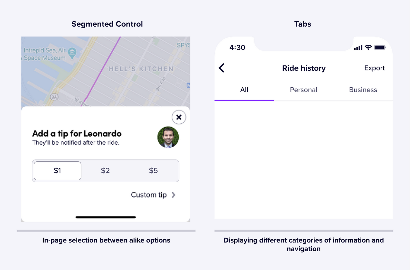
Clear and internally consistent differences
Our previous definition for segmented control borrowed heavily from Apple’s which literally states what the component is. But the “what” doesn’t help designers make decisions. Now, we emphasize the “why” and the “how”:
Segmented controls allow users to make a single selection from a set of 2–5 options, as a common alternative to radio buttons and dropdown menus. They clearly present all available options to users and are easy to use on mobile devices.
• Use them over other selection controls to reduce cognitive load.
• Do not use them to filter or navigate content (use Tabs instead).
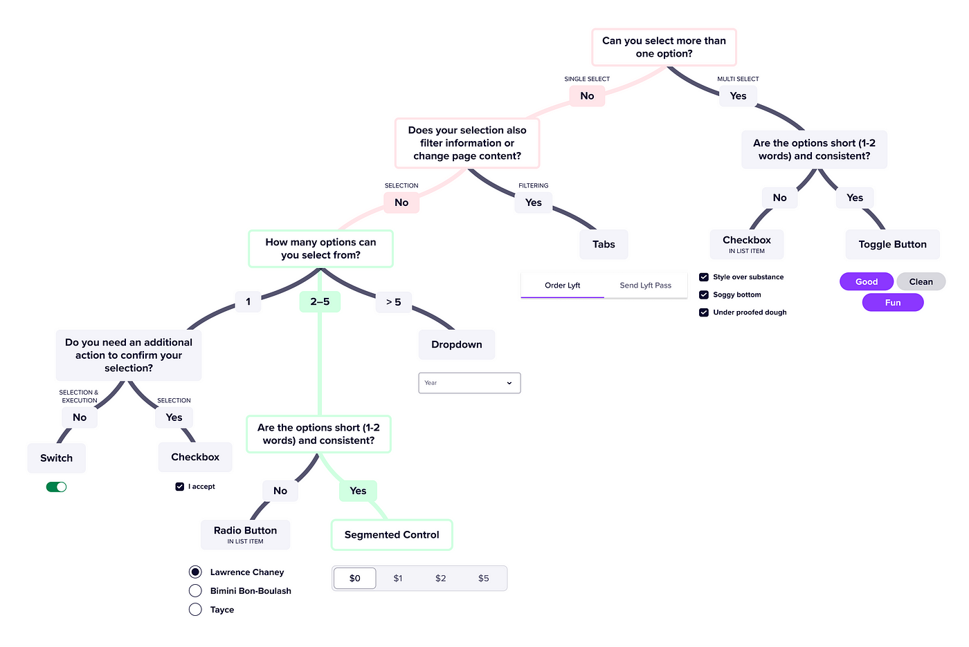
Selection control ecosystem flow chart aka pure insanity
Tying up loose ends
Updating documentation is one thing, but we still needed to make it as easy as possible for designers to use the updated system component. We wanted to avoid triggering potential breaking changes by simply swapping symbols in Figma. Instead, we phased out the old component as suggested by Onfido’s great article on deprecating components in Figma design systems. For us, that meant:
- Renaming the page with the old component.
- Moving the page with the old component to the “Deprecated Dungeon” section of our library.
- Adding a super obvious visual overlay to all variants of the old component, complete with a ghost emoji ? as voted upon by our design team.
With the old component relegated, we could finally consider this problem solved.
Banished, but never forgotten
As long as there is a central system, there will be teams that deviate from it. So often as systems stewards, we seek to reduce and reign in those deviations. In this case, we could have chosen to remove segmented control from LPL because it wasn’t being used. Yet, when we examined why so many teams were choosing to build custom components over using the system component, we ended up with a more varied, more robust, more usable, and better defined ecosystem of selection patterns. As for the meta-problem, if your team calls this component something else or thinks about its usage differently than we do, let’s chat about it!
This article was written by the extremely talented Runi Goswami — a product designer on the Lyft Design Systems team. Please subscribe!