How to Prioritize Features and Projects: The Ultimate List of Prioritization Frameworks
You have 2 free member-only stories left this month.

- Complete list of prioritization techniques (124 bullet points)
- Grids (30)
- Scoring (49)
- No-score Sorting (7)
- Qualitative classification (8)
- Maps and canvases (7)
- Activities/Games (13)
- Processes (10)
- Other prioritization questions
My hope is that this article serves the community in a few ways:
- Helps managers spend less time reinventing the wheel
- Inspires managers to improve their prioritization
- Provides ideas for improving communication with partners
- Spotlight contributions that so many have made from the 1980s to 2021
How to prioritize: What I learned
I wrote about some of my learnings while putting this list of prioritization techniques together.
- Prioritization and sequencing are two different things
- There are more ways to prioritize than I thought
- Prioritization frameworks are not dead
- One framework may not be enough
- Important prioritization criteria are often missing
- Grids and scores are not being leveraged to their full potential

-
Agreement Certainty
-
Impact vs Effort
-
Value vs Feasibility
-
PICK Chart
-
Risk vs Return
-
RVCE Matrix
-
Business Value, Effort, Risk
-
Value, Likelihood, Effort
-
Kano Model
-
Build, Partner, Buy
-
Gusto Prioritization Matrix
-
How, Now, Wow
-
Eisenhower Decision Matrix / Covey’s Four Quadrants
-
Big Bet, Home Run, Small Win
-
Market Newness vs Product Newness
-
Problem Definition vs Domain Definition
-
Business Goals vs Degree of Change
-
Time to MVP vs Market Differentiation
-
Market Impact vs Tech Newness
-
McKinsey prioritization matrix
-
Purpose Alignment / Nickolaisen Model
-
BCG Prioritization
-
4 Dimensions!
-
How many, How Often
-
Value Mapping from Intercom
-
Disruption vs Visibility Bug Prioritization
-
Nine-box Matrix Updated
-
Vision, Sustainability
-
Business Strategy Prioritization
-
House of Quality (QFD)
-
BTFB
-
RICE
-
ICE
-
ICE number 2
-
BRICE
-
LICE
-
DIE
-
PIE
-
Task Score
-
BUC
-
BREaD
-
TIR
-
Raveesh Dubey
-
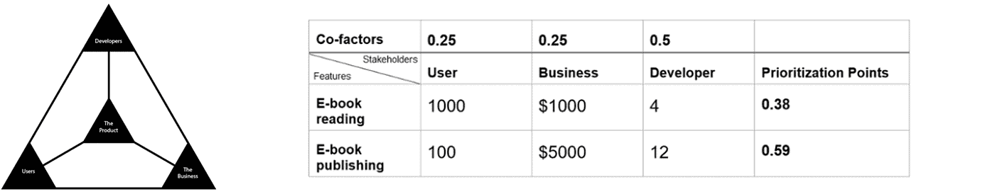
Product Manager Triangle weighted scoring
-
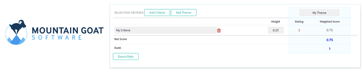
DIY, Choose your own themes weighted scoring
-
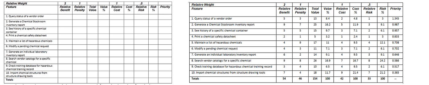
Karl Weigers Relative Weighting weighted scoring
-
Modified three feature buckets weighted scoring
-
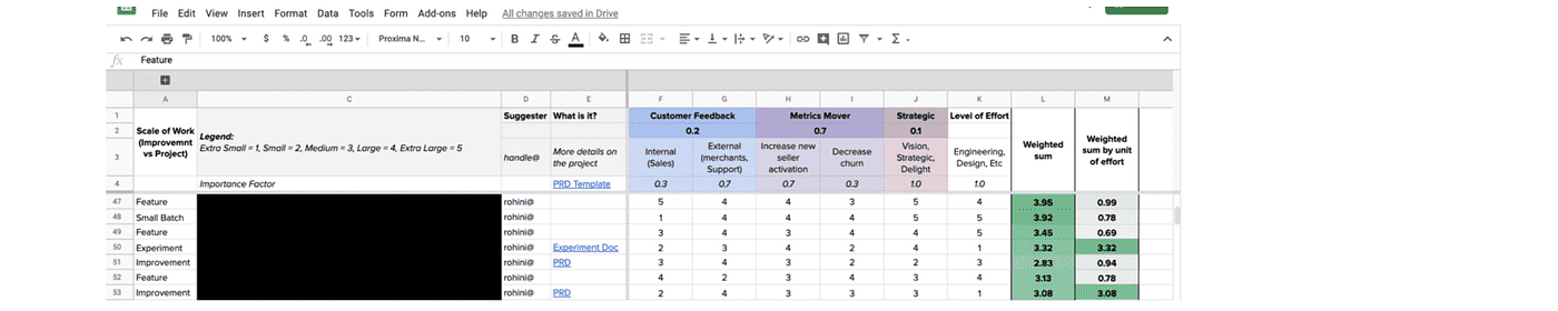
Customer Satisfaction, Business Value, Cost weighted scoring
-
ROI Scorecard
-
Weighted Shortest Job First (WSJF)
-
SIF (Shortest Item First)
-
LIF (Longest Item First)
-
Monster prioritization
-
Remco Prioritization
-
5-Pillar-Prioritization-Framework
-
Coverage, Magnitude, Cost
-
EFQ
-
Turn Ideas Into Products Questions
-
Expected Value
-
Opportunity Score
-
BACER
-
Risk-based prioritization
-
Pugh Matrix Theme Screening
-
Evidence Score
-
IDEA/E
-
CUP Method
-
Decision Diamond
-
Pairwise / Paired Comparison Matrix
-
AHP
-
Hierarchy AHP
-
Impact Estimation Table (IE)
-
PXL
-
Hotwire
-
Monetate
-
VIDEO
-
ASPIRE + SOAR
-
User Value Scorecard
-
HIPE
-
Desirability, Feasibility, Viability
-
LIFO
-
FIFO
-
Classification Rankings
-
Priority Groups
-
Bubble Sorting
-
Binary Search Tree
-
Binary Priority List
-
MoSCoW
-
Planning Game
-
70/20/10
-
Three feature buckets (sometimes 4)
-
Candy, Vitamins, Painkillers
-
4-UP
-
Easy Hard Expensive
-
4 Ds
-
Priority Pyramid
-
Bullseye Diagram
-
Story Mapping
-
Impact Mapping
-
Walking Skeleton
-
Systemico
-
Critical Path
-
Dot Voting / Cumulative Voting
-
Hierarchal Cumulative Voting
-
Multi Voting
-
Theory-W
-
Buy-a-Feature
-
Ping Pong Balls
-
TribeRank
-
Prune the Product Tree
-
Speed Boat
-
Poker Planning
-
In or Out
-
Family Feud
-
Even-over Statements
-
A, E, I, O, U
-
GRIDS
-
Ian McAllister
-
Mariano Capezzani 4 Step
-
Ruthless
-
KJ Technique
-
Prosono’s Priority to Action Framework
-
GEM model
-
Ranallo’s 100
-
Kareem Mayan
Read further for more information, images, and tons of resource links.
Lean prioritization grids, Matrices, Quadrants, Window Diagrams


Left to right: productplan.com, groupmap.com, reforge.com
- Vertical axis: Impact/Value/Benefits, etc. (Specify one perspective: User or Business)
- Horizontal axis: Effort/Complexity/Cost, etc. (for Team/Business)
Also known as Value vs. Complexity, Action Priority Matrix, Benefits vs. Cost, or Value vs. Cost, “Impact vs Difficulty”, and sometimes simply “The Four Quadrants.” This model can help product managers understand whether a feature is one for the backburner/filler/nice-to-have, a low hanging fruit/quick win, or something to discard altogether. Unsure what to do after everything is plotted on the cost vs value graph? Check out the PACE framework which proposes how to prioritize from this grid.
Read more about the value vs. effort matrix: ProductPlan | GroupMap | Miro | Reforge | Nathan Robinson | Beyond20.com PACE framework

Left to right: IBM.com, nngroup.com, beekfast.com, cdss.org
- Vertical axis: Impact/Value/Benefits/Importance, etc. (Specify one perspective: User or Business)
- Horizontal axis: Feasibility
Read more about value vs. feasibility: IBM | Nielsen Norman Group | Mural | beekfast | CDSS.org
- Vertical axis: Easy, Hard
- Horizontal axis: Low Payoff, High Payoff
PICK stands for the categories that emerge in the quadrants: Possible, Implement, Challenge, Kill. This has the same effect as the Impact vs. Effort grid with the additional benefit of categories that are being easy to remember.
Read more about the PICK chart: Easy Projects | Wikipedia | Vertex42 | BPI
- Vertical axis: Return on investment
- Horizontal axis: Risk level
A great choice, especially when working in a risky area (compliance, reputation, etc.) Will Lord offers this matrix to help managers assess where they can maximize value to the business while having an awareness of whatever risks may be involved.
Read more: Risk/Return Matrix (
)
- Vertical axis: Risk
- Vertical axis: Cost
- Horizontal axis: Effort
- Horizontal axis: Value
A unique matrix on the list is that it uses 2 vertical axes and 2 horizontal axes. While we would often use cost and effort synonymously, this model breaks them up. This is also one of the few methods on this list that risk factor.
Read more: Process Excellence Network
- Vertical axis: Business value
- Horizontal axis: Effort
- Bubble size: Risk
Airfocus wrote up some example use cases years ago. They utilized bubble sizing to make a 3rd dimension available for assessing priorities. Of course, this is similar to one of the most common matrices we’ve seen, Value vs. Effort. Adding Risk into the equation can be helpful, however, when risk management is a particular concern.
Read more: Airfocus

Left to right: airfocus, doing-projects.org, syncopation.com
- Vertical axis: Probability of success
- Horizontal axis: Value
- Bubble size: Person months allocated
Another Value/Effort chart but with the added benefit of confidence or success probability. This is a great way to really challenge the ROI claim considering real-world factors of any kind, from team efficacy in a certain technology to competition or market conditions.
Read more: Airfocus
- Vertical axis: Satisfaction
- Horizontal axis: Functionality/Investment/Fulfillment/Sophistication/Realization of customer requirements/Implementation/Degree of achievement
Pronounced “kah-no,” there is more to the Kano model than this diagram, and there are different ways folks use this diagram. It can help teams think beyond churning out features and consider which features will have the most bang for the buck for customers.
Read more: Mind the Product | Justinmind | The Startup | Folding Burritos | Nathan Robinson

- Vertical axis: Strategic priority
- Horizontal axis: Urgency
Perhaps less about prioritization and more about general decision making and resource allocation, The Framework Bank points out the all too familiar Build or Buy decision and offers this tool for the challenge.
Read more: The Framework Bank

- Vertical axis: Customer impact
- Horizontal axis: Expected to Unexpected
Take a stroll down Customer Obsession lane and set aside resourcing constraints and politics, and check out what an innovative roadmap could look like if effort and complexity were not in the way. All ideas will fit into one of the 4 quadrants: Must have, Wow, Neat, Who cares.
Read more at Gusto

Left to right: Gamestorming, Joelle Hagen, Openpracticelibrary.com
- Vertical axis: Complexity (easy to impossible)
- Horizontal axis: Novelty
The How/Now/Wow 2x2 is similar to the Gusto matrix above. Expected vs. Unexpected (Gusto) is similar to the Novelty axis here; however, the Impact axis of Gusto is replaced with Implementation Complexity. Try this one if you want to stand out in the market but balance the level of effort.
Read more: Frameplay | Gamestorming | Joelle Hagen (
) | GroupMap | Openpracticelibrary.com

Left to right: todoist, ProductPlan, TechTello, Altassian
- Vertical axis: Importance or Impact
- Horizontal axis: Urgency
The nice thing about this one is that not only can it help with features, risks, or projects — but also for day-to-day tasks. Covey’s Four Priority Quadrants is another version (simply reversed) in case you happen to run into that one. Impact vs Urgency is another version where the quadrants turn out pretty much the same in the end. If you’ve got an Eisenhower matrix with many items in multiple quadrants, check out this related ABC exercise as a secondary sorting process to make sense of a busy 2x2. High Medium Low is another way to think about the quadrants in an Eisenhower matrix.
Read more: Unboxing Product Management | todoist |ProductPlan | TechTello | Atlassian

Left to right: Daniel Shapiro, Agile Pearls, A Good Life
- Vertical axis: Value/Impact
- Horizontal axis: Probability of success/Likelihood
Dubbed the PMAT (Priority Matrix) and related to PRISM method, PMs can use it to determine where they can add the most value. This grid points out those that are most important but have a greater chance of failing and need more focus.
Read more: Daniel Shapero | Appfluence | A Good Life (
) | Agilepearls.com

Left to right: YoursProductly, IG Reddy, Wikipedia, HBR
- Vertical axis: Market newness (How established is the market)
- Horizontal axis: Product newness
This one is a bit different in that it uses bands rather than quadrants. The bands are “Core innovations,” “Adjacent Innovations,” and “Disruptive Innovations.”
Called the “Innovation Ambition Matrix,” Roman Pichler adapted this tool from Bansi Nagji and Geoff Tuff's earlier work in his book Strategize. It is based on the Ansoff Matrix from Igor Ansoff. In this case, “Product newness” and “Market newness” (How established is the market) are your axis labels.
Read more: YoursProductly (Ravi Kumar) | nzdl.org

- Vertical axis: How well is the problem defined?
- Horizontal axis: How well is the domain defined?
Perhaps the problem is obvious, but the path forward is not because of constraints in the team or whatever else. This framework can help identify gaps and opportunities for your team in particular and what kind of activities are most applicable for moving forward.
Read more: Harvard Business Review | toolshero

- Vertical axis: Incremental to substantial change
- Horizontal axis: Reduce cost to increasing revenue
After filling in this 2x2, you’ll want to aim for the 2 quadrants in the top half. The idea is to shoot for significant change (top two quadrants) and choose to reduce cost (left) or increase revenue (right) depending on business goals.
Read more: Design a Better Business

- Vertical axis: Time to MVP
- Horizontal axis: Market differentiation
How fast can you move, and how much will your feature stand out? Although it is not the article's focus, Sarah Gibbons uses this no-nonsense prioritization matrix as a unique example.

Left to right: Viima, Slideteam.net
- Vertical axis: Market impact
- Horizontal axis: Tech newness
Like the first innovation matrix above, keeping the market factor but pivoting from “Newness” to “Impact” seems to strike a good balance. Instead of only looking at doing something new, do something new that is meaningful and makes a difference in your target market.
Read more at Viima
- Vertical axis: Market Differentiation
- Horizontal axis: Mission Critical
If market share is the game, Nickolaisen Model is the name. That doesn’t really flow. As with any good 2x2, aim for the upper right where you’ll be differentiating in core areas and gaining market share in your sector.
Read more: The Agile Manager | Informit | Agilocity | CIO

Left to right: Miro, Airfocus, professionalacademy.com
- Vertical axis: Market growth rate
- Horizontal axis: Relative market share
- Bubble size: Allocated resources
Also called the Boston matrix or the growth-share matrix, Boston Consulting Group created this template to help understand a project’s potential to increase market share and grow the business.


- Vertical axis: Amount of time users engage
- Horizontal axis: Number of engaged users
A nice reminder in really making sure the problem is well defined and prioritized appropriately, Will Lord points out this diagram to help managers assess a problem’s priority in the overall scheme of things. This chart could also serve as a strong communication tool to stakeholders who may not appreciate being told no.
Read more: Will Lord (
)

Left to right: Intercom, zepel.io, productpopcorn.com
- Vertical axis: How often customers will be using the feature (Very little, Some, Most, All of the time)
- Horizontal axis: How many customers will be using the feature (Few, Some, Most, All)
This is a more structured 4x4/16-box grid version of the above “How many, How often” chart. The Intercom Value Mapping approach has a similar axis but breaks up each axis into 4 levels. If you don’t have the precise numbers on hand, this could be a good alternative to get to a helpful view quickly.
Read more: Intercom

- Vertical axis: Disruption/Impact on user experience
- Horizontal axis: Visibility
This bug prioritization framework from Hannah Catania could be a good customer-centric option where UX and a brand reputation are critical. This one may also help make quick decisions with more qualitative criteria than the Value/Cost matrix above.

- Vertical axis: Customer pain
- Horizontal axis: Team efficacy
The nine-box has been used for decades in prioritizing investment in business units or personnel. Eleanor Stribling, however, introduced a way to use a grid with nine boxes in product management by changing the axes. The nice thing about the nine-box is that it adds granularity to the 2x2 in a structured way, but it’s still straightforward.
Read more: Productized

Left to right: Radical Product, Agile Insider
- Vertical axis: Vision fit
- Horizontal axis: Sustainability
Once a vision and strategy are set with a list of opportunities to consider under the strategy, this view helps businesses understand how they can balance managing risk with pursuing their long term vision.
Read more: Radical Product | Agile Insider

- Vertical axis: Strategic fit
- Horizontal axis: Feasibility
- Bubble size: Economic impact/Value
One of the few on this list to include a strategic alignment piece, this chart is a solid one. It’s missing an estimated effort, but feasibility could cover some of that depending on how the user defines it.
Read more: Airfocus

I’ve seen this show up multiple times in product prioritization contexts in blogs. Although it looks cool, I highly doubt this is ever really used in product management prioritization. It is not traditionally used for prioritization; rather, it is a complex development and design framework.
I wanted to share this article specifically (section: Application in Portfolio Management), however, since it seems to offer a prioritization spin on QFD with a series of scoring matrices using the 1–9 AHP scale.


Formula: BTFB = value points / story points
The Bang for the Buck score is simple and related to one of the most popular frameworks — impact/effort. In this case, we will specify that story points are the measure of effort. Calculate value in whatever way works for you and your team.
Read more: codetiburon.com

Formula: RICE Score = (Reach * Impact * Confidence)/Effort
What is the RICE method for prioritization? Created by Intercom, RICE is a simple formula and easy to remember. Reach is the number of people who will be exposed to the project or feature in a period. Impact is a rating from 0.25 to 5 (0.25 minimal impact, 0.5, 1, 2, 3 massive impact). Confidence is also a set range of values: 50%, 80%, 100%. Effort is person-months.
Read more: Roadmunk | Intercom | ProductPlan | RICE Family of frameworks | Nathan Robinson

Formula: ICE Score = Impact + Confidence + Ease
What is ICE prioritization? ICE is a simple formula for prioritizing features or product backlog items. It uses Impact, Confidence, Ease on a scale from 1 to 10.
Assuming the Impact rating, in this case, can also take into account “Reach” which is lost from RICE, then there really isn’t much difference. It is perhaps a bit more subjective since each category is a 1–10 value. Since 3 out of 4 of the RICE categories are subjective, I am not sure it really matters.
Read more: productfolio | ProductPlan

Formula: ICE = Impact + Cost + Effort
That’s right, there is a second ICE score floating around the internet. They are actually quite different. Here, C stands for Cost. Also, the calculation is very different. Impact can be either 0 or 2, Cost is either 0 or 1, and Effort is 0 or 1. This way Impact is weighted heavier than the other two. The maximum score being 4, would make this difficult to use for a larger list of features or ideas.
Read more: mmsonline.com | speero.com

Formula: BRICE Score = (Business importance * Reach * Impact * Confidence)/Effort
Thanks
, for the clever way of introducing strategic goals/importance into the popular RICE formula!
Read more: Medium (
)

Formula: LICE score = Lead quality + Impact + Cost + Effort
This is a more advertising/sales-focused approach from Josh Pigford, where Cost and Effort are separated into separate categories. Also, “Lead quality” is a unique factor among prioritization frameworks in this article. This could be helpful, however, to PMs who do encounter different Cost and Effort concerns. As for “Lead quality,” this could easily be adjusted to account for more use cases by changing “Lead quality” to “Evidence quality” or “Confidence.”
Read more: Baremetrics (
)

Formula: DIE Score = Demand + Impact + Effort
Could a prioritization scoring system get any simpler than RICE and ICE? Yes. In this case, the idea is to select a number between 1 and 5 for each of the 3 categories across all of your ideas. Demand is a nice angle since it forces a customer-centric/market consideration.
Read more: baremetrics | The 5 Minute Product Manager | Atlassian

The PIE score is the average of 3 scores — Potential, Importance, Ease. The higher the score the higher the priority. With potential and importance being two separate categories, importance could serve as a strategic alignment category. The main difference between other simple scores like RICE, ICE, etc. is the absence of a confidence factor.
Read more: widerfunnel.com | practicalecommerce.com

Formula: Task Score = ((Value impact) + (10 -Time) + (10 -Complexity))/3
Startups.co shared this back in 2007. It’s made up of 3 scores, which are given a value between 1 and 10. The output is the sum of these numbers divided by 3. The higher the score, the higher the priority. Piece of cake.
Read more: Startups.co

Formula: BUC score = (Business benefits + User benefits)- Cost
With each of the 3 categories — business benefits, user benefits, cost — being a value from 1–10, sum the first two and subtract the cost after doing this for each item, sort from highest to lowest.
Read more: productmanagementexercises.com

Formula: BREaD = [Blocker, 0 or 1][Revenue/Effort normalized][0–9 relative accumulated Delay since request]
Lost? This took me a second to wrap my head around, but I like it now! This is a bit different from others in this list. I am not sure how to write it mathematically… where these 3 inputs are essentially concatenated together (not multiplication) to form a 3 digit number then used to stack rank items (as usual).
Read more: Medium (
)

Formula: TIR = Time * Impact * Resources
Also referred to as the “Bryan Eisenberg rules”, this is a simple score that is similar to a basic impact/effort scoring but will guarantee that speed of implementation is given weight. Each factor in this scoring framework is graded on a scale from 1–5. So this might be a good method when time to market is a priority.
Read more: endlessagain.com | Bryan Eisenberg

Formula: score = (priority * confidence)/(effort/resource availability)
wrote about their score in detail in 2020 but left it unnamed. Raveesh tells about how they wanted to emphasize resources available which are left unreviewed in most popular frameworks.
The priority input comes from a weighted scoring framework with a number from 1–100. Confidence is a percentage. Effort is between 0 and 1. Availability is also a percentage.
Read more: Raveesh Dubey
Weighted Scores
There is no one right way to use a weighted score. This is where you can really tweak a system to your team, organization goals, or product. Use whatever factors are important to you. They can be as simple or as complex as you’d like. Here are some examples of weighted scoring systems:

Formula: ROI = Value/Effort
This is basically a score and table version of the Impact vs. Effort matrix above. Take a list of ideas/features/problem statements. Add a column for value or your impact currency of choice and effort (days, sprints, devs, hours, story points, etc.). Do the math! Simple.
Read more: Open Classrooms

Formula: CD3 = (Cost of Delay for a period of time) / (time to solve or fix)
What is WSJF?
WSJF stands for Weighted Shortest Job First and it refers to a method for prioritizing work base on a formula. The score is calculated by dividing the cost of delay for a period of time by the time to complete the work.
Sure we can look at a problem or list of problems and their impact on the business, but that isn’t very helpful in prioritization unless we weigh the cost of solving each problem. By creating a ratio between the impact of the problem and the resources needed to fix it, a product manager can prioritize in a way that makes more sense.
Read more: SAFe | OpenClassrooms | Nathan Robinson
SIF or WSIF (Work Shortest Item First) is a one-dimensional prioritization method where the item that takes the least amount of time gets worked on first.
Read more: Beyond20.com
LIF is the opposite of SIF. It means Longest Item First. This is not very normal and would be pretty narrow-minded to use as a product manager. Perhaps this could be helpful as a part of a larger score or for very specific types of work.
Read more: Beyond20.com

Formula: (Reach * Customer Impact * Business Impact * Opportunity Cost * Confidence) / Effort
Structured similarly to RICE but with some improvements,
offers the Monster prioritization, splits Impact into two separate buckets — Business Impact and Customer Impact. The formula also adds Opportunity cost to help us move quickly.
Read more: Monster prioritization

Formula: (Business Value+ Urgency+ Opportunity)/Dev size
Remco Magielse wrote about this formula in November 2019. It uses the Fibonacci sequence up to 21 for business value, urgency, and opportunity. Development size/effort uses the number of sprints for simplicity since this is what his teamed used at the time
Read more: Start It Up

Formula: Reach + Customer Impact + Business Impact + Validation + Ease
has shared this one, and it is effortless. Each category is given a value from 1–10. They are all added up. Then the higher the score, the higher the priority. In the article, Felix also recommends weighting as needed (although I did not include this in the separate list of weighted scoring techniques).
Read more: The Startup

Formula: CMC score = (Coverage * Magnitude) / Cost
This is a nice straightforward framework that makes a lot of sense. I see this one sitting next to the familiar RICE and ICE, where we are dropping the more subjective “Confidence” factor. From the author, “Generally, the more complex the model, the costlier it is to maintain. It helps to make everything as simple as possible, but no simpler.”
Read more: Medium (
)

Formula: EFQ = Effort * Frequency * Quality
writes about this in Design Bootcamp, where each factor is on a scale from 1–5 or something similar. Vamsi recommends a scale of 3–5 values, and that’s a nice point — that there is some flexibility here. Check out the definitions of each factor in Vamsi’s article.
Read more: Design Bootcamp

Count up the number of yeses to these questions for each feature or project:
- Innovation: A new way of solving a customer problem (yes/no)
- Customer need: Most of our customers need this (yes/no)
- New revenue: This will enable us to generate new revenue (yes/no)
- Losing deals: We lose deals because we lack this solution (yes/no)
- Product parity: Most of our competitors have this capability (yes/no)
- Increases renewals: This will improve recurring revenue and/or renewals (yes/no)
- Reduces costs: This will reduce our internal costs (yes/no)
- Dissatisfaction: Customers are dissatisfied with the current solution (yes/no)
- Expertise: We have the expertise to deliver this (yes/no)
- Easy to deliver: This is somewhat easy to deliver (yes/no)
- Prerequisite: This is core functionality necessary for other stories (yes/no)
Read more: Reddit | Turn Ideas Into Products

Formula: Expected value = (probability of success)(value of success) + (probability of failure)(value of failure)
As the saying goes, “All models are wrong, but some are useful.” We know our estimation of all of these things is wrong (value, impact, effort, risk, etc.), but we do not know how wrong or where in our calculation is most inaccurate.
Read more: The Black Box of Product Management (
)


Formula: BACER = (Business impact * Customer Adoption * Customer value * Probability of Result) / Effort
Rahul Malik brings this one to the community. The name comes from the Hindi बसर, which means vision. There are many similarities to RICE, assuming Customer Adoption could be represented in RICE’s Reach. We have seen the nice thing in other “custom” scores is splitting out Business Impact vs. Customer Impact/Value.
Read more: The Startup

Formula: Risk Score = Risk Impact * Risk Probability
Heavy on the risk and testing side of things, this simple formula uses the Impact of failure in production and the probability of failure in production. Each is measured on a scale from 1–3 making the range of the total score for each feature 1–9.
Read more: luxoft-training.com


Not all observations are created equal.
lays out an excellent guide to different types of evidence that product managers or requestors can tie to a business idea. With a series of suggested categories and scores, product folks can be armed with a way to quantify evidence and challenge not only stakeholder ideas but also their own convictions and hunches. Ultimately, this leads to increased confidence in prioritized items. has also written about evidence scoring and has his own proposal for the types of evidence and their weight.
Read more: Itamar Gilad, Fu Fei

Formula: IDEA/E = (Impact of problem + Dissatisfaction with current situation + Evidence + Advantage to us) / Effort to deliver
Thanks to
for this one. I really like it. It captures some of the more interesting missing factors from other models. We rarely see the level of satisfaction with the current solution included. “Advantage” here does leave room for strategic alignment as well. A lot captured in a simple framework. Bravo!
Read more: under10consulting.com | roadmap.com

Formula: CUP = Current primary goal alignment + Unique value prop alignment + Pain points
Designed specifically for entrepreneurs and building innovative products,
created the CUP method. This could be a great fit for startups or entrepreneurs wanting to make a splash with limited data. Can has a detailed guide to get you started.
Read more: cupmethod.com

Formula: Decsion Diamond score = Business Driver [1|0] + User Research [1|0] + Gut Feel [1|0] + Data [1|0]
brings us the Decision Diamond. Super simple. Answer yes or no (0 or 1) whether you have each of the 4 supporting points. Do the item that has all 4 first, then 3, then 2,…
Read more: Mr. Joe Leech
Also called the “Paired Comparison Priority Matrix,” the age-old method of ranking many items is incredible. When I first saw this, my mind exploded. It is so simple, yet so profound. Line up the same items on a vertical and horizontal axis. Each item gets compared to the other. Check out the examples in the images and below to digest how the scoring works.
Read more: Rod Baxter, rndtoday.com, mindtools.com

What is AHP prioritization? AHP is a more intricate framework developed on top of pairwise comparison. The process starts with pairwise comparison. The entries made during this process are actually at different intensity levels. For example 1 for equal value when comparing the two options — 3 for slightly higher value — 5 for much higher value and so on. This ultimately leads to a scientific and well-respected way of not only ranking items but understanding how much more of a priority one is versus another. A Minimum Spanning Tree can be used within this standard AHP process to reduce the number of comparisons needed.
Read more: this video will make it all clear | Article | Thomas Saaty
AHP has a problem with larger numbers of comparisons. For example, only 10 requirements or features, would require 45 comparisons! Hierarchy AHP was introduced so only items at the same level are compared — rather than comparing all items to each other. So broader things are at a higher level while more specific things are at a lower level in the AHP hierarchy.
Read more: Article


This scorecard comes from ConversionXL. This unique prioritization scoring technique revolves around UX considerations.
Is the change above the fold? Does it align with user testing findings? Questions like these are used to score an idea’s potential in terms of user impact and user-based evidence — qualitative and quantitative.
For PMs working with UX and User Research and looking for ways to integrate those learnings into their prioritization process, this framework could be a fantastic place to start.

Pauline Marol, Head of Product at PlayPlay, shared a framework her team used when she was a PM at Hotwire (an Expedia Group travel brand). Since then, it has been dubbed as the “Hotwire model” on multiple blog posts on the net. This is another rubric-style method and uses binary grading on a variety of categories. It strikes a nice balance between user impact, strategic alignment, and business impact. This one serves as a great example of how PMs can create their own custom frameworks that work for their team, org, and stakeholders.
Read more: Optimizely

Back in 2014, an A/B testing platform now owned by KIBO, published a basic method to prioritize tests. Answer 3 questions with a score from 1–5. Multiply those numbers. The higher the score, the higher the priority.
- How difficult is it going to be to deploy the test?
- How much creative work needs to be done to perform the test?
- What’s the potential impact of the test?
Read more: Monetate.com | web.archive.org (in case other is redirected)

Left to right: under10consulting.com, Quora
Formula: VIDEO score = (Value to us * Importance to customers * Dissatisfaction with current solution)/Effort = Opportunity
Steve Johnson has contributed multiple scoring methods over the years. This one. Steve’s techniques always include the level of satisfaction with the current solution which stands out from the rest of the prioritization landscape.
Read more: under10consulting.com | Quora

This one is another great model from Steve Johnson. It includes some important strategic elements while balancing complexity and how well-positioned the team is to execute. The scoring is simple. Use 1s and 0s and add up the total.
Read more: under10consulting.com | Quora
proposes the User Value Scorecard which uses 3 criteria that are all centered on the user. Those three are Effect (number of users impacted), Frequency (how often will users engage or how often is it a problem), and Importance (how relevant is this to the users’ pain points). Each of these are rated on a scale from 1–10. The final stack rank would be determined by the sum of each where the higher the number, the higher the priority.
Fu also advocates for assessing confidence/amount of evidence as well as the development cost.
Read more: User Value Scorecard
Initially, I didn’t see this as a prioritization framework, but this acronym from Jeff Chang could be a solid contender as a simple prioritization tool.
HIPE stands for Hypothesis, Investment, Precedent, Experience. Below are the different questions that Mr. Chang poses for each part of HIPE. Although he doesn’t prescribe any specific way to apply HIPE, it’s easy to see how these different pieces could be quantified (0 or 1, scale from 1–5 for example).
Hypothesis: _Why will this idea have a significant impact on metrics?
_Investment: _How much time will we have to invest in this project?_Precedent: _Is there a precedent for this working in the past?
_Experience: Is this change a good user experience
Read more: growthengblog.com

Here are some ways to sort items without needing to do any scoring. Because of the simplicity and intuitiveness, these could be good collaborative exercises to do with a few key stakeholders/partners, but they do not require a group.

Pretty simple. The last (latest, most recent) item added to the list gets worked on first. From a product management perspective, this is usually not the best way to prioritize work. But perhaps you have a certain track/swim lane where items come in and get picked up immediately.
Read more: Beyond20.com
The opposite of LIFO (Last In First Out), FIFO just prioritizes the first item that came up (or the oldest, earliest). For product managers, consider building in something that takes age into account as part of a custom score. Age may mean nothing to you, but depending on the team or product, this could be a relevant factor to consider and linked to delivering value for the business.
Read more: Beyond20.com

Taking Classification Rankings one step further (and then more), Priority Groups was written about in 1998. Items are grouped initially into 3 broad groups — High, Medium, Low. We don’t stop there, however. From here, each group is then divided into High, Medium, Low subgroups. Then again and again, potentially. The groups are continually split up until there is only one item per group. The stack-ranked priorities can be found by reading left to right.
Read more: Article

What is bubble sorting? Bubble sorting is simple and intentional way to stack rank ideas. By comparing 2 at a time and the “loser” of each round to the next, the most important features or ideas naturally “bubble” up to the top.
Read more: rubygarage.org

Binary search tree is a sort algorithm that can be used intuitively to stack rank items. Start with any one item in a list as the first node. From there, each item is subsequently compared and placed as a child node on the left or right. If smaller/lower priority than the parent node, the child is added on the right. If higher priority — on the left. For each item assessed, start over at the top and follow the path on down. In the end, the manager can read the items from left to right.
This video was really helpful to follow.

Binary Priority List or BPL is pretty much the same as the Binary Search Tree but instead of placing items left or right (and reading from left to right in the end), BPL is simply top and bottom which results in a stacked list in the end.
Read more: Article

These are qualitative and useful after a quantitative prioritization has already been done or beforehand to reduce a large list quickly.
How do you categorize priorities?
There are many different ways to categorize projects or items in a backlog. The best one to use will depend on the team and product. MoSCoW is one of the most popular methods. There are many others though like Three Feature Buckets, 4 D’s, etc.
What is the MoSCoW prioritization technique?
MoSCoW prioritization is a popular prioritization method where four buckets are established. The categories are: Must have, Should have, Could have, Will not have/Wish we could have. All items must go into one of these 4 groups. This is helpful for sifting through a large list quickly.
Read more: ProductPlan | Wikipedia | Agile Business Consortium | Nathan Robinson
Kent Beck in his 1999 book Extreme Programming Explained discussed this activity which is similar to MoSCoW but the bucket definitions are certainly different.
In Planning Game, there are 3 categories:
- Critical features or requirements needed for the system to function
- Those that are not as essential but are important for the business
- Nice to have
Ideas are added into one of these buckets. Then simply ranked subjectively within each.
Read more: Article

Left to right: livechat.com, product-frameworks.com, dzone.com, Left Travel
Metric Movers, Customer Requests, Customer Delight. I’ve seen a fourth bucket introduced sometimes, and that is Strategic. I support this.
Read more: Adam Nash

Left to right: saasclub.io, Strategy Dynamics, dalziel-pow.com

Greg Coticchia offers his categorization framework from his extensive experience. This method classifies different items as one of 4 categories: Clean UP, Catch UP, Keep UP, and Leg UP. Select based on the needs of the business at the time and consider combining it with a scoring or ranking technique to prioritize within each category.
Read more: Greg Coticchia on LinkedIn

Read more: Article from

Left to right: ProductPlan, Qualtd, laurabain.com.au
Similar concept to the Eisenhower matrix where a traditional task/time management tool could also be leveraged for features, requirements, or projects for a high-level prioritization. The Eisenhower matrix would help someone actually reach these 4 D categories. The 4 Ds are Do, Defer (Delay), Delegate, Delete (Drop).
Read more: Wan How | ProductPlan | Forbes

With the customer at the center, these are used to get a higher-level view of opportunities. These are generally done interactively with groups.

Left to right: Philip Rogers, The Agileist, CC Pace
Also called Pyramid Backlog or Pyramid Planning, there are multiple variations on this. Ideally, a single item is at the top as priority 1. That becomes a nice benefit of this model — communicating to the team and aligns on one top priority. From there, multiple items will land in different tiers/rows of the pyramid, with the groups becoming broader and including more items the lower they are on the pyramid.
Read more: Philip Rogers | The Agileist | CC Pace
With little need for explanation, prioritizing with a bullseye is a beautiful way to collaborate. The outer ring is a lower priority or just the place to dump everything. The more inward, the higher the priority. Although it sounds simple (and it is), there are some excellent resources out there with tips for real-life application.
Read more: Agile Insider (
), Miro, Bright Fund, Dan Schreiber, Angry Ventures

Left to right: ProductPlan, Aha!, Visual Paradigm

Left to right: ProductPlan, impactmapping.org
While the name is similar to Story Mapping, Impact Mapping is quite different. Impact mapping is more of a tree or canvas style visual that breaks down a Goal — any goal — into actors and how they can support the goal and then the relevant features to support those activities.
Read more: ProductPlan | ImpactMapping.org | Open Practice Library | Plays-in-business.com

Left to right: The Agile Manager, jpattonassociates.com, mpug.com
This is really just part of Story Mapping or Impact Mapping, but it can also be referenced as its own concept. The Walking Skeleton is the highest priority set of stories/functionalities and is critical for launch. Depending on your definition — these could make up the MVP of the product or feature.
Read more: Stack Exchange | The Agile Manager

As a JTBD friendly framework, Systemico starts with 4 levels of user engagement, with which you’ll break down several predefined key user goals. It integrates well with user stories or whatever story/problem statement format you prefer.
Read more: Barry O’ Reilly
This prioritization tool works well as a visual and could come in handy when there is a hard deadline. While various project management tools may boast complex critical path planning features, this technique can be as simple as a whiteboarding session.
Read more: Parabol | isixsigma.com | projectmanager.com

Taking the fun one step further, the emphasis here is discussing and understanding different perspectives across teams, rather than leaving with a concrete decision.

Left to right: nngroup.com | dotmocracy.org | tablexi.com
This cumulative voting technique can be done with dots or without. Dots simply represent a vote and voting can be done however the facilitator prefers.
With a collection of items (for example, sticky notes on a wall), each person puts a dot (with a sticker or marker) on their favorite ideas. The voting can be done on individual items or themes/collections of items. Cumulative voting can help gauge where people are interested especially with a large, diverse group — and with a lot of ideas. How many votes should people get? Check out the “How many dots to use” section in this article for some ideas.
HCV works the same as standard cumulative voting (CV or Dot voting), but first specific features or requirements are broken out into broader categories. The cumulative voting exercise is then done on those lower-level features/requirements. Only ideas in the same group are compared to each other in the voting process.
Read more: Article
Multi voting can be a good way to get to through tradeoff decisions transparently and where everyone is comfortable. A group of people go through a series of voting rounds (like dot voting). In the first round, each person chooses their top n items. From there, subsequent rounds of voting are conducted to reduce the list further until the desired number of items remains. In these follow-up rounds, team members could be limited to one vote only or limited to a smaller number of votes.
How many votes should people get? Check out the ideas in the “How many dots to use” section in this article.
“W” stands for “Win” because the point here is that everyone wins. It’s difficult to find information on this but I’ll note a couple of the best references I could find. Please share if you see any others out there.
The way it works is stakeholders get together and first, privately rank items from their own perspective as well as consider which items they could give up. After that, the group comes together to share their rankings and negotiate.
Read more: Requirements.com, Article
You probably don’t think of even-over statements as a prioritization tool, but just as they can help guide a strategy or vision like the familiar Agile Manifesto, even-over statements can be used as a framework to decide which items in a list are most important.
In fact, a good set of even-over statements could serve as a strategy and a practical prioritization framework all in one!
Read more: Parabol

Left to right: ProductPlan, Innovation Games
Cited in a 2019 paper from students at Blekinge Institute of Technology, this activity is simple, but could require a lot of time and… well… ping pong balls.
The way it works is a group of 12 or so people get together with some ping pong balls. Given one prioritization factor at a time (effort, cost, risk, etc.) the ping pong balls are distributed across all of the items until there is consensus.


Left to right: Game Storming, Scrum.org, Klaxoon

Left to right: Michael Karpov, MyTake
suggests this PM version of Planning Poker. Instead of devs throwing story points around, the product manager and team vote on usefulness and cost separately. The outcome is a ratio to separate the wheat from the chaff and feed a more in-depth prioritization effort.

Get a group together and decide one by one if each item is “in” or “out”. If the goal is to plan out work across multiple sprints, the “out” group of one round can then be divided up again with the same process, and so on and so forth.
Read more: Karl Weigers
This game is not a voting exercise. Instead, it is about getting input in order to classify items into 3 categories. The categories are Broad Support, Conflicted, and Low Priority initiatives. Each participant “votes” For, Against, or Neutral. These are then used to calculate a Conflict Score and to visualize the team’s perspective.
Normally, we are looking for items with the most support, but the most valuable takeaway from this activity will be the conflicts — where there are a lot of votes for and against.
Read more: Mads Johnsen | Product School

These are examples where PMs have shared their workflows and mindset going into prioritization.
A, E, I, O, U prioritization
writes about this loose framework of different types of criteria. This isn’t a scoring framework but something like this could probably be a good foundation for building a custom score for your own needs.
The acronym refers to Affordability, Effectiveness, Impact, Optionality, Uncertainty. Throughout his writeup, Russell suggests various measurements in these categories with visuals of how he might lay out the spreadsheet calculations.
GRIDS
offers up this 5-step framework for building product roadmaps. Read the full walkthrough at Product First. GRIDS stands for Gather and group like ideas, Review and Respond, Investigate, Decide, Share.
Ian McAllister
This old Quora response by
has been shared a lot in the product management community. Check out these 6 steps from the Chief Product Officer at Crowd Cow and former Director at Amazon.
Mariano Capezzani 4 Step
has developed a 4-step framework that starts with the critical first step of “Know the context.” Check out this article from Product School with the rundown.
Ruthless
This post by
is definitely worth a read. Brandon separates the approach between prioritization between projects vs. prioritization within a project. The framework(s) call out some interesting considerations like the importance of constraints and building dependable systems for prioritization within a project. Check out the article at The Black Box of Product Management.
KJ Technique
The KJ Technique is hard to track back to the origin, but apparently, it has been around for some time.
outlined the process well in this article. Starting from a single question, a group can brainstorm, group similar items, create themes, and rank the items and the themes. This is a great way to get alignment with a large group.
Prosono’s Priority to Action Framework
Published in the early days of the COVID-19 pandemic, the framework from Prosono places emphasis on acting quickly when there is a clear problem. The process starts with a meeting set up where listening is crucial, then ends with action items being defined. Check out the article on Medium.
GEM model
Gibson Biddle writes about this metrics framework he used for prioritization at Netflix. GEM stands for Growth, Engagement, and Monetization, although Biddle doesn't prescribe any specific formula. His team targeted a metric in each of the 3 different categories then rank projects accordingly.
Ranallo’s 100
In a Medium post,
outlines a perfect example of how several frameworks can work together. After understanding the business goals, Anthony organizes themes into the four Eisenhower categories. This PM determines the value and combines the value with the Eisenhower importance/urgency category.
Kareem Mayan
emphasizes listening to customer feedback and understanding business goals clearly and early on. This is the core of Kareem’s 5-step process that is a detailed step-by-step guide at The Startup.

A prioritization framework is a broad term for any kind of structured technique or method to processes a list of items in a way that identifies which items are most important and which are least important.
What are prioritization techniques?
There are many different types of prioritization techniques. At a high level, prioritization techniques are processes or methods that enable someone to identify the most essential work items so that tradeoff decisions can be made in a way that aligns with business goals.
What are prioritization techniques in agile?
Agile prioritization techniques are any methods used to identify the most important items for informing a roadmap in an agile work environment, where teams acknowledge uncertainties and unavoidable inaccuracies while remaining determined to make informed, data-guided decisions.
Is prioritization an important skill?
Prioritization is one of the most important skills and one of the hardest skills for product managers. The prioritization process can be made easier, however, by having a clear vision and/or objectives for the business and developing a strong framework with stakeholder input.
How do you prioritize a list?
There are well over 100 documented methods for prioritizing a list of backlog features, requirements, or projects. Some of the most common techniques are RICE, MoSCoW, Impact vs Effort, but the best technique will vary by team depending on the goals and market.
What are the most commonly use prioritization techniques?
The most commonly used prioritization techniques are RICE scoring, ICE, MoSCoW, and Impact vs Effort. These methods may be missing some important criteria, however, depending on the goals of the team. For example, value from the customer’s perspective, strategic alignment, and confidence or evidence level.
Who prioritizes the backlog?
Usually, the product manager or product owner is really the one owning the backlog and product roadmap. This should not be done in isolation, however. There should be a close relationship with internal partners, customers, engineers, user experience designers, and analysts.
What’s a backlog?
A backlog is any list of things that are set aside and designated to come next — whatever that means in the particular environment. The backlog should be kept relatively short and should be kept up to date. A common mistake is that backlogs can become overrun with outdated or poorly thought-out ideas.
Who creates the backlog?
The product owner or product manager usually creates the backlog of work but works closely with partners in other teams to ensure it is the most relevant work, the most impactful, and that it is up to date.
What are the three prioritization methods?
There are well over 100 methods that have been used by product managers to rank features, projects, bugs, or brainstormed ideas. There are 2 or 3 that are discussed the most and these are MoSCoW, RICE, and Kano. This doesn’t mean these are the best methods, however. They are missing key criteria such as user value (vs business value), level of evidence, and alignment with business goals.
Got one to add or any feedback? Let me know!
You may also like these other frameworks posts: