Introducing the Salesforce Color System

At Dreamforce in 2017, Salesforce introduced personalized theming and branding into our product. Customers could add their logo and brand colors to customize their Salesforce organization’s user interfaces. We faced an incredibly tough challenge in developing this feature — how can we express any brand through our product, predictably, automatically, and in a way that would scale beyond Salesforce?
We knew not all customers would have someone on staff with a design eye. We also learned that even if they did, applying holistic color updates to user interfaces can be time-intensive and error-prone, and guaranteeing the color contrast accessibility throughout the entire experience would be tedious. We built a system that automatically handled these challenges and applied the results to the Lightning interface, resulting in themes that were closely tied into any brand.
We also observed the Salesforce brand evolve faster than we represented in the product. Brand decisions were not tied into our design system as closely as they should have been. With a renewed partnership with our marketing brand team, we revamped and expanded upon the existing customer theming algorithm, through experimentation and iteration, in order to create a genuinely robust color generation system.

On the left our product experience and on the right Salesforce.com
Before this color system investment, Salesforce’s design language relied on a limited, hand-curated color set, scoped to specific Salesforce products. In the product, Lightning’s UI includes mostly blue and gray shades, with sprinkles of color here and there. A robust color palette for Salesforce did not exist. After evaluating the challenges of color availability, we found creating a color system promoted an opportunity for additional brand expressions within our products and our customers in a more cohesive way.
The Vision
The approach our design system team started with was assessing what we had, evaluating our color tokens, and consolidating redundant colors. This audit gave us a starting point. To improve on top of what we had, and to make a case for overhauling what was currently in place, we needed to look across various product experiences, collateral and graphics to understand how robust the system needed to be. Our team needed to start small and expand along the way. This strategy worked well for us.
To get our color system started, we wanted to understand the landscape to make decisions with rationale and intent. We evaluated other color systems like Google’s Material Design, The US Design System, and IBM’s Carbon to learn how other teams have approached the same challenges. There are a lot of fantastic systems — cheers to all the brilliant minds who have created them. It is no easy feat. When done successfully, color systems present endless flexibility and structure to products and brands.
For a Salesforce color system to be successful, it needed to scale to support any of our customer’s brands. When we make decisions at Salesforce, we’re rarely thinking about solutions in a single space, for a single brand. We think about our customers first, and in this case, our customers’ brand. To our fortune, the engineer behind the initial theming system, Jade Pennig, was available to help iterate on this more robust vision. We built upon her previous work by building a new series of tools that generated colors by leveraging the [HCL (hue, chroma, luminance) color space](https://en.wikipedia.org/wiki/HCL_color_space#:~:text=HCL%20(Hue%2DChroma%2DLuminance,implicit%20in%20using%20varying%20saturation.), a space defined according to how humans naturally perceive color.
Together, we created three goals to help guide us on our color system journey:
Strong brand and product alignment
Brand and product colors were decentralized; we wanted to unite them and systemize brand updates across Salesforce.
Clarity of usage
To reduce the need for people to make color decisions, we wanted to solve this ambiguity. Our goal is to simplify color, so people have more time to focus on what they do best, and not waste time questioning their color decisions.
Built-in contrast ratio scores
Ensuring colors meet WCAG color contrast rules can be a tricky, manual process. We wanted to ensure our system would provide clear and obvious guidance on which colors will work together, and which ones will not.
The Process
With our vision in place, we got to work. We built new tools that would generate a series of monochromatic colors for any given brand color, named in such a way to provide guidance on how they should be used. We also relied on the HSL color model to identify complementary hues, based on our Salesforce blue.
After selecting the additional hues, we used the color generation tool to build our color system, using a color algorithm and manual adjustments based on our design-eye. Once the color selection was decided in partnership with our brand and product teams, we started to apply these new colors across various areas at Salesforce for stress-testing.
The Result
After a period of reviews with partners and stakeholders, we all aligned on using this system as the new foundation of color for everything here at Salesforce.

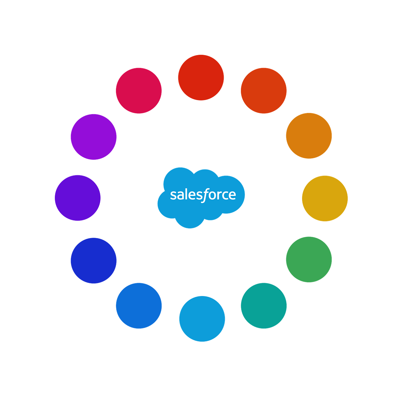
Our vibrant palette

Our natural palette
We found the need for two color palettes during the reviews and iterations — a vibrant palette for the screen and a natural palette for illustration and print materials. The vibrant color palette complimented the primary Salesforce brand color, and the natural palette complemented brand collateral. This palette model and generation method will allow us to automatically turn on features like dark mode and high contrast mode.
Salesforce is now working with a color palette that operates as an ecosystem, instead of a single solution. It’s a color system that solves for color solutions beyond our Salesforce brands and supports our customers’ brand.
The Future
Color is a critical pillar in the foundation of any brand and experience. It is a core building block to any design system. There are many moving pieces that we are stepping through carefully to roll this out across Salesforce products and brands. Many teams are involved, so we’re focusing on clear communication paths to ensure a successful rollout process. A significant part of this communication is our guidelines for Salesforce design teams to reference for appropriate usage. As we make progress, we will be focusing on releasing a color tool to share our work with the design community. Make sure to keep an eye out for more color-system-related blog posts with in-depth context to how we arrived with our system. Stay tuned!