What Is CSS Containment and How Can I Use It?
Written by Harry Roberts on CSS Wizardry.
Table of Contents
Independent writing is brought to you via my wonderful Supporters.
- Why Containment Exists
- Meet the
containProperty - Layout Containment
- Paint Containment
- Size Containment
- Style Containment
- Special Values:
contentandstrict - Containment in the Real World
content-visibilityandcontain-intrinsic-size- Caveats, Gotchas, and Things to Watch for
- When to Use Containment
- Closing Thoughts
Continuing my work on web performance for design systems, I want to look at a woefully underused CSS feature called containment. I fear it’s underused because there isn’t much written about it, so this piece aims to be the post I wish I’d been able to read a few years ago. Hopefully it demystifies things a little for you, too.
Modern UIs are busy places. A single page might contain a fixed header, an infinite scroll feed, a sticky cart summary, and a few different third-party widgets stuck around the edges. Every time something changes, the browser needs to decide how much of that page it has to re-think: styles, layout, painting, compositing, and so on.
Out of the box, the browser needs to be cautious. If it cannot be sure that a change is local, it behaves as if almost anything might have moved, forcing it to touch more of the page than is strictly necessary. While this is safe, it’s not always cheap.
CSS containment is a way of telling the browser where the boundaries really are. You use it to say this bit of the DOM is independent of the rest; you can treat it as a self-contained island. In return, the browser is free to skip work outside those islands when things change.
In this post, we’ll take a look at what CSS containment actually is, what each contain value does, and how to use it confidently on real projects without creating hard-to-debug side effects. We’ll also look at my most favourite real-world example of just how effective containment can be. Let’s go!
Why Containment Exists
To understand containment, you don’t need to memorise the entire rendering pipeline, but you do need a rough mental model of where the work goes.
When something changes in the DOM, a browser typically has to:
- recalculate styles for affected elements,
- recalculate layout (sizes and positions),
- repaint the pixels that changed, and
- re-composite layers on screen.
The expensive part is often how far those changes spread. A small change in one part of the tree can invalidate layout or painting in other parts—or even the whole document—and the browser cannot always know that the effect is local. That is why relatively simple operations on a large application can feel sluggish: the browser is having to think about the whole world.
Containment is a promise that a given subtree is isolated:
- changes inside it will not influence layout or paint outside it, and
- in some cases, its own size does not depend on its children.
Once you make that promise, the browser can exploit it. For example:
- it can avoid relayout of the rest of the page when something changes inside a contained widget, or
- it can skip painting descendants of an off-screen container entirely.
All of that reduces work on the main thread, which is exactly what we want when we are trying to keep interactions snappy (think Interaction to Next Paint).
Meet the contain Property
The main lever you’ll pull is the contain property:
.card {
  contain: content;
}
At a high level, contain lets you assert different kinds of independence for an element and its subtree. There are four basic types of containment:
layoutpaintsizestyle
You can specify them individually or in combinations:
.card {
  contain: layout paint;
}
On top of those, there are a couple of shorthand values:
content: shorthand forlayout paint style.strict: shorthand forsize layout paint style.
There is also inline-size, which is a more targeted form of size containment—we don’t really need to give it much more attention than that.
Let’s go through each of these in turn.
Layout Containment
contain: layout tells the browser that the internal layout of the element is completely independent of the rest of the page.
.card {
  contain: layout;
}
In practice, that means:
- layout calculations for descendants of
.carddo not affect layout outside of.card, - the
.cardestablishes its own formatting context (like a mini layout world), - floats and margin-collapsing are contained within
.card, .cardbecomes the containing block forposition: absoluteandposition: fixeddescendants, and- a new stacking context is created, so
z-indexon children is scoped to that card.
This has two main consequences:
- Performance. When something changes inside
.card, the browser can keep most layout work local to that subtree because it has been told none of those changes influence other boxes outside. - Layout behaviour. The new formatting context and containing block can be very handy for controlling floats, margin-collapsing, and
position: fixedchildren, but it can also change behaviour compared to an uncontained element.
A simple, realistic use case is a grid of dashboard cards:
.dashboard-card {
  contain: layout;
}
Each card may have its own internal structure (headings, charts, small controls), but nothing inside one card affects the layout of any other. When a chart animates inside a card, the browser does not have to re-evaluate layout for the entire dashboard.
Gotchas
- A fixed-position child that used to be anchored to the viewport will now be anchored to the contained element instead. If you are using
position: fixedfor tooltips or overlays, check them carefully. - Margin-collapsing rules change; that is usually a feature, but it can affect legacy layouts that rely on collapsing from the first child into the parent.
Paint Containment
contain: paint isolates painting to the element’s box:
.card {
  contain: paint;
}
With paint containment in place:
- nothing inside
.cardcan visibly overflow its padding box, - if the
.carditself is off-screen, the browser does not need to paint its children at all, and - you still get a stacking context and containing block, as with layout containment.
This is ideal for widgets where everything should stay visually inside the box anyway: cards, tiles, thumbnail previews, and so on.
Gotchas
- Any intentional overflow effects (drop-shadows that extend beyond the box, popovers that stick out of a sidebar, decorative ‘bleeds’) simply will not show. If you depend on overflow, do not use
contain: painton that element. - If you combine
layoutandpaintcontainment, you will see both behaviours: independent layout plus clipped painting.
Size Containment
contain: size is more specialised. It decouples an element’s size from its contents:
.widget {
  contain: size;
}
When you turn on size containment:
- the size of
.widgetis calculated as if it had no children, and - children can still be laid out and painted inside, but they do not inform the container’s own size.
This is a powerful constraint. Used wrongly, it is also an easy way to create a bunch of zero-sized boxes.
In almost all cases, when you use contain: size you must also provide an explicit size for the element, either via the usual width/height properties or via contain-intrinsic-size:
.widget {
  contain: size;
  contain-intrinsic-size: 400px 300px; /* Fallback/reserved size */
}
The intrinsic size tells the browser what size to assume for layout purposes if it cannot derive that size from the children. This becomes particularly important when you start deferring rendering with content-visibility, which we’ll look at shortly.
Gotchas
- Forgetting to set a size often leads to zero-height containers, which then hide their children or cause unexpected scroll behaviour.
- The size containment itself does not buy you much performance on its own; it is mainly there to unlock other optimisations safely.
Style Containment
contain: style is probably the least glamorous of the four, but it has a specific job:
.section {
  contain: style;
}
Style containment stops certain style-related side effects from spreading outside the contained subtree. The main one you will encounter is CSS counters:
- Counters created or modified inside
.sectionwill not affect counters outside it.
If you have ever used automatic numbering for headings or figures across a page, you will know that counters are global by default. Style containment is a way of saying this component’s counters are its own, do not let them leak out.
It does not give you general purpose ‘scoped CSS’ in the sense of preventing selectors from matching, so it should not be confused with Shadow DOM or @scope.
Special Values: content and strict
Typing contain: layout paint style over and over gets boring fast. The spec therefore gives us a couple of convenient shorthands.
contain: content
.article {
  contain: content;
}
content is shorthand for:
.article {
  contain: layout paint style;
}
You get:
- independent internal layout,
- clipped painting within the padding box, and
- counters and similar style side-effects scoped to the subtree.
You do not get size containment. That omission is deliberate: without size, the risk of creating zero-sized boxes is much lower, which makes contain: content safe to apply quite widely.
This value is an excellent default for self-contained units like:
- blog posts on a listing page,
- cards in a grid,
- rows in a data table,
- slides in a carousel…
…as long as nothing needs to extend outside of the bounds of them (e.g. tooltips in said data table).
contain: strict
.panel {
  contain: strict;
  contain-intrinsic-size: 600px 400px;
}
strict is shorthand for:
.panel {
  contain: size layout paint style;
}
This is the most aggressive containment you can ask for: the panel’s size no longer depends on its children, its internal layout is independent, its paint is clipped, and its counters are local.
That combination is very powerful, but it comes with responsibilities:
- you need to give the panel an explicit or intrinsic size,
- you need to be confident that nothing inside the panel is meant to overflow visually, and
- you need to understand that
position: fixedchildren will now anchor to the panel, not the viewport.
As a rule of thumb: do not reach for strict until you have a clear reason and a good understanding of what will happen.
Containment in the Real World
So far we have stayed fairly abstract. Let us start with a real example before we look at a few more generic patterns.
OpenTable’s Mobile Drawer
A couple of years ago, I ran a custom INP workshop for the wonderful OpenTable (honestly, web-perf and grub, can you think of a better client?!). When we think about INP, we usually think of JavaScript, but the Presentation Delay phase touches a lot of what I call purple time: recalc style and layout. And while the headline savings below aren’t going to win me any awards, I do think this is a beautifully succinct and comprehensive demonstration of contain in action…
On OpenTable’s mobile UI, there’s a language switcher in their off-screen drawer menu. Tapping the switcher opens a dropdown. The dropdown opens and pushes content beneath it down the viewport, but it doesn’t affect anything outside of the drawer menu itself. Without containment, opening the language switcher scopes a layout event to the whole document, touching 4,371 nodes and applying new layout to just 41 of them—fewer than 10%:
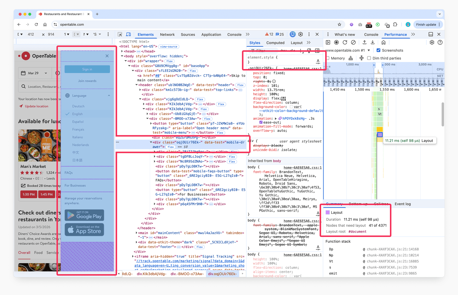
11.21ms of layout work, rooted at #document , touching 4,371 nodes to relayout just 41. View full size/quality (1MB)
While the whole operation only took 11 milliseconds, that’s still a lot of waste, and we don’t like waste.
By applying contain: strict to the drawer menu’s root DOM node, we can limit the reach of the work and create incredible savings:
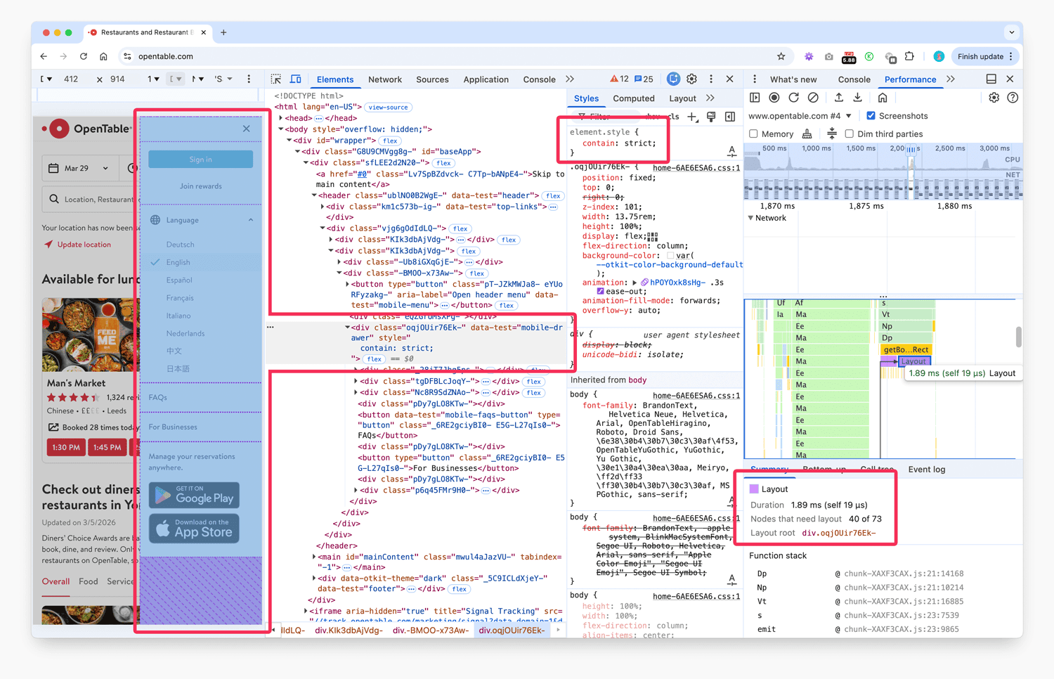
1.89ms of layout work, rooted at the drawer itself, touching 73 nodes to relayout 40. View full size/quality (1MB)
Now, we can see as clear as day that the operation only touched 73 DOM nodes, 40 of which needed attention, and the scope of the work is very clearly the drawer itself. Hyper precise, and about six times faster.
I think this is one of the most beautiful demos I have ever been fortunate enough to present: such a story told in one before/after.
If this kind of rendering and interaction work looks familiar, it is exactly the sort of thing I cover in workshops, masterclasses, and hands-on consultancy.
Other Good Candidates
Once you start looking for them, you will see these opportunities everywhere:
- dashboards full of independent cards, where updates in one card should not force relayout of its neighbours,
- long, scrollable feeds or search results, where each item can be treated as its own island, and
- third-party widgets, where you may not control the internals but can still bound their effect on the rest of the page.
In those kinds of interface, contain: content is often a very good starting point:
.dashboard-card,
.feed-item {
  contain: content; /* layout + paint + style */
}
And where you need to fence off an embed or ad slot more explicitly, this is often enough:
.ad-slot {
  contain: layout paint;
}
If those widgets live on other origins, it is also worth configuring your preconnections properly.
content-visibility and contain-intrinsic-size
While this post is about contain, it would be unwise not to mention two closely related features: content-visibility and contain-intrinsic-size.
Skipping Work with content-visibility
content-visibility allows the browser to skip layout and painting work for elements that are not currently relevant to the user, typically because they are off-screen.
The value you will see most often is auto:
.article-preview {
  content-visibility: auto;
  contain-intrinsic-size: 600px 400px;
}
With this in place:
- elements near or inside the viewport are rendered normally,
- elements far off-screen can have their contents ‘skipped’—the browser does just enough to know where the element sits, but does not lay out or paint the subtree,
- while skipped, the elements effectively have layout, style, paint, and size containment applied, and
- the
contain-intrinsic-sizevalue tells the browser what size to assume for layout purposes before it has actually rendered the contents.
This is particularly effective for long and repetitive pages or lists. You get the performance benefits of virtualisation without having to wire up a full virtualised list implementation, as long as you can provide a reasonable size estimate.
In fact, I use content-visibility on this page you’re reading right now:
.s-post > h2:nth-of-type(2) ~ p {
  content-visibility: auto;
  contain-intrinsic-size: 1px 250px;
}
This rather unwieldy selector targets every paragraph after the second <h2> on the page, renders them lazily with content-visibility, and sets their placeholder size to one pixel wide and 250 pixels tall. These numbers are somewhat magic and the 250 is derived from ‘roughly how big the average paragraph on a page is’—nothing more complicated than that.
Accessibility and Script Considerations
Because the DOM nodes still exist, off-screen content with content-visibility: auto can usually still be:
- surfaced to search engines and other bots,
- found via in-page search,
- targeted via anchor links, and
- interacted with via assistive technologies.
However:
content-visibility: hiddenis more like a performance-friendlyvisibility: hiddenplus containment. The content is not rendered and may be removed from the accessibility tree, depending on the browser.- Any JavaScript that queries layout or style (
getBoundingClientRect,getComputedStyle, etc.) on a skipped subtree may force the browser to render it early, eating into your performance gains. Keeping such calls away from skipped content is important.
Your mileage may vary.
Caveats, Gotchas, and Things to Watch for
Containment is not free. You are trading global flexibility for local isolation, and that trade can surprise you in a few ways.
Zero-Sized Boxes
The most common error with size containment (directly or via content-visibility) is forgetting to provide an explicit or intrinsic size. The browser then treats the element as if it had no children when computing its size, and in many layouts that means it collapses to zero.
Symptoms include:
- content that appears ‘missing’ but still exists in the DOM,
- scrollbars not behaving as expected,
- layout shifts as content does get rendered, or
- click targets that are present but not visible.
The cure is simple: always pair contain: size or content-visibility: auto with contain-intrinsic-size or appropriate width/height constraints.
Unexpected Clipping
contain: paint (directly or via content/strict) will clip painting to the padding box. That is often exactly what you want, but it will break patterns that rely on overflow:
- tooltips or dropdowns implemented as children,
box-shadow‘bleeds’ beyond the card boundary, or- decorative elements that are positioned partially outside a section.
In those cases, either move the overflowing element out of the contained subtree or avoid paint containment on that particular container.
Stacking Contexts Everywhere
Each layout or paint containment boundary establishes a stacking context and a containing block. This is usually a benefit, but can add up:
z-indexdebugging becomes more involved because more elements define their own stacking contexts,fixed-position children may suddenly anchor to a widget instead of the viewport, and- combinations with
transform/opacity-driven stacking contexts can become tricky.
If you ever find yourself thinking why is this tooltip behind that overlay?, check for containment on ancestor elements as part of your debugging checklist.
Container queries rely on certain forms of containment under the hood; for example, container-type: inline-size effectively applies layout and style containment to define a query container.
That means:
- If you are already using container queries, you may get some of the benefits of containment ‘for free’ on those containers.
- If you add more explicit containment on the same elements without thinking about it, you might over-constrain things, particularly with
sizeorpaint.
A sensible approach is to treat query containers as places where you carefully review which kinds of containment are already applied before adding more.
When to Use Containment
By this point you should have a decent mental map of what the different containment values do. The remaining question is when to actually apply them.
Here is a pragmatic checklist.
Good Candidates
You should strongly consider contain: content (or similar) for:
- self-contained cards or tiles arranged in grids or lists;
- repeated article previews on index pages;
- sections of a long, scrolling page that are visually and functionally independent; and
- third-party widgets that should not bleed into the rest of the layout.
You should consider content-visibility: auto plus contain-intrinsic-size for:
- very long lists of similar items where many are off-screen;
- pages with dozens of article previews or product tiles; and
- heavy, mostly static sections further down a page.
Use With Care
Be cautious with:
contain: strict: use it only when you have explicitly sized elements and no desired overflow.contain: sizeorinline-size: always provide intrinsic or explicit sizes, and always test in a range of layouts.paintcontainment around components that intentionally overflow (tooltips, dropdowns, overlays).
Probably Avoid
Containment usually does not belong on:
- root- or page-level wrappers where everything inside is interdependent;
- small inline elements like buttons or labels; or
- elements whose whole purpose is to extend beyond their own bounds visually.
Closing Thoughts
CSS containment is a feature that can yield massive benefit when well deployed. It lets the browser do less work and gives you better control over where you spend your purple time.
You don’t need to apply it everywhere—and it might even be a micro optimisation for your use-case—but a small handful of well-placed rules can make measurable improvements to the interactivity of your UI.
Start small, measure carefully, and keep an eye on the gotchas, but before you know it, you’ll have a finely tuned interface that leaves as small a footprint as possible.
Hopefully that’s lifted containment from an obscurity to an everyday part of your arsenal.

Hi there, I’m Harry Roberts. I am an award-winning Consultant Web Performance Engineer, designer, developer, writer, and speaker from the UK. I write, Tweet, speak, and share code about measuring and improving site-speed. You should hire me.
Connect
Projects
- <svg xmlns="http://www.w3.org/2000/svg" viewBox="0 0 510 164.36" role="img" aria-labelledby="logo-title"><title id="logo-title">Obs.js: context-aware web performance for everyone</title>

- ITCSS – coming soon…

Next Appearance
-
Talk
Web Day Out: Brighton (England), March 2026
Learn:
- Understand
Cache-Control - Core Web Vitals and SEO
- CSS Performance
- Does
DOMContentLoadedStill Matter? - Push Speculation Rules to the Max
- Improve Web Performance on iOS
- Master CSS Containment
max-agecalculator- Core Web Vitals on iOS
- Design for High Latency
- Optimise Largest Contentful Paint
- Speed Up Google Fonts
- Can We Drop Our Build Tools Yet?
- Get the Fastest Possible LCP
- Diagnose Time to First Byte
- What Is the Maximum
max-ageValue?
I help teams achieve class-leading web performance, providing consultancy, guidance, and hands-on expertise.
I specialise in tackling complex, large-scale projects where speed, scalability, and reliability are critical to success.