Logo soup 问题(以及如何解决它)
You know the scenario. Marketing sends over a folder labeled "Partner Logos Final FINAL v3." Inside: a chaotic mix of file formats, each logo arriving with its own special quirks.
你知道那种情况。营销部门发来一个名为 "Partner Logos Final FINAL v3." 的文件夹。里面:各种文件格式的混乱混合,每个徽标都有自己的特殊怪癖。
Some are perfectly cropped SVGs with transparent backgrounds . Others are PNGs with mysterious amounts of padding baked in, as if someone screenshotted them from a website and called it a day. One has a thick stroke that makes it look bold and confident. Another is just a thin wordmark that practically whispers its existence.
有些是完美裁剪的带有透明背景的 SVGs 。其他的是 PNGs,内置了神秘数量的填充,仿佛有人从网站截图后就此打住。一个有粗描边,使其看起来大胆自信。另一个只是一个细字标,几乎悄无声息地诉说着它的存在。
You line them up in a row, and they look like a ransom note.
你将它们排成一行,看起来像勒索信。
You try making them all the same width. Now the square logos tower over everything else like skyscrapers, while the wide ones shrink into illegibility. You try making them all the same height instead. Now the wide logos dominate the entire row like billboards, and the compact ones vanish into the background. You manually adjust each one, tweaking widths and heights until they look somewhat balanced. It works. Until next week, when three more logos arrive.
你尝试让它们所有具有相同的宽度。现在方形 logo 像摩天大楼一样高耸于其他一切之上,而宽的那些缩到难以辨认。你尝试让它们所有具有相同的高度。现在宽 logo 像广告牌一样主导整行,紧凑的那些消失在背景中。你手动调整每一个,微调宽度和高度直到它们看起来有些平衡。它有效。直到下周,又来了三个 logo。
This is the logo cloud problem. It's not glamorous. It's not the kind of thing that makes it into conference talks or gets you promoted. But it's real, it's annoying, and it eats up more time than anyone wants to admit.
这就是徽标云问题。它不迷人。它不是那种能进入会议演讲或让你升职的东西。但它是真实的、烦人的,并且消耗的时间比任何人承认的都要多。
The usual suspects
常见的嫌疑犯
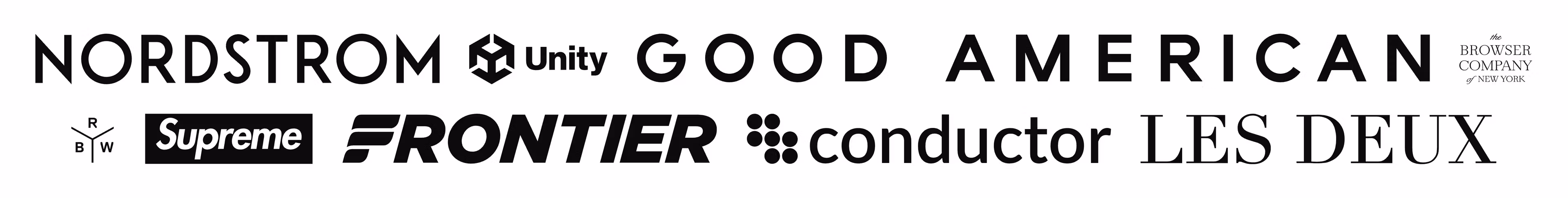
Let's talk about some real examples, all great logos in their own right. It’s when you try to put them together you’re getting into a bag of hurt.
让我们谈谈一些真实例子,它们各自都是很棒的 logo。当你试图将它们组合在一起时,你就会陷入一堆麻烦。
Take logos like Nordstrom or Frontier. These are wide wordmarks, roughly 8:1 aspect ratio. Put them next to something like Sanity's square logo (1:1), and...