When life gives you lemons, write better error messages

Error messages are part of our daily lives online. Every time a server is down or we don’t have internet, or we forget to add some info in a form, we get an error message. “Something went wrong” is the classic. But what went wrong? What happened? And, most importantly, how can I fix it?

We encounter error messages all the time, but how often do they actually help us understand what went wrong and how to fix it?
About a year ago at Wix, we abruptly realized that, too often, we were not giving users the answers to these questions. When we got this wake-up call, we felt compelled to act swiftly, and not just to address the one error message that woke us up.
Welcome, folks, to Errorgate 2021.
Or, that time we changed thousands of error messages across Wix in just a month.
To complete this effort, we first had to define for ourselves what counted as a bad error message and what counted as a good error message.
What makes a bad error message

This is an example of a bad error message. It uses an inappropriate tone, passes the blame, speaks in technical jargon and is too generic.
Inappropriate tone: Imagine a doctor performing a procedure and then suddenly saying “Oops! Something went wrong…” That is the last thing anyone wants to hear when the stakes are high, whether it’s surgery or someone’s source of income. That is not the time to be cutesy or fluffy. We want to show the users that we know it’s serious and we understand it’s important to them.
Technical jargon: Even in today’s world of user-centered design, technical jargon still sneaks its way into error messages. You couldn’t fetch my data? My credentials were denied? What? The technical stuff is not important to the user, they just want to know what went wrong and how to fix it.
Passing the blame: Try to focus on the problem, rather than the action that led to the problem. We don’t want to shame users, even if something they did is why they’re seeing a certain error message.
We also made the decision not to pass blame on to third parties because it makes us look unprofessional, even if it would have taken some of the burden off of Wix. The user came to Wix as a trusted platform; they don’t want to think about other platforms. While we can say something like, “We’re having trouble connecting to __”, we wouldn’t say something like, “__ isn’t responding right now.”
Generic for no reason: Sometimes we don’t know what caused the error… but sometimes we do. If we know what caused it and we’re not telling them, we’re doing our users the ultimate disservice.
What makes a good error message

This is an example of a good error message. It explains what happened and why, provides reassurance, is empathetic, helps the user fix the issue and gives the user a way out.
Say what happened and why: Make it super clear what did or didn’t happen. This can be done with a combination of visuals and text. Explain why the user got this error, even if the only explanation is that there was a technical issue. At Wix, we made the decision to say “an issue on our end” if we have the space, to really reiterate that it’s not the user’s fault.
Provide reassurance: Where possible, let them know what was not affected by the error. For example, were their changes still saved as a draft, even though their email wasn’t sent?
Be empathetic: While we don’t want to be overly apologetic, we decided that we did still want to use “please” if the situation warrants it. Maybe it’s a really dire situation, or it’s something that we absolutely can’t help the user solve. In that case, we might use “please” to empathize even more.
Help them fix it: Tell them exactly what to do if there’s a way to possibly fix it. Short on space? Send them to a knowledge base article with a descriptive link like, “Learn how to resolve this” or “How do I fix this?”
Always give a way out: If they can’t fix the problem, or if it’s possible the issue could keep happening, provide them with a way to contact Customer Care.
Now that we had defined what makes a good or a bad error message, we had to start getting rid of the bad ones.
How we tackled removing bad error messages
We did a search in our content management system and found that there were 7,643 keys with the word “error” in the key or value. That’s 7,643 pieces of content that–at the very least–needed to be reviewed.
The task seemed monumental.
But we did it. We reviewed every single piece of content related to errors and decided if it was relevant for this effort. Once we had a list of all the errors we considered “generic” or “not helpful”, we sent everything to developers.
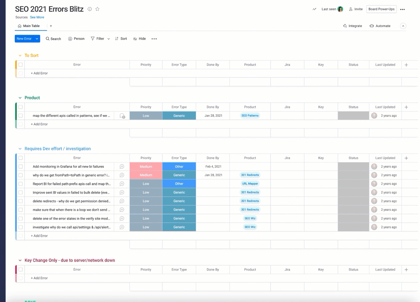
This was just one of the Monday.com boards that we used to categorize every single piece of content related to errors. Boards like these helped us set priorities, due dates and keep all disciplines in the loop.
Developers went message by message and mapped where each was being triggered in the code. They looked at what was causing the message to show, how frequently it was occurring, and what could be done to resolve the issue.
Based on that error mapping, the product managers, UX designers, and writers sat down and came up with solutions. We started by transferring everything from a spreadsheet to a Monday board, where we could easily track the status of things and what needed to be done. Sometimes, it was just a simple content change. In other cases, it required brand new error messages. And in lots of other instances, there was additional development work that needed to be done to fix things behind the scenes.
Then, we prioritized which errors to work on first. To set priorities, we focused on how often the error was happening and if it blocked the user from completing the flow. After that, we set milestones of one to four weeks, so that things didn’t fall by the wayside.
What we learned
There’s a difference between generic and unclear messages. While there were certainly a lot of generic “Something went wrong” messages, there were also a lot of unclear messages. These are just as bad as generic messages, and deserve the same amount of attention.
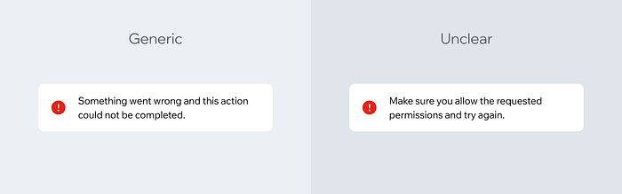
An example of a generic message compared to a message that is unclear. In the generic message, we’re simply not telling the user anything other than something went wrong. In the unclear message, we tried to explain what went wrong, but it used confusing language.
It’s not a content issue most of the time. Avishai Abrahami, our CEO and the reason this project got started, put it best in his email to all employees. “Generic errors are the result of bad development and product. … We must all care about it together.”
Truly everyone in Wix had to come together across all disciplines to fix these messages. Developers had to investigate and map. Product managers had to prioritize and create tasks. Designers had to provide new designs for new flows. And we, the UX writers, had to write and rewrite thousands of error messages.
We should be asking more questions. It used to be really common for a developer to say to us, “Hey, we need a generic error message here. Can you add one?” And we would say yes, thinking it would be a fallback or rare message. We didn’t often stop to ask questions like, “Why are users seeing this?” and “What is happening in the background?”
We missed a learning opportunity. Unfortunately, we were reactive instead of proactive here. If this effort had been strategically planned, it could have been an amazing learning opportunity for junior writers in particular. Instead, we were scrambling to write and rewrite messages without much strategic thought.
We were being a bad friend. At Wix, we have the mantra, “Write it like you’re talking to a friend.” We really believe in empathizing with the user, and being a friend with them throughout their process. But it turns out that we were more like that friend who loves to gossip, but doesn’t pick up the phone when life gets hard. That is not the friend we want to be, so we had to really dig deep and admit that we weren’t doing the best we could.
When we work together, we build better products. It’s cheesy, but it’s true.
What we’ve changed in our process
Established a cross-functional team to focus on error handling. This team is made up of senior product managers, frontend and backend developers, UX designers and UX writers. Their goal is to make sure proper error handling is part of the product life cycle, not an afterthought.
View it as a shared responsibility. Everyone is responsible for making sure we’re handling errors properly. Product managers are expected to place more emphasis on errors and edge cases, not just happy flows. Developers are expected to investigate and document errors according to platformized guidelines. Data scientists are expected to do better analysis on errors so we can track the events properly.
Review errors one month after launch. Sometimes, especially if it’s a brand new product, we don’t even know what errors to expect. So we might have to launch with generic errors, but now we have a procedure where we review the errors occurring one month after launch. This allows us to see what really are the biggest errors and write content specifically for those.
Ongoing review process. As writers, we know everything can always be optimized. So we’re constantly reviewing our errors, even the ones we just updated recently.
UX writers are empowered to challenge generic errors. In case a product manager or developer ever says, “Let’s just use this generic error message in all cases”, we now have the power to say no. The CEO of the company has said generic errors are not acceptable, so we’re not going to write them without more investigation and understanding of the problem. The power lies with us!
All in all, we changed thousands of error messages by working together with our colleagues. It was hard work and we all had a drink or two at the end of it. But it was the right thing to do for our users, and the only way to truly live up to our value of putting the user first.
Edited by Dan Raz. Graphics by
.
Is there a topic you want to see covered by the Wix UX team? Let us know by filling out this form.