Your Images Are (Probably) Oversized
Are you setting the sizes attribute on your <img/> tags?
No?
Then you're most certainly serving images that are larger than they should be. Even for large-width (e.g. desktop) screens.
Oh, you're using NextJS's <Image/> component and you're telling me you don't need to worry about it? Oh my sweet summer child.
You're implementing a beautiful landing page your designer just created, and like most landing pages, it has a hero section with a prominently featured image, something like this:

In the example above, the hero image stretches both horizontally and vertically (but of course, always maintaining its original aspect ratio) covering almost the entire screen, and thus, its rendered size will depend directly on the dimensions of the user's device.
Thankfully, your designer also understands that, and to ensure that this image looks good on any screen size, they send you a very high resolution image, let's say 3600x2400 pixels. With that many pixels, it will look sharp even on the largest monitors.
The problem, however, is that the majority of your users won't have screens that are big enough to make use of all those pixels, so having them download an image this big is essentially a waste of both bandwidth and compute, which could be better utilized for other things.
Ah! But I use NextJS
<Image>component, so I won't have this issue, as it will optimize my images so that they are never bigger than they should be.
So, without a second thought you summon the fabled NextJS <Image/> component and use it like this:
priority // We want to load this eagerly, as this is part of the FCP className="relative w-screen h-screen object-cover"
If this looks right to you, I have some bad news.
Let me show you something:

This is that same landing page we saw above, but now seen through a much narrower viewport, sized at 425px to be precise.
Now, if using NextJS <Image> component this way was enough to have images sized appropriately, in the example above we'd expect to be serving an image that is much smaller than the original one.
However, look at what we actually get:
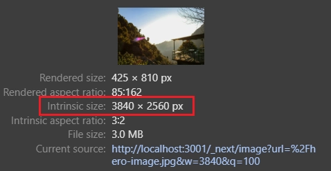
Although the image's rendered size (image's actual display size) is 425 x 810 pixels, its intrinsic size (the dimensions of the image file itself) is even larger than the original image. The size of the image file is also as large as the original image.
Some of you might be asking yourselves whether this is a side-effect of NextJS's development mode, which is known to deliberately disable some optimizations for debugging/ease of development purposes. But no, this is actually running in production mode.
And just to be clear, this is not about picking on NextJS (notably because this isn't its fault to begin with), as the only reason I chose it for my examples is because it is probably the most widely used React (meta-)framework.
And if you think that this is a NextJS problem only, you'd be mistaken, as we get pretty much the same results with Nuxt, which is a Vue-based (meta-)framework.
Now look at what happens when we set the sizes prop:
priority // We want to load this eagerly, as this is part of the FCP className="relative w-screen h-screen object-cover" sizes="100vw" // 100vw as it spans the entire viewport horizontally
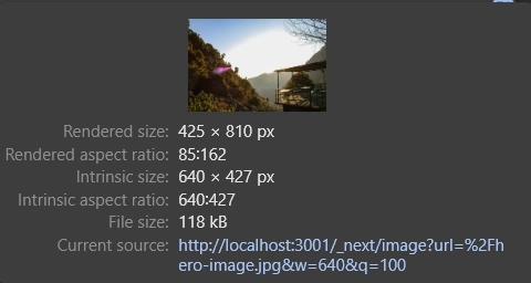
Ah, there we have it! An image that's appropriately sized to the current viewport, which also has a profound impact on its file size, as now it is around 25 times smaller than the original one.
You might be wondering how an image that's around 1/6th the width of the original one is around 25 times smaller.
Recall that because images are rectangles, scaling one of its dimensions linearly (i.e. width or height) while maintaining its aspect ratio, scales the image's number of pixels quadratically. That is, doubling an image's width, quadruples the number of pixels it has and conversely, halving its width, reduces its pixel count to 1/4th the original amount.
Additionally, there's also a compression algorithm that comes into play and its compression rate may vary for different sizes of the same image, and this is why we get an image that's 25 times smaller and not 36 times.
We just saw how just by passing the sizes attribute to NextJS's <Image> component has a dramatic effect on the images we serve to our users, but that's not the end of the story.
In this post I want us to understand the challenges of responsive images and how to address them in frontend development in general.
To do that, the first thing we need to understand is what problem responsive images solve.
Generally speaking, the more pixels an image has, the better it looks, as more pixels means more information and a more detailed visual representation. But there's a limit to that, as there's always a threshold where past this threshold adding more pixels contributes absolutely nothing to how detailed the image looks to viewers.
And let me be clear, I'm not talking about human perception here, but rather about the physical limitations the devices that display these images have.
In the context of digital display devices (e.g. digital monitors, laptop displays, mobile screens, etc), a pixel is the smallest visual unit that can be addressed by the underlying device, so the number of pixels a device has imposes a physical limitation on how many digital pixels we can display at a given time on that device.
Let's say, for example, that we're going to display images on a device that has a resolution of 20x20, that is, it has 20 rows of 20 phyiscal pixels each. Regardless of how many pixels the images we're going to display has, if we want to display the whole image on this device, we'll always have to fit them into these 400 pixels.
In practice, this implies that for images that are either wider than 20 pixels or taller than 20 pixels, we'll have a single device (physical) pixel being used to represent more than one digital pixel, and as a consequence of that, we're essentially losing information, so this image will look as if it had as many pixels as the device that it is being displayed.
This tells us is that serving images that have more pixels than our users' screens is wasteful, and we should strive to always serve images with the right resolution to our users.
And this is precisely the problem that responsive images solve.
Now that we understand that different screen sizes need different resolutions of the same image, lest us waste our users' precious CPU cycles and bandwidth, it begs the question: how do we do that?
If we use the <img> tag naively, by passing a src to it, then we can only serve a single image regardless of the screen size, so the answer lies within two attributes of the <img> tag: srcset and sizes.
The srcset attribute acts as a sort of a "replacement" for the src attribute, as it allows us to specify multiple images to be served under certain conditions, instead of a single one that would be served at all times.
Taking our landing page example from the previous sections, if we were using plain HTML we could do something like this:
class="relative w-screen h-screen object-cover" /hero-image-425.jpg 425w, /hero-image-800.jpg 800w,
srcset receives a list of image URLs along with their intended widths, separated by commas.
We only need to specify images' intended widths and not their intended heights, because the browser always assumes that we'll always maintain their aspect ratios intact.
In the example above, we're telling the browser that for screen widths that are at most 425 pixels wide, we should serve the image located at /hero-image-425.jpg, then, from screens that are 426 pixels wide up to 800 pixels wide, we should serve the image located at /hero-image-800.jpg, and the finally, for screens above 800 pixels wide, we should serve the original image.
The srcset attribute can be a little confusing at times, so let me clarify a few things:
First, notice that the intended width that comes right after the image location, has this weird w unit, instead of something like px, and there's a reason for that which we'll explain later, but for now you can think of w as px, so 425w translates to 425px and so on.
Second, although logically speaking, for the third image option (/hero-image.jpg 3600w) we wouldn't need to specify the max width (3600w) for which we should serve it, as it is the last option, srcset requires us to always include it after all image options. So in this case, although we're using the value 3600w (which coincides with the original image's width), we could have used any other value greater than 800w.
By passing a srcset to the <img> tag, the browser automatically requests and displays the right image according to the viewport's current width.
Now, some of you may have noticed that our current strategy only works because our image spans the whole viewport, that is, it will always be as wide as the viewport, so when the viewport is, say, 425 pixels wide, we need an image that is also 425 pixels wide, and so on. But what happens when that's not the case like when the image's width is a fraction of the viewport's width?
This is where the sizes attribute comes in.
To illustrate what I mean, let's say that in our landing page example, for whatever reason we wanted the image to be centered on the screen and only half of its size (I know this looks awful, but that's besides the point), like this:

Now, when the screen is 800 pixels wide, the image's display size will be only 400 pixels, but we'll be still serving the 800 pixels wide one.
With the sizes attribute, however, we can indicate to the browser the actual width we need for the image.
We use it like this:
class="relative w-[50%] object-cover" /hero-image-425.jpg 425w, /hero-image-800.jpg 800w,
In this case, as our image is sized proportionally to the viewport's width, we're specifying sizes using the vw unit, but we may use any other CSS unit like px, em, rem, vh, etc, with the exception of percentages. In fact, we can even use CSS functions and pass a value like calc(50vw - 12px) or min(40vw, 320px).
Another key capability of the sizes attribute is that we can use media queries to specify different different sizes for different breakpoints. This is useful for situations where our image's "sizing logic" varies for different breakpoints.
When specifying different sizes depending on the current breakpoint, we do something like this:
w-[200px] min-[400px]:w-[400px] /hero-image-425.jpg 425w, /hero-image-800.jpg 800w, (400px <= width < 800px) 400px,
Last but not least, there's a "special" value we can pass to sizes which is auto. When using auto, the browser automatically infers the correct image size.
But there's a catch: it only works when the image is loaded lazily.
The <img> tag has a loading attribute that lets us choose one of two possible loading strategies for that image: eager loading (loading="eager") and lazy loading (loading="lazy").
The default strategy is to load images eagerly (if you don't specify the loading attribute, this is the strategy that is used), where the image starts to be fetched as soon as it its <img> tag is parsed.
Then there's the lazy loading strategy, which defers fetching the image until it enters the viewport.
In practice, browsers may not necessarily wait until lazy loaded images enter the viewport to start fetching them, as they might want to have a "buffer-distance" so that when the image actually enters the viewport it is already loaded. Also, browsers may take other factors into consideration when deciding the exact moment they will start fetching images, like the user's bandwidth, or whether there are other resources being fetched.
The point is that you shouldn't take the "waits until the image enters the viewport to start fetching it" literally, as browsers' actual implementation may vary.
Not much time ago, we had to resort to using JavaScript and IntersectionObserver to lazy load images, but now, fortunately, there's native browser support for that.
Although, for historical reasons, the default loading strategy is to load images eagerly, in most cases you'll want to adopt the lazy loading strategy. The only cases where you definitely want to eagerly load images, are for images that are part of your first contentful paint (FCP).
Reiterating, if (and only if) an image has it's loading attribute set to lazy, then we can specify its sizes as auto, and then the browser will wait until the image's concrete size (the image's rendered size) is known so that it requests the appropriate image.
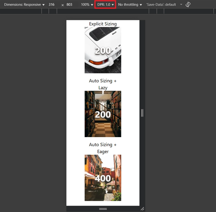
Check out the demo below:
In this demo, we have three different images and each image is overlaid with a number that indicates the width of the image file that is being currently served (we're hooking into the onload event to track whenever a new image file is loaded).
Notice that all images have the exact same concrete size (min(50vw, 500px) in this case).
Their sizes, however, are different:
In the first image, we set sizes to an explicit value, min(50vw, 500px) and the loading is eager by default.
In the second image, sizes is set to auto and loading to lazy.
In the third image, sizes is set to auto, but loading is set to eager (we set it explicitly to make it stand out, but it is equivalent to not setting it at all, as eager is the default value).
For the first and second images, the browser is able to request the correct image file, however, for the third one, because sizes="auto" doesn't work with eager loading, it falls back to the default sizes value which is 100vw, that is, it considers that the image is as wide as the whole viewport. This is why the browser keeps requesting images larger than 500px even though the image's rendered size never exceeds 500px.
It all makes sense when we think a little bit about how lazy vs eager loading works.
Given that with eager loading, the image is requested as soon as the <img> tag is parsed, the browser hasn't even finished parsing the HTML, so it hasn't started the layout phase yet and therefore it can't know whether the image is in the viewport or not, nor its concrete size.
Lastly, keep in mind that sizes="auto" is not supported by all browsers (https://caniuse.com/mdn-html_elements_img_sizes_auto).
For instance, this is that same demo, but now on Firefox:
So, until sizes="auto" is widely supported, you should always provide a fallback sizes, after auto, like this:
sizes="auto, min(50vw, 500px)"
Even if it might be hard to specify a precise sizes, it's better to pass something, otherwise it falls back to 100vw, which in many cases is much wider than you need.
There is one last topic we need to discuss about responsive images, that is the device pixel ratio (DPR).
First, we need to go back to the definition of a pixel.
So far, we've been using the concepts of device pixel and CSS pixel interchangeably, and although they might coincide at times, they are not the same.
A device pixel, as we stated before, is the smallest visual unit that can be addressed by the underlying device.
A CSS pixel on the other hand, is a measurement unit that is defined as "the visual angle of one pixel on a device with a device pixel density of 96dpi and a distance from the reader of an arm's length (nominally defined as 28 inches)". Which is quite a mouthful, but ultimately means that given a specific device, the CSS pixel translates to a physical distance that can be measured in inches, centimeters or any other unit of length of your choice.
So what is the relationship between CSS pixels and device pixels, and how are the former mapped to the latter?
That's where the device pixel ratio (DPR) comes in. The DPR specifies how many device pixels a CSS pixel spans.
For instance, for a DPR of 1, each CSS pixel maps exactly to one device pixel. For a DPR of 2, each CSS pixel is mapped to 2 device pixels, and so on.
To compute the DPR, browsers take a few things into consideration, like the device's pixel density, its intended reading distance (e.g. TVs are usually seen from a bigger distance than monitors, which in turn are seen from a bigger distance than phones) and the zoom level.
Back in the day, most devices that were used to render websites (mostly monitors) had a pixel density of 96dpi and were meant to be seen from "an arm's length", which makes it such that a device pixel would coincide exactly with a CSS pixel.
However, with time, some devices with higher pixel densities started being produced, notably with the rise of mobile devices, and with that, we started having devices where a CSS pixel would span more than one device pixel.
The fundamentals of how many pixels an image should have so that it doesn't contain less nor more information than it needs, remains the same, that is, an image should (ideally) have as many digital pixels as the number of device pixels the area in which it will be displayed has.
The thing is that when an image is rendered on the browser, its concrete size, which is what is used to determine the appropriate image to be served, is measured in CSS pixels. So, when choosing the appropriate image to be served, the browser also takes the device's pixel density into consideration.
For instance, for a DPR of 2, an image whose concrete size is, let's say, 200 CSS pixels wide, must be 400 pixels wide to ensure that each image pixel maps one to one to a device pixel.
An easy way to check your device's (or your users') DPR is through a property on the window object, devicePixelRatio.
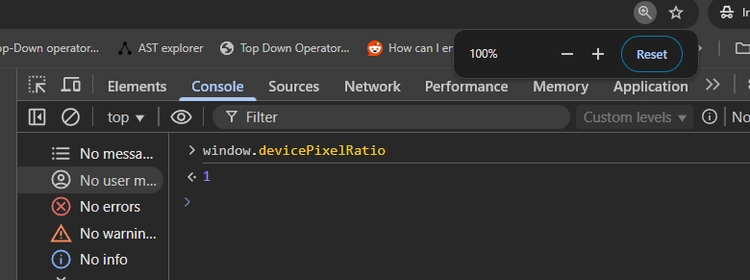
At the standard zoom level, my monitor's DPR 1. (Yeah, not great I know, but I just fixed my car and it cost a lot of money, so upgrading my monitors will have to wait).
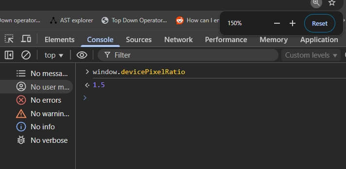
When I increase the zoom, to, let's say, 150%, the DPR increases to 1.5.
At the standard zoom level, my laptop's DPR is 2, as its screen has a bigger pixel density. And my phone's DPR is a staggering 2.8!
Last but not least, let's go back to our demo to see how this affects images:
First, I want you to pay attention to the red rectangle. That is a control that lets us set a specific DPR, which currently is set to 1.
Then, because our images have their concrete size set to min(50vw, 500px), on a viewport that's 316px wide, they will be 158px wide, which on a device with a DPR of 1, means we'll settle on the 200px image.
If we change the DPR to 2, see what happens:
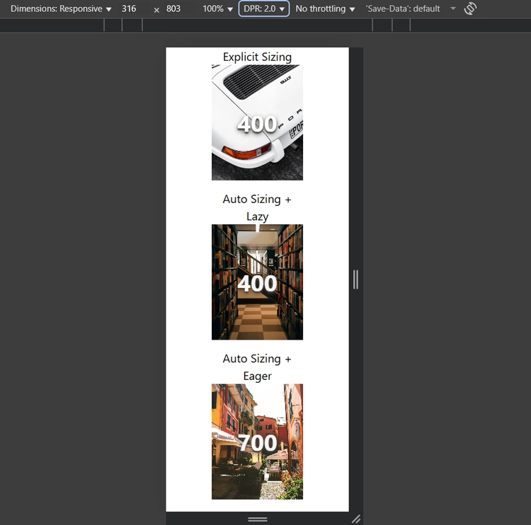
Now, although images are still 158 CSS pixels wide, with a DPR of 2, we'll need double the number of pixels, and that's why we settle on the 400px versions of the images.
Going back to the srcset property, recall that we specify image widths with that weird w unit instead of pixels, and that is due to the whole DPR thing. The w is equivalent to the DPR times the image's concrete size in CSS pixels, which equates to the number of actual device pixels that we will need to "fill" with the image.
I should also mention that there is that an alternative to using w to specify image sizes within srcset is to use the DPR itself, like this:
sizes="auto, min(50vw, 500px)" srcset="img-2_500.jpg 1x, img-2_1000.jpg 2x"
Instead of specifying a number with the w unit, we specify the intended DPR followed by x.
There's a catch though. The DPR "method" of specifying image sizes is intended to be used only for images that have a fixed concrete size, whereas the w method works regardless of whether the image has a fixed or a dynamic (responsive) concrete size, and thus when possible, you should prefer using the w method.
Throughout this post we saw the why's and how's of responsive images, so to finish it, I want to give you practical implementation guide that summarizes everything we saw so you can refer back to it when you need.
When you're dealing an image on the frontend, the first thing you need to know is whether this image needs to be responsive, that is, if its rendered size will change depending on the dimensions of your users' screens.
If an image has a fixed width and height regardless of the dimensions of the viewport (e.g. icons), set the sizes attribute to the image's rendered width (which will be an absolute fixed value), and also set the srcset so that you serve appropriate images for different DPRs.
<!-- With DPR specifier --><!-- With width specifier -->
For images whose rendered size depend on the viewport's dimensions, set the sizes attribute to the attribute to the image's rendered width and for the srcset, prefer using the w unit.
Also, check whether the image is part of your application's first contentful paint (FCP). If it isn't, set loading to lazy and also preprend your sizes value with auto.
sizes="auto, (width < 625px) 100vw, min(750px, 70vw)"