Subcomponents

For most design systems, solving for every feature to support every case is a fool’s errand. Yet, design system practitioners cringe when a designer detaches a Figma component or developer codes a component from scratch.
As libraries top out with enough atoms and molecules, things get tougher with the richer, configurable compositions. These complications force decisions: don’t support some things, or never finish trying to enable configuration of all the things.
This article explores the conundrum of configuration to bridge to what some avoid as a viable alternative: offer composable subcomponents, too. It details how to divide components into reusable chunks and flexible containers, dispersing an API across parts as you go. Demonstrating composition through examples that others inspect and emulate reveals the potential for richer, self-served solutions. As a result, teams can adapt their mindset, anticipate objections, and adjust how subcomponents are made, packaged and used.
Imagine a Card offers features via configurable properties for content, visual attributes, and even a slot for a composible area.

Card component with many configurable properties
This wide range of properties enables you to create diverse variations of a Card to suit many purposes.
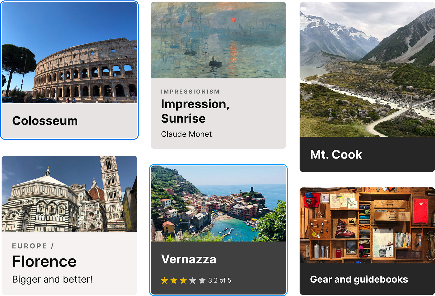
Cards of varying states, content, sizes, and color modes
Yet, what about other potential cases? How do you…
- …stack
Cardelements in a different order? You can’t. - …orient a
Cardhorizontally rather than vertically? You can’t. - …remove a
Cardby anIconButtonin the corner? You can’t. - …precede a
Titlewith a nestedBadgecomponent? You can’t. - …show an
Iconon a background instead of an image? You can’t - …display
IconButtonsactions, not aButtonorLink? You can’t.

Card variations that the component does not support
It’s not good when you hear “You can’t.” Not “You shouldn’t.” Certainly not “Sure, here’s now.” Just “You can’t. You can’t. You can’t.” over and over. For systems that serve many teams, such needs are potentially legit. What to do?
When an implementer needs a component capability that’s not already available, you can add a configuration, make them build a component from scratch, or offer them smaller yet useful parts to maximize what they can do while minimizing the work to do it.
Option 1: Add configurations
Need an element? Add an element. Need a prop? Add a prop. Designers and developers are evolving as architects together to craft a component’s API. Their habits can get addicted to this natural, predictable and incrementally safe approach. Just add more features to the thing, one after another.
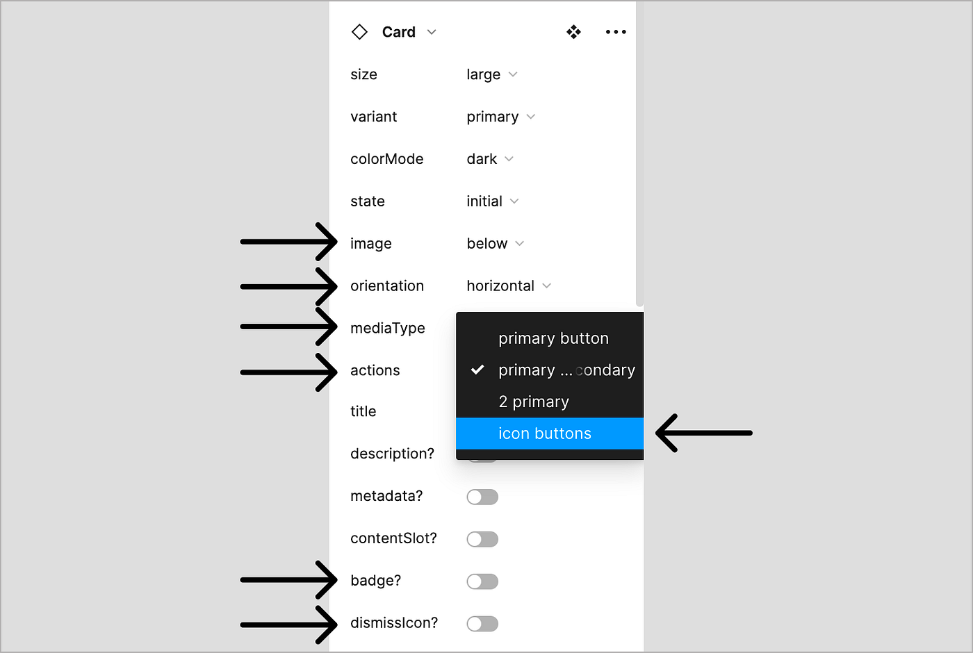
Adding more and more properties to support rare cases
Beware. A system can’t anticipate and produce every configuration of every need anyone ever has. Count me out of that slow motion game of whac-a-mole. Also, increasingly feature-rich components get brittle. Esoteric props start to conflict and grow into a ridiculously long list. Permutations become harder to specify and test. Turnarounds times slow as you struggle to keep up with diversifying needs. No thanks.
Option 2: Make implementers build from scratch
You could say no. But if the system won’t support their needs, what do they do? Build it themselves, of course. This also stinks, since they…
- …lack the time and attention.
- …aren’t adept atomic styling, structure, and states.
- …lack familiarity with tokens for color, typography, space and sizing.
- …aren’t motivated to inspect and emulate component build patterns.
Building from scratch takes knowledge, patience and persistence – all in short supply for a simple variant they probably feel should be in the system anyway.
Option 3: Offer subcomponents, too
What if you could offer smaller yet useful parts that solve for nearly everything they need, sustain consistency, and accelerate their delivery? Beyond simple nested yet generic components like a Button or Icon or Image, subcomponents are more specific — and juiced up — to build solutions of a specific class or context.
Subcomponent: an independently composible UI component with a well-defined API intended for use only within a specific parent component or context.
For example, instead of (just a) Card to configure, they also had access to independent CardContainer, CardText, CardImage, and CardActions as smaller parts. Or a List with ListItems that each have ListItemText, ListItemIcon, ListItemAction and other parts to assemble themselves.
Subcomponent are easy to spot, with names (ListItem or CardText) that prepend the parent name (List or Card) to establish scope and intent. Subcomponents offer many benefits, in that they can:
- …flexibly support many more cases with a set of smaller parts.
- …empower implementers to take control rather than feel beholden to a system to approve and make everything for them.
- …reduce dependency on the system team because makers do the last bit of work to solve for their unique need.
- …reduce adding irrelevant features that complicate a system that aren’t needs shared by many teams.
- …encourage exploration and divergent thinking so that implementers challenge, innovate, and extend what’s there.
But how do we tear apart the bigger things into smaller, reusable things?
To get started, identify the reusable chunks and container(s) you’ll place them in, and then disperse relevant top-level properties and attributes to each one.
1. Identify reusable chunks
Start inside out to identify elements and sets of elements that you’d arrange independently but need not be further divided. These include lockups, extensions, combinations and repeating sets of elements.
Subcomponent lockups combine elements and encapsulate space within. For example, CardText could combine title and optional description and metadata. Additional props could include colorMode (for light / dark), size, and even an inset toggle (to ease composition with adjacent items).

A CardText lockup with properties to configure visibility, content and style
Subcomponent extensions are used to forward to, add to, inhibit and facade properties of an existing component to function in a specific manner in a narrower context. For example, CardImage could extend Image to forward to the alt-text prop, add a hover animation, and use a facade to limit aspect-ratio variants to only those relevant to Card.

A subcomponent extension can apply, add, limit or inhibit access to features, such as aspect ratio options
Subcomponents can expose permitted combinations. For example, CardActions could limit quantities, pairings, variants, ordering and spacing of Buttons, Links, and Icon Buttons. This aids in understanding (making recommended choices visible), improves consistency (by limiting choices to a closed set) and increases efficiency (via an API that’s easier to configure).
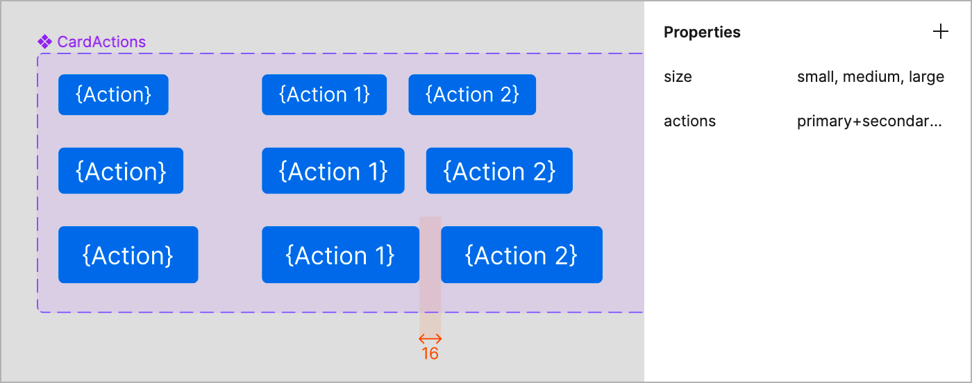
Subcomponents can enumerate approved combinations and encapsulate space within
Combinations may warrant different approaches in design versus code tools. Designers may value recommended pairings, a size prop, and good defaults. Developers may prefer flexible composition of in more a generic container.
Finally, repeater subcomponents form lists, like CheckboxItems within CheckboxGroup, ListItems within a List, or Steps within a Stepper. Each item arranges elements within it and relative to items before and after. Material UI React’s List component is an excellent example of this.
Next, think outside in to identify containers. What areas— at what levels—might you need to arrange subcomponents, nested components and other elements? Containers can encapsulate layout rules, govern spacing, and apply attributes like background color, rounded shape, and interactive states. A general container like CardContainer is good starting point.

Comparing the original Card with a CardConstainer subcomponent
As opposed to generic containers, typed containers act as zones that expect specific children. For a Card, subcomponent zones could provide targets for CardMedia, CardContent and CardActions that offer flexible internal composition but embed layout and spacing.
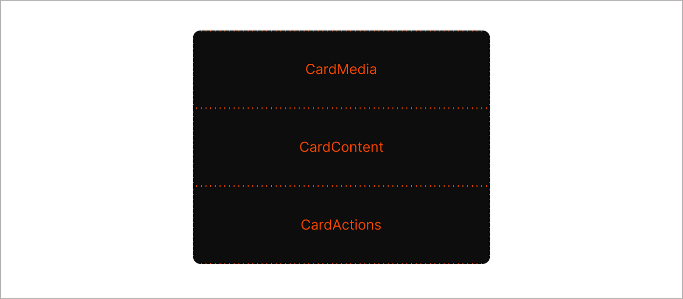
CardContainer with three children zones for media, content and actions
A CardMedia typed container could expect any of SpotIllustration, Image, ProductImage, or Icon. On the other hand, CardImage container would expect only an Image and enable the implementer to configure Image however they want.
An interactive container subcomponent enables implementers to wrap children as an interactive target with states (hover, focus, and more). These are useful when a component (or a portion of it) can be either static or interactive. Interactive subcomponents have names like ...Button or ...Action or ...ActionArea.
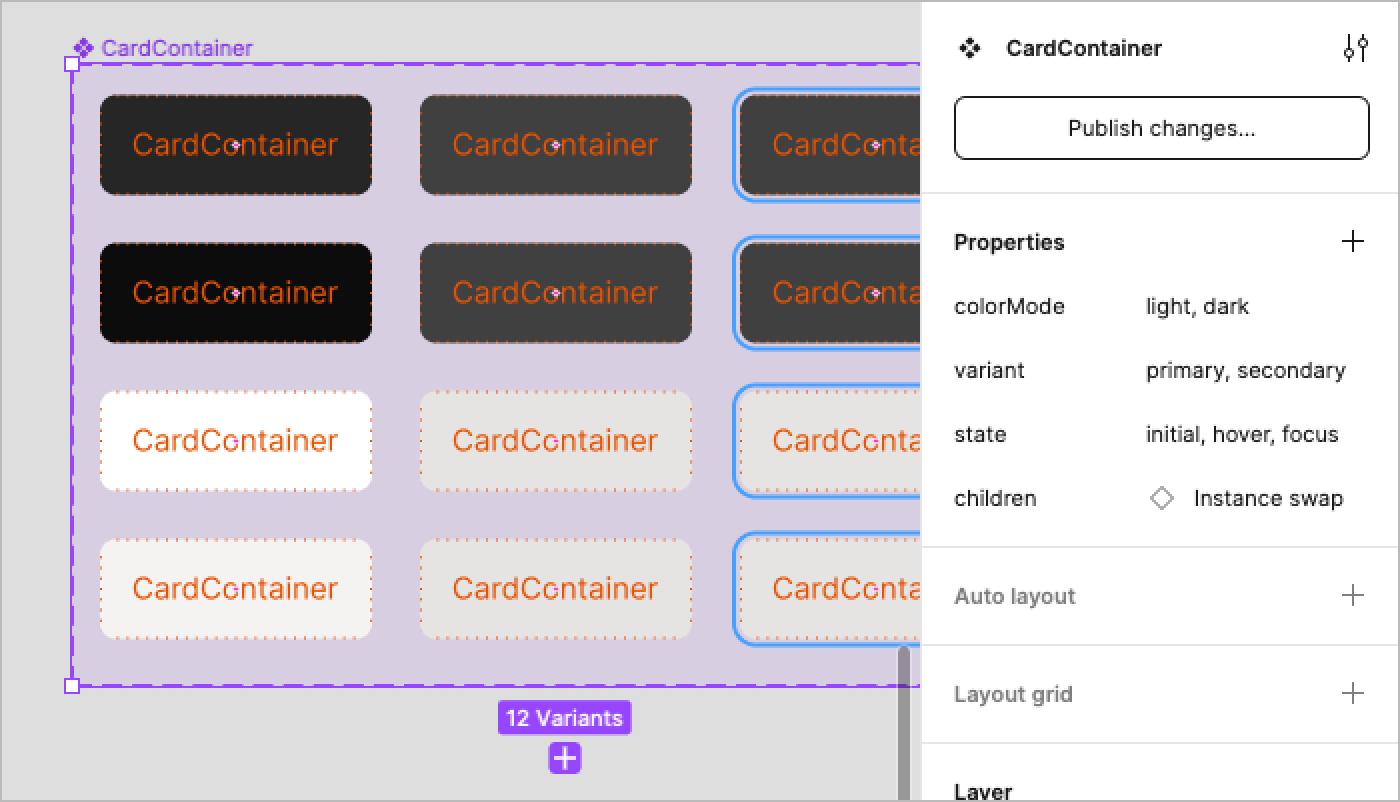
CardContainer with features for color mode, color hierarchy, and interactive state
Container choices are challenging. When designing containers for Card, we faced questions like:
- Combine states (
focus,hover,…) into a top-levelCardContaineror offer a separateCardButtonsubcomponent? - Offer a closed set of
colorModes (my preference), an open property for any ol’ color token or hex code? Or both? - Force padding? Lack padding? Default to no padding and offer an
inset? - For
Cardcontent, include aCardContentsubcomponent and inset that (follows spacing principles but adds complexity), or exclude it and add space in the margin ofCardText(more efficacious but adding space in margins violates principles)?
Through experimentation, feedback, and iteration, we struck the right balance of flexibility, precision, clarity, and complicatedness. It’s tough, and there’s no perfect answer.
Recall all the things you can’t do? No more! Equipped with subcomponents, you can demo how to construct solutions via simple examples to highlight putting parts together in simple ways.
In examples that follow, Figma is used to demonstrate composition, but the hierarchical patterns apply to code too. In each example, a CustomLayout... layer depicts custom layouts swapped in as CardContainer’s children, an intermediate step I wish Figma would avert.
Reordering items
Want to reorder CardText to precede CardImage? Yes, you can! Simply arrange CardText and CardImage in reverse order within a CardContainer.
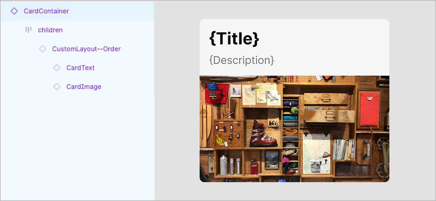
Rearranging layout
Want to layout the card horizontally instead of vertically? Yes, you can! Just adjust the layout of CardImage and CardText within a CardContainer.

Adding elements
Want to add an icon to the upper right corner to remove the Card? Yes, you can! Simply absolutely position a DismissIcon within an otherwise straightforward composition.
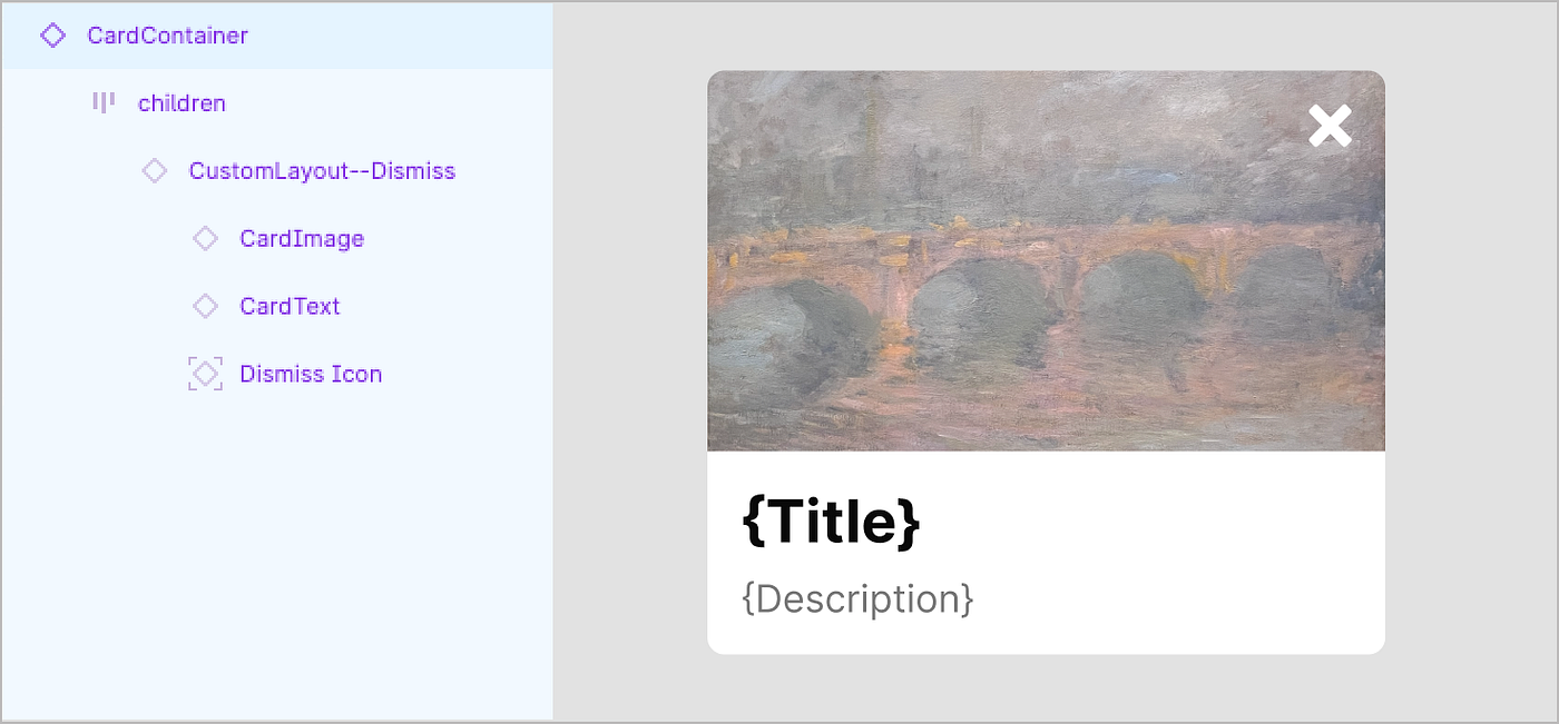
Customizing style
Want a custom media area with icon and background color? Yes, you can! Simply use a custom CardMedia construct in place of a CardImage.

Including nested components
Want to display a Badge above CardText? Yes, you can!

Increase interactive flexibility
Want to show a custom bar of IconButtons as actions? Yes, you can!

In each example, composition is straightforward. Additional work is often limited to futzing with resizing (for a designer, Fill, Hug or Fixed), configuring subcomponent props and content, and applying space and layout as needed. In other cases, customizing the style, content and arrangement of elements can be more effortful. But that’s up to the implementer. The system’s job is to offer a range of examples that designers and developer can study, inspect, and start from.
When a design system opens to subcomponents, its approach shifts how features are prioritized, built, documented and packaged. Instincts to add more configurations give way to how to provide for implementers to do-it-yourself. Principles change as a result, lifting how much teams value making the uncommon composable.
1. Make the very common configurable.
2. Make the uncommon composable. **NEW**
3. Make the less common configurable, as time permits.
I’ve redirected team conversations with “What if you let implementers put that together themselves, instead?” Sometimes, architects resist. But increasingly their tensions ease, they see an alternative and flexibility that it unlocks. For the system team, decoupled parts are tough to architect but can be easier to make, test and maintain. For implementers, empowerment to construct autonomously overshadows a mild burden to craft a bit of it themselves.
Anticipate some objections
For design system teams new to publishing subcomponents, it can feel uncomfortable. Transforming a mindset from configurable to composable triggers objections like “Subcomponents…
- …aren’t relevant to some libraries.” Those that offer only “atomic” and smaller “molecular” things may not need to be broken down. I get that.
- …risk inconsistency and quality.” No need to read minds of design system professionals. They say this out loud, immediately, instinctually, fearfully. Their reactions hint at disrespect and distrust of implementers they believe incapable of constructing quality things themselves. I work hard to check that attitude. Consider a reminder of “Implementers own their own destiny, and our systems exist far more to equip and accelerate than control or prevent that destiny.”
- …require more implementer work.” They must learn, choose, and put the pieces together. Anatomy here, spacing there, behaviors to wire up. It’s almost like… they are making their own component. Indeed they are, but significantly accelerated by subcomponent starting points that get them most of the way there.
- …create debt.” Custom constructions, configurations, and custom layouts may require upgrades as components improve or even solve the need they built themselves. Sure, that’s true. But that’s the same story for anything an implementer builds using the system as a base.
- …feel awkward in Figma,” Component swapping remains complicated. It’s an extra step, and resets resizing props unpredictably. It annoys me too. Until I think about not having subcomponents and being constrained by a weaker, monolithic main component.
- …obscure the discoverability of Figma props.” Once designers begin composing, they aren’t into constantly bouncing around layers and CTRL-right clicking objects (try that, you’re welcome ?) to find props to adjust. Recent Figma enhancements also encourage consolidating props at the top-level, which actually discourages breaking components into it smaller configurable parts. This leads architects to avoid subcomponents. I get the challenge, but believe good examples and docs can make the difference.
- …leads to less performant code.” That’s true. A bunch of smaller parts wired together by someone less familiar with the code isn’t optimized like a configurable component can be. That said, if the choice is less performant or not having the feature, then it’s time to talk tradeoffs.
Adjust your workflow
As you begin to deliver subcomponents, you’ll adapt your workflow. You and your teammates should ask yourselves “How do we…:
- Create specifications of many interrelated smaller things instead of or in addition to one monolithic big thing?
- Publish and expose smaller things — Figma assets or code packages — that complicate how people discover, navigate and choose what to use?
- Include or exclude subcomponents when building top-level configurable alternatives due to framework or tool constraints?
- Improve and synchronize examples that exhibit how to construct and arrange subcomponents into useful patterns?
Subcomponents aren’t some revolution, hot tip, or fresh news that’s the umbrella for your rainy day. Yet for many teams, subcomponents are an incremental addition to experiment with to enable others solve problems themselves. Have fun while you break it down again (I’m a huge Tears for Fears fan) to build things in new and interesting ways!