How do we use SwiftUI in the Medium iOS application
A deep dive into our ever growing SwiftUI usage.

In my last article, I had a small section about SwiftUI, but I didn’t really go further into our usage, because it was focused on the architecture as a whole. But the simplicity of SwiftUI plays a big part in this new architecture, as it allows us to build self-contained features more easily.
This story will be focused on SwiftUI and how and why we use it in the Medium iOS application.
First and foremost, we’ve been using it for a while, since 2020 actually, and last september, we dropped iOS 13 support, so we’ve been able to adopt SwiftUI faster as iOS 14 & 15 support is far better. We still have to make some compromises on iOS 14, but this represents a very small part of our userbase nowadays. I’ll go into the details of those compromises a bit further down this article.
Lists

The lists feature is a great addition to Medium, it’s a whole new layer we added to the platform, and on iOS we decided to go with SwiftUI. It made a lot of sense, because this is a lot of pretty (and new) UI to wire together, a perfect candidate to use SwiftUI.
We’ve made various components, like the list preview in the first screen on the left:

We try to keep the body as simple as possible, extracting all views to small computed properties or proper SwiftUI views in other files (when you want to reuse them in other components).

The code is for displaying the list preview component. Nothing fancy in there, but this is to emphazise my point, the body should be readable and lead you to other smaller views. By CMD+Click contentView or previewImageView, you can easily go to their properties.

And contentView is another very small view using only basic SwiftUI primitives views.
Now let’s look at how we compose a list of those list preview components.

The body is again, simple to read, you get the basic architecture of the view. We’re using a ScrollView and a LazyVStack here because List have some shortcomings and behavioural differences between iOS 14 & 15. We’ll have much more control using a LazyVStack for this screen, where we need to hide separators etc…
Let’s look at the contentView computed property now

You’ll notice that the store.state property is simply an enum, so in the view body can write a crystal clear switch with it.

Store is simply the view model, we call it store in this case because it’s a bit shorter, but I can assure you, it’s a proper & standard view model.
Internally, we like to use state instead of a myriad of various published properties. Because with one state, you end up with much simpler logical flow in your views, you don’t need to test for different combinaisons of various properties.

As you can see in the code above, the view model is also very easy to read. We have a few other functions inside, that the view will call and the view model will end up updating its state internally, and the view will react to those changes.
This is even an older version of our pattern, those days we prefer to have associated values, so the success state will forward the catalogs data, and the backing property will be private and internal to the view model.
One other interesting part of the lists feature, is that within a list, we display a list of posts. As we didn’t want to embed UIKit in SwiftUI for a list, we built a new post preview in SwiftUI.

The problem is that to this day we still have two post previews component in the app, one in UIKit for all our feeds, and one in SwiftUI for lists. They don’t share anything apart from the underlying model. One of our goal will be to rewrite feeds in SwiftUI so we can use the preview we have for lists everywhere in the app.
The post preview is small but have quite a lot of different layout and complexities, our design system allows us to share all the underlying styling logic but we do have two view layouts that we have to keep in sync.
The average user won’t spot a difference, but believe me, there is.
This was a a brief overview of the technical aspects of the lists feature, let’s see what else we do in SwiftUI.
Activities

Activities is our most modern take on SwiftUI, it’s one of the latest features we wrote using it and we now have a mature set of SwiftUI tools & patterns.
And right from the view model that is backing the activities list, you can feel it:

We have a proper State with associated values, nesting a PagingState, and all other properties are private.

The view is very simple too. This time we’re using a proper list, because our UI & UX benefits from all the native features that the List component offer.
Appart from that, we’re also using our State here to draw our view, and using computed properties to properly separate our views in smaller entities which make everything very easy to read.
One of the feature I can maybe talk a bit about is our loading / shimmering state. If you look closely, we call the same function for the loading state and the success state. It’s because we’re using the built in redacted feature of SwitUI (.redacted(reason: .placeholder)). So in order to draw a placeholder as close as possible to the final view (for the transition between states to be as smooth as possible) and the less effort possible (for us developers), we actually do use the same views, for the success and placeholder state.
We simply generate some placeholder data that conform to the protocol our view needs, and then pass it to the function with the placeholder flag.
Here is the code of this function now, so you can attest that I’m telling you the truth

And I guess that’s it for activities.
Responses

Responses was actually our first SwiftUI feature, when we decided to modernise responses, the decision was made to rewrite it in SwiftUI, and it was quite exploratory at the time, we had many iterations on it since then and had a very recent big round of polish. I can say that SwiftUI was indeed the right choice, but we had to make a few compromises due to the nature of the feature.
User input is nowhere near where it should be in SwiftUI, we had to make some workarounds to have the keyboard place nicely with the scroll view. Also ScrollViewReader is quite buggy with complexe views, our current implementation is nowhere near perfect, and ideally we would need to back it with more UIKit to avoid some bugs.
I could make a whole article about managing user input in SwiftUI, so let’s not dig too deep into it for now.
Sharing

The new post sharing is a feature we launched quite recently. And it’s also entirely in SwiftUI. This was a no brainer here as it’s a very visual feature. And we iterated a lot with designers.
When tapping share from any part of the text or directly from the top of the post page, you’ll see this beautiful, full screen paginated view of all your highlights and one special page for the post title. You can then select any and share it using the native iOS share sheet or few of our shortcuts. We support some special export feature if you have Facebook or Instagram installed where you can play with the different layers to compose your story.
The complexity here is that it allows you to share it as an image (or as layers) we actually take a snapshot of the view. While this is easy in UIKit this was a bit more challenging in SwiftUI. To make it short, we have a snapshot function exposed as a view modifier. This will then wrap the view in a UIHostingController and snapshot it using the well known [UIGraphicsImageRenderer](https://developer.apple.com/documentation/uikit/uigraphicsimagerenderer) API.
Customise your interests

This feature was one of our most legacy one, it was still in Objective-C until a few weeks ago. And we (well actually mostly Alla Dubovska) took it directly to SwiftUI.
The interesting part here is that it allowed us to make very generic SwiftUI components of our users & publications list. So every other time you see a list of users in the app, it’ll use the same underlying component, in SwiftUI.
We have a shiny MediumEntityList features package which handles all that.
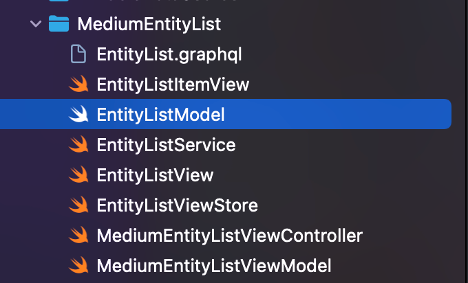
Nothing crazy in the body
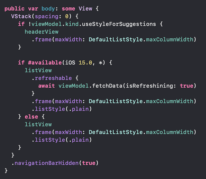
One interesting thing is that we do use a lot of the new Swift concurrency.
Async / await have been very helpful at keeping the code simple. For example here we can enjoy the build in pull to refresh feature of iOS 15, which is in sync with the fetching method of our view model.
Some other SwiftUI stuff

The new post bottom floating action bar is in SwiftUI, we embed it both in SwiftUI (list) and UIKit (post) views. I believe there is some stuff to be said about it, maybe Zouhair Mahieddine will even write an article about it, who knows.

The add to list bottom sheet is actually also in SwiftUI. Of course it’s wrapped in some custom UIKit controller, but the UI is all in SwiftUI.
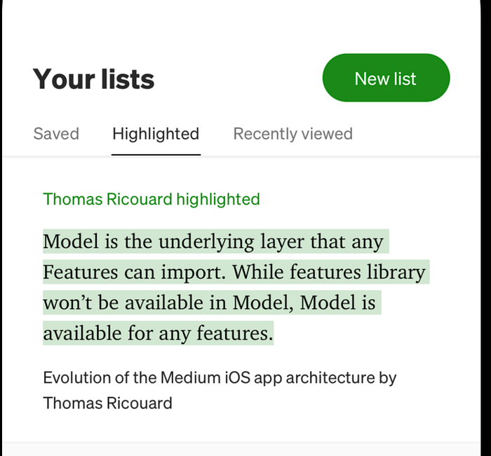
The highlighted tab is also in SwiftUI, it’s actually SwiftUI cells embedded in a UITableView because the whole chrome of the screen is in UIKit. It works very well, even if you need to do some gymnastic to have it properly wired.

As I said, any list of users in the app is now in SwiftUI, when you tap any claps count in the app, you’ll land on a view like the above for example.
As you can see above, we have many features (big & small) already in SwiftUI, and this list will keep growing. As we evolve the architecture of the app, we added a lot of velocity to features development. It’s a combinaison of small & independant features packages & SwiftUI usage. SwiftUI allow fast iteration when working on UI, thanks to SwiftUI previews + fast build time when working at the package level. When not working with UI, SwiftUI is also built with all the latest Swift features in mind, Combine, Swift Concurrency, various property wrapper to make youe life easier. It’s never been easier to write pure MVVM and keep the code minimal & clean. You need a lot less “wiring” code than with UIKit.
If you want me to go deeper in any of those features, let me know. I realise that the aim of this story is more a testament that SwiftUI is ready and already in use by millions of users than just a technical article about obscur SwiftUI patterns. But in the end, that was one of my goal when writing this.
Thanks for reading! ?