Beautiful interactions

I work on an open source library that aims to provide a beautiful and accessible drag and drop experience for lists on the web ([react-beautiful-dnd](https://github.com/atlassian/react-beautiful-dnd)). One goal of the library is to provide a drag and drop experience that feels as if you were dragging physical objects around. The library tries to avoid any interactions where something immediately snaps from one place to another. Snapping breaks the visual language of moving physical objects around as it is not how physical objects behave.

Dropping and reordering with the native html5 drag and drop has a lot of snapping ?
For most interactions, the library achieves no snapping ?. However, there was still an interaction that contained snapping: moving between lists
Terminology
- ? home list: the list a dragging item started in
- ✈️ foreign list: a list that the dragging item did not start in
- placeholder: space inserted into a list
Moving between lists
In this example, the placeholder in the ? home list instantly collapses after a drop animation finishes:

After dropping the ?home list would instantly collapse (Animation slowed down)
In this blog, I will detail my journey towards removing snapping when moving between lists. As it turned out, in order to make an experience that was elegant and robust, there was a lot that needed to be done.
With the help of Daniel Kerris (designer at Atlassian), I put together a strategy that I thought would be exactly what I needed to remove snapping when moving between lists:
- Only have one placeholder in any list for the dragging item
- When over no list, show a placeholder in the ? home list
Here is what the ? home list needed to do:
- Instantly show the placeholder when a drag started
- Animate the placeholder closed when dragging over a ✈️ foreign list
- Animate the placeholder open when returning to the ? home list
- Instantly remove the placeholder when a drag ended
Here is how it looked:

Not too shabby! No more snapping after a drop ?
Nothing more to do, right? If I had stopped there I would have released a super broken experience. It turned out this strategy had some fairly major flaws ?.
Here is what happened if you first moved an item down before moving it between lists:

What is this disaster!?
It’s a bit hard to see what is going on, so let's slow it down
Tip: When debugging animations, slow them down ?
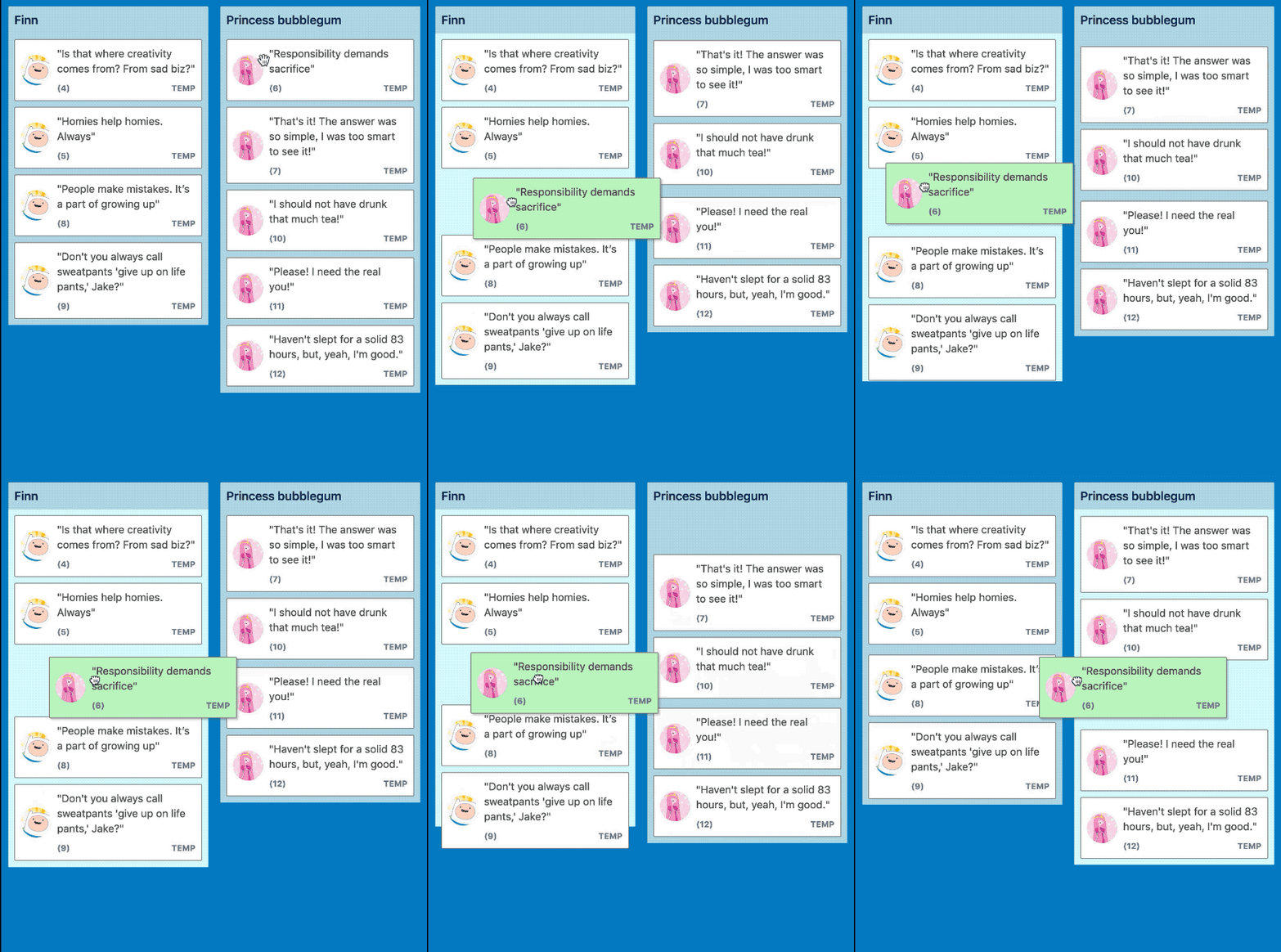
Slowing the animation down helps us see that it is a garbage fire ??
To make things worse, the ? home list was spasming all over the place when quickly moving in and out of ✈️ foreign lists. This is easily observable when moving between ✈️ foreign lists that have a gap between them.

Have a look at the Princess bubblegum list (third) when moving between BMO and Finn lists (the first two) — it jumps all over the place!

So it turns out my initial thinking on how to remove snapping when moving between lists was pretty bad. There were a number of challenges that needed to be thought through and resolved.
When an item is dragged, other items move out of the way to make room for the dragging item.
This is how items were behaving in the ? home list:
Step 1: Lift ?️♀️
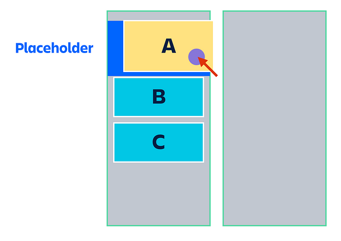
- Dragging item (
A) is removed from the document flow. The space thatAoccupied would normally collapse because of this removal - A placeholder is instantly inserted into the location of
Ato maintain it’s space in the list and to stop the list collapsing BandCare not touched
Step 2: Moving down ↓
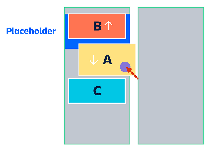
- Placeholder remains in the original place of
A Bis shifted upwards with atransformto make room forACis not touched
Step 3: Moving to a ✈️ foreign list →
Here is where things start to go badly
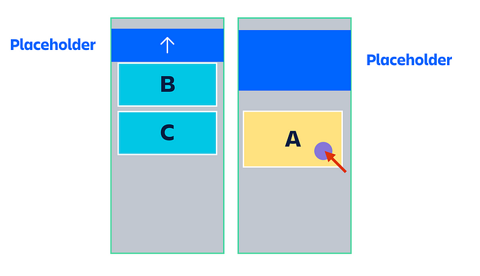
- Placeholder is inserted into the ✈️ foreign list to make space for the dragging item
A - ?The placeholder in the ? home list animates closed
- ?
Bhas it’stransformupwards reversed to counteract the at the collapsing placeholder to try to keepBin the same visual spot at the top of the list Cis still not touched, but is now shifted up by the closing of the Placeholder in the ? home list
My attempt to counteract the collapsing placeholder animation lead to B jittering. The expanding placeholder is pushing B down while a transform is trying to pull B up. Even with opposite animations, this caused some jittering.
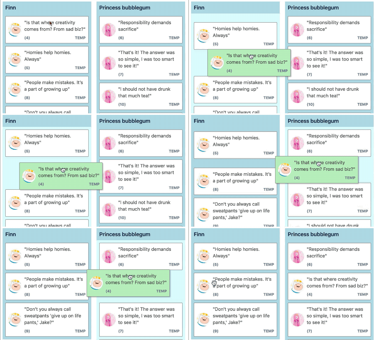
If you look closely item (5) has some minor jitters (Animation slowed down)
Step 4: Moving back into the ? home list ←
Things continue to go badly
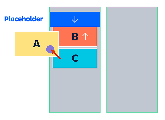
Moving A back into the list in a location that would require B to move up
- A placeholder is removed from the ✈️ foreign list
- ?A placeholder in the ? home list animates open in the original spot of the dragging item
A - ?
Bis applying atransformto shift upwards in order to be at the top of the list. Cis still not touched, but is now shifted down by the expanding of the Placeholder
The expansion of the placeholder clashes with the upward shift of B and causes a bad animation experience
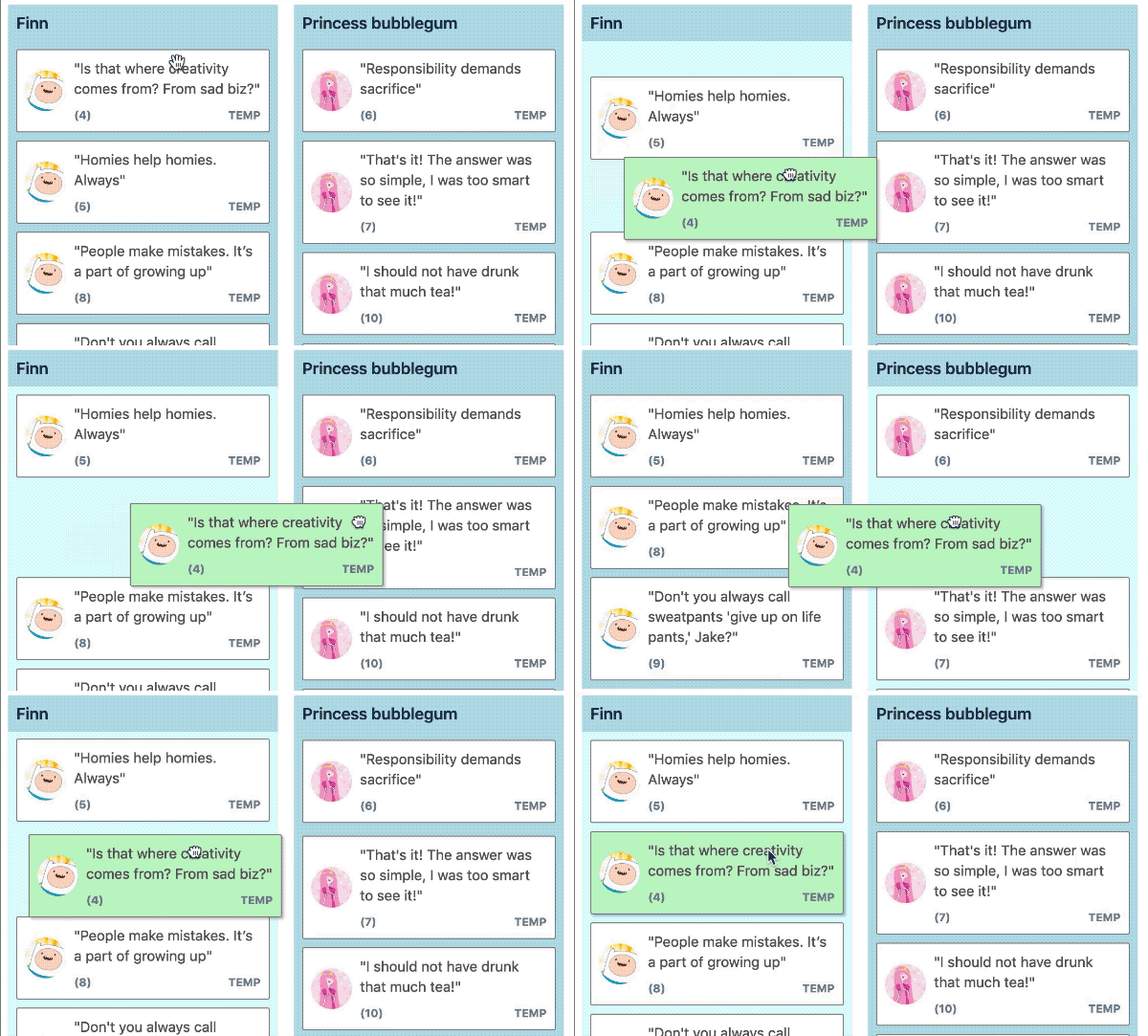
When entering back into the ?home list, item 5 has a bad time
An alternative interaction pattern
Things work a bit differently in ✈️ foreign lists. Let’s take a closer look at how they work for the same interaction as seen before:
Step 1: Lift ?️♀️
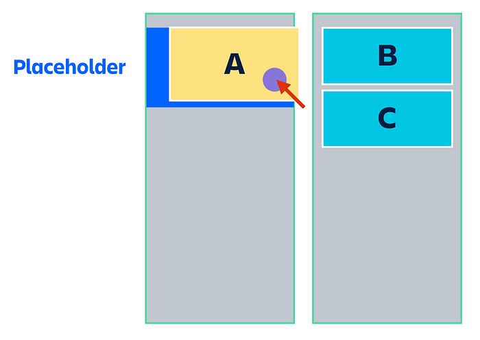
- Dragging item (
A) is removed from the document flow - A placeholder is instantly inserted into the location of
Ato maintain it’s space in the list BandCare not touched
Step 2: Moving over a ✈️ foreign list →
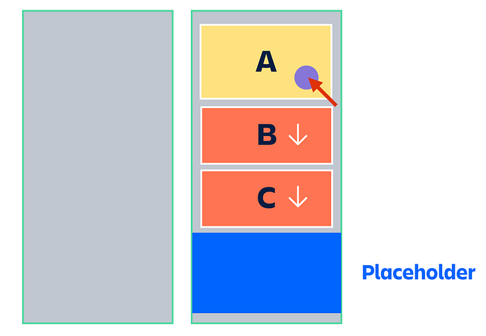
- The placeholder animates closed in ? home list
- A placeholder animates open at the end of the ✈️ foreign list to make space in the list for the dragging item
A BandCshift down with atransform
Step 3: Moving back to the ? home list ←

- A placeholder animates closed in the ✈️ foreign list
BandCanimate their shift back up to their original position by removing theirtransform- A placeholder animates open in the ? home list
What can be learned from the ✈️ foreign list pattern?
The foreign list displacement and placeholder pattern result in no strange animations. It looks great. The big thing to notice here is that no animations are fighting each other. In the ? home list, there were scenarios where the placeholder expansion and collapse animations are not working well when running right next to an item trying to shift up or down.
Tip: avoid scenarios where animations try to cancel each other out
A new ? home list pattern
I created a new interaction pattern for the ? home list based on how the ✈️foreign list worked.
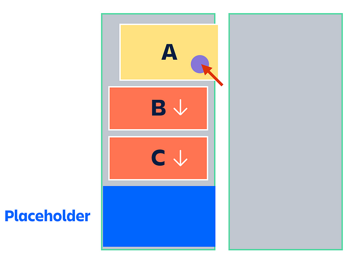
Step 1: Lift ?️♀️
- Dragging item (
A) is removed from the document flow - A placeholder is inserted at the end of the list. Previously a placeholder was inserted in the place of
Ato prevent the list from collapsing - As a result of
Abeing removed from the document flow, it’s space in the list has collapsed and everything afterAshould be moved up - In the same browser update, everything after
**A**is instantly shifted down to counteract the collapsing of**A**. Visually it looks like nothing has moved at all ??
Step 2: Moving down ↓
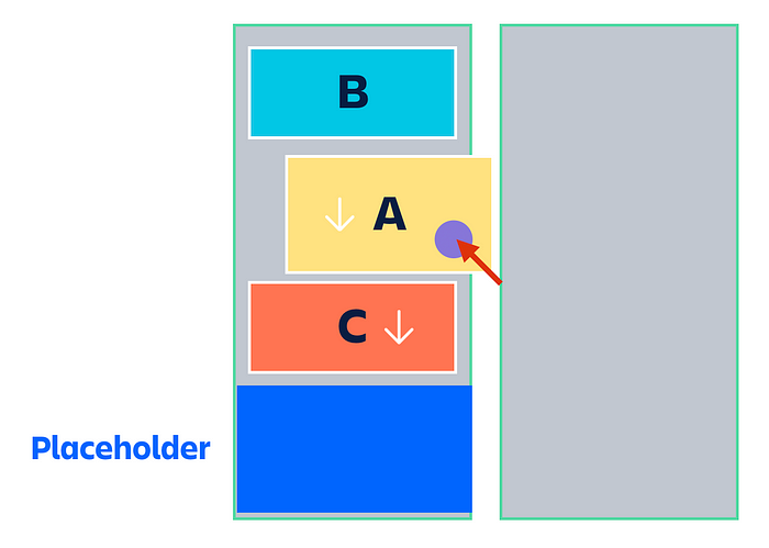
- Remove the initial, non-animated downward shift from
B.The removal of this downward shift will cause**B**to move up. - The placeholder remains at the end of the list
Ccontinues to be shifted forwards
Step 3: Moving over a ✈️ foreign list →
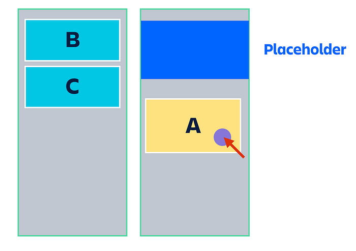
- The placeholder animates closed in ? home list. This does not shift any items in the list as it is at the end of the list.
- Remove the initial, non-animated downward shift from
Cwhich causes it to move upwards. It moves upwards due to space created in the list by the removal ofAwhen lifting - A placeholder animates open at the end of the ✈️ foreign list to make space for the dragging item
A
Step 4: Moving back to the ? home list ←

- A placeholder animates open at the end of the ? home list. It does not impact the placement of any item
- Animate the movement of
Cdownwards to make room for A Bis untouched
Beautiful result ?
This new pattern overcomes the animation issues that were being caused by the previous home interaction pattern.
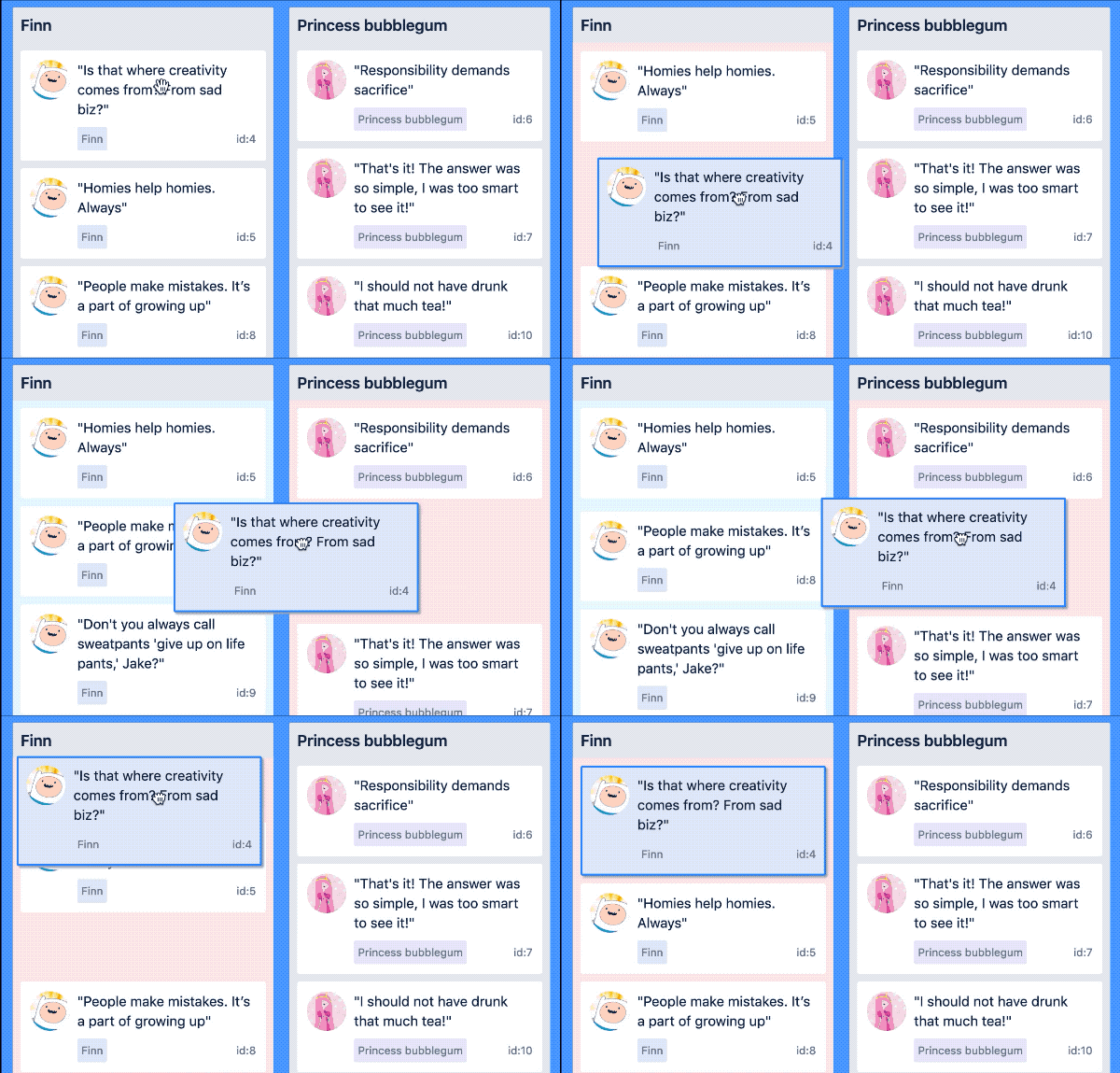
Looking fantastic ?. Animations slowed down
Note: Performance ?
Instantly shifting everything below the dragging item would normally be a huge performance issue as you would be modifying a lot of items all at once. I had previously built a to overcome this problem. The big idea is that only visible items are shifted. I was able to use this logic to ensure that shifting lots of things forward in a ? home list when lifting was not a performance issue.
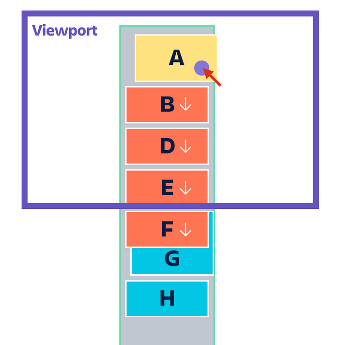
No shifting offscreen items to improve performance
Note: Brutal ?
This change involved extensive modifications all over the codebase. The new pattern introduced the idea that some items were shifted when the lift occurred in order to be in their initial visual position. Almost every feature needed to be adjusted to accommodate this mental (and visual) shift.
There were still some other issues that needed to be overcome with my attempt to avoid snapping when moving between lists. Let me remind you of the garbage fire ??:

Have a look at the Princess bubblegum list (the ?home list)
The strange behaviour in the ? home list of my example is because of my attempt to implement:
2. When over no list, show a placeholder in the ? home list
Space was used to indicate the drop location of a dragging item. If a user drops outside of a list then the dragging item is returned to its home position. So when over nothing I would make room for the dragging item in the ? home list.
However, adding a gap in the ? home list when over nothing caused a bad experience when you quickly moved on and off ✈️ foreign lists. The items in the ? home list would start to make room for the dragging item to return home, and then quickly need to remove this space.
This led me to rethink how space was being used. Do we need the space in the ? home list when over nothing? On a big list if the user has scrolled the viewport and the home position is no longer visible then the space is not helpful in showing the user where an item would return to if dropped outside of a list.
I decided to let consumers of the library decide how they would like to communicate which list is the ? home list. I added some extra information to the API to let people know which list is the ? home list during a drag.
In our reference application, we use colour to communicate what is being dragged over (pink). We now also use a different colour when over no list to communicate which list is the list the item will return to if dropped (light blue)
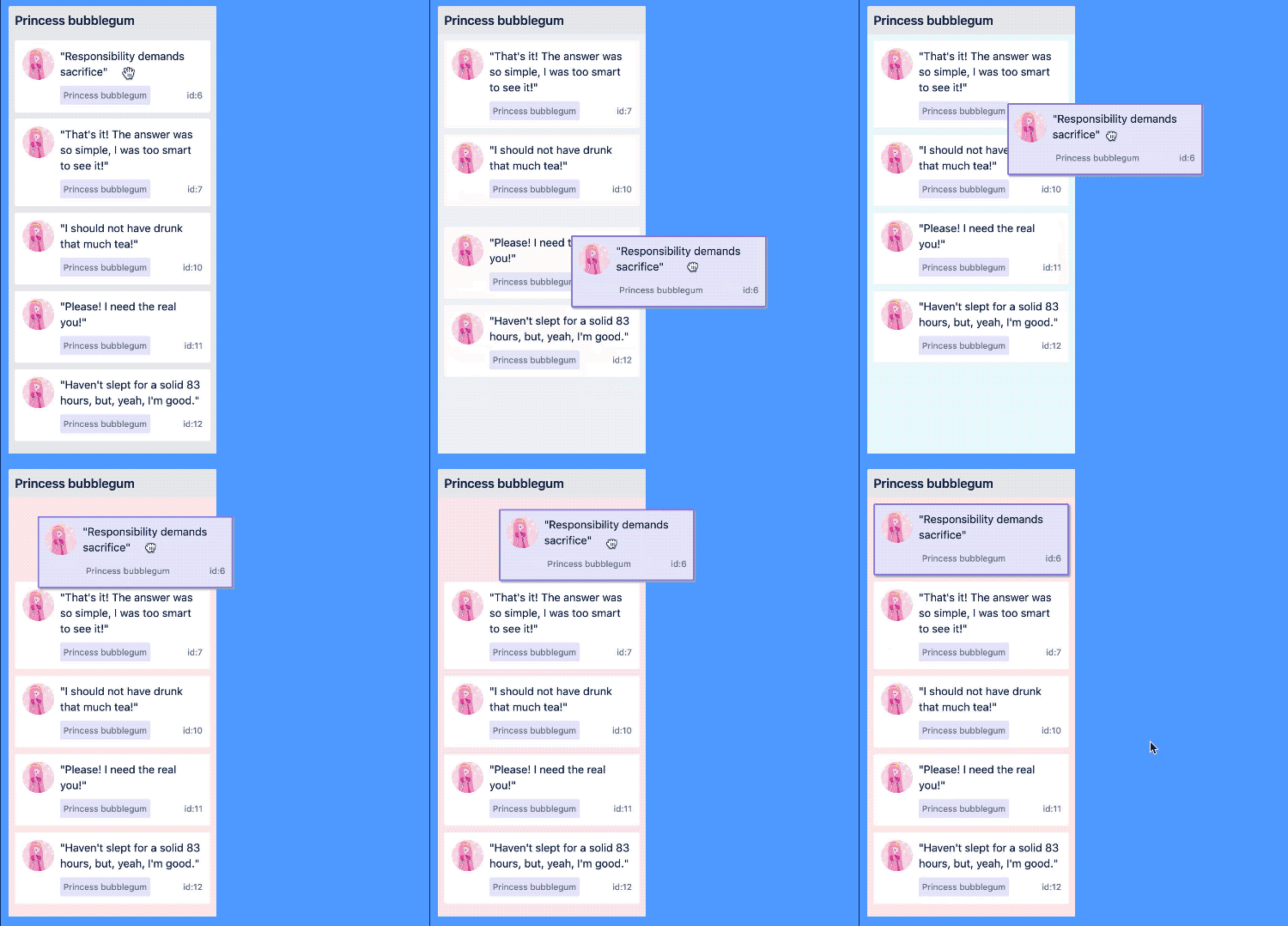
Using colour to communicate what the home list is
Using colour to show what list will be dropped into when over nothing is nicer than using a space as the list’s colour can be visible even when the home location is no longer visible.
By no longer making room for the dragging item when over nothing, there is no more jittering in the ? home list
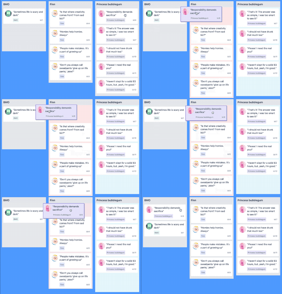
No more jittering in the ?home list (Princess bubblegum)
When users are quickly dragging something around, the direction of an animation might need to be changed. In our new design pattern, the placeholder in a ✈️ foreign list expands open and collapses closed. When a user moves off a list while a placeholder is expanding we want to interrupt the existing expansion animation and animate a collapse from there.
Here is how it looks using CSS animations:

Trying to collapse a foreign placeholder when expanding causes it to fully expand instantly and then start to shrink ?
It turns out that CSS animations are not interruptable, whereas CSS transitions are interruptable
CSS transitions introduce some complexity if you want to mount the expansion of an element. With CSS animations all you need to do to animate the mount of an element is apply the animation to the element when it is mounting. This is not possible to do in a single pass with a CSS transitions ?. CSS transitions move a property from one value to another. The value that a CSS property starts with is set as the initial value and is not transitioned too. Transitions occur from that initial value.
At a high level, here is what you need to do to perform an animated expansion on mount using CSS transitions:
- Mount the element with no size (eg
height: 0px;). Put atransitionon the element (egtransition: height 1s ease;) - After the element has been rendered, set the size to the desired amount (eg
height: 100px)
This approach has some complexities:
- In order to animate something in you need to render the item twice. Firstly with no size, and then with a size
- You need to manage what happens if the element is unmounted before the expansion animation starts.
By using CSS transitions for our placeholder mounting animations the mounting animation is able to be interrupted.

Interrupting animated placeholder insertion in a ✈️ foreign list. Animations slowed down
Initially for this new animation pattern, as soon as an item was dragged out of a list, the placeholder in the ? home list would animate closed.

Collapsing the ?home list placeholder when leaving the list looks pretty good
While this behaviour looks good, it had some bad consequences. When a drag starts the library captures the dimensions of all of the relevant DOM elements. From that point, no recollection occurs.
If a placeholder is removed from the ? home list during a drag then the home list can shrink. A collapsing ? home list can also cause other ✈️foreign lists on the page to move around. These effects are not reflected in the dimensions captured when lifting.
Knowing whether or not the ? home list will collapse when a placeholder is removed, and by how much, is extremely difficult to know. There are a number of CSS and DOM rules at play. It is also extremely difficult to know if the collapsing of the ? home list will impact the placement of ✈️ foreign lists on the page.
The library cannot simply patch it’s stored dimensions with expected changes, as the changes are unknown. The library could potentially recollect the DOM element’s dimensions, but that is a very difficult and slow path I have tried before.
Here are some problems caused by a collapsing ? home list:
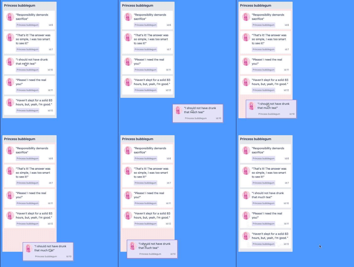
Problem: Dragging below the ? home list would register as being inside the ? home list
Reason: The home list dimension is still recorded as its original size which includes some area below the visible bottom.

Problem*: Dragging over a ✈️ foreign list stacked* below the ? home list would yield super strange drop targets
Reason: The ? home list is collapsing and the ✈️ foreign list is moving up visually, but the home list and foreign list still have the original dimensions

Problem*: Dropping into a ✈️ foreign list stacked* below the ? home list would have a broken drop position
Reason: When calculating the drop location the upwards shift of the _✈️_foreign list is not being taken into account
Maintaining space of the ? home list
To get around these issues I decided to keep a placeholder in the ? home list for the entire drag to maintain the original size of the ? home list. I would then animate the placeholder closed during a drop.
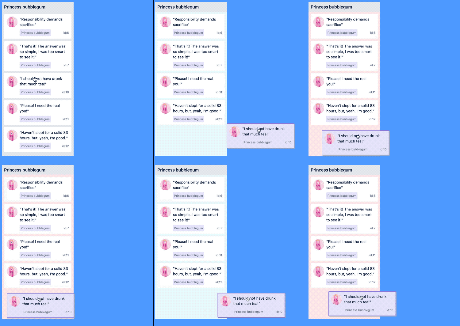
Fixed: dragging below the ? home list

Fixed: dragging over a stacked ✈️ foreign list
Sadly though, dropping into a stacked foreign list is still broken

Broken: dropping into a stacked ✈️ foreign list
I was animating the placeholder in the ? home list closed during the drop animation. This could cause the ? home list to collapse. Any collapsing could cause the calculated drop location to be incorrect as list collapsing is not being accounted for.
Animate closed after the drop
In order for the drop location to be correct, the size of the placeholder needs to be maintained in the ? home list until after the drop animation has completed. This avoids any ? home list collapsing which can impact our drop location.

Correct drop location into a ✈️ foreign list. Then the placeholder in the ?home list collapses
Accidental benefit: less distraction
I originally was a bit sad that the placeholder collapsing in the ? home list needed to happen after the drop animation. I showed it to Jake Miller (UX wizard at Atlassian) and he preferred the new approach of collapsing the placeholder in the ? home list after the drop ?. He thought it was distracting to have the placeholder collapsing in the ? home list at the same time as the drop animation as there were too many things pulling the user's focus.
“Animations draw the user’s focus. If you have to animate more than one thing, trigger them one after another so the user focuses on a single piece at a time.”
- Jake Miller
By animating the collapse of the placeholder in the ? home list after the drop animation the user is not being distracted from the drop interaction that they are performing.
All of the work up to this point has had a singular focus: avoiding snapping. This can come into conflict with allowing the user to get things done quickly.
A ‘drag and drop’ interaction should ideally allow for the fast movement of items. I do not want a user to be forced to wait for animations to complete before they can drag other things around.
With the new animation pattern that avoids snapping, there are two animations that run after a user signals that they want to drop an item:
- Animation of the dragging item to the new position; then
- Collapsing the placeholder in the ? home list
Lifting ?️♀️
When a drag starts the dimensions of all of the relevant DOM elements are collected. It is important when a drag starts that all dimensions be in their resting location and with their resting sizes. Capturing a dimension while it is in the middle of collapsing would yield incorrect information. So in order for things to be correct when the user starts dragging all of the movements and animations need to be completed.
Competing interests ⚖️
In order for the collected dimensions to be correct when a drag starts, all of the animations need to be completed.
So the choice is between:
- Make the user wait for all drop animations to finish before they can start a new drag. Everything will be in the correct spot. But, this would restrict how quickly items could be dragged around. Or
- Flush any running animations so that everything is in the correct spot. The user could start a new drag whenever they want. But, it would produce some snapping.
I decided to go with option two to allow users to not be restricted in their interactions
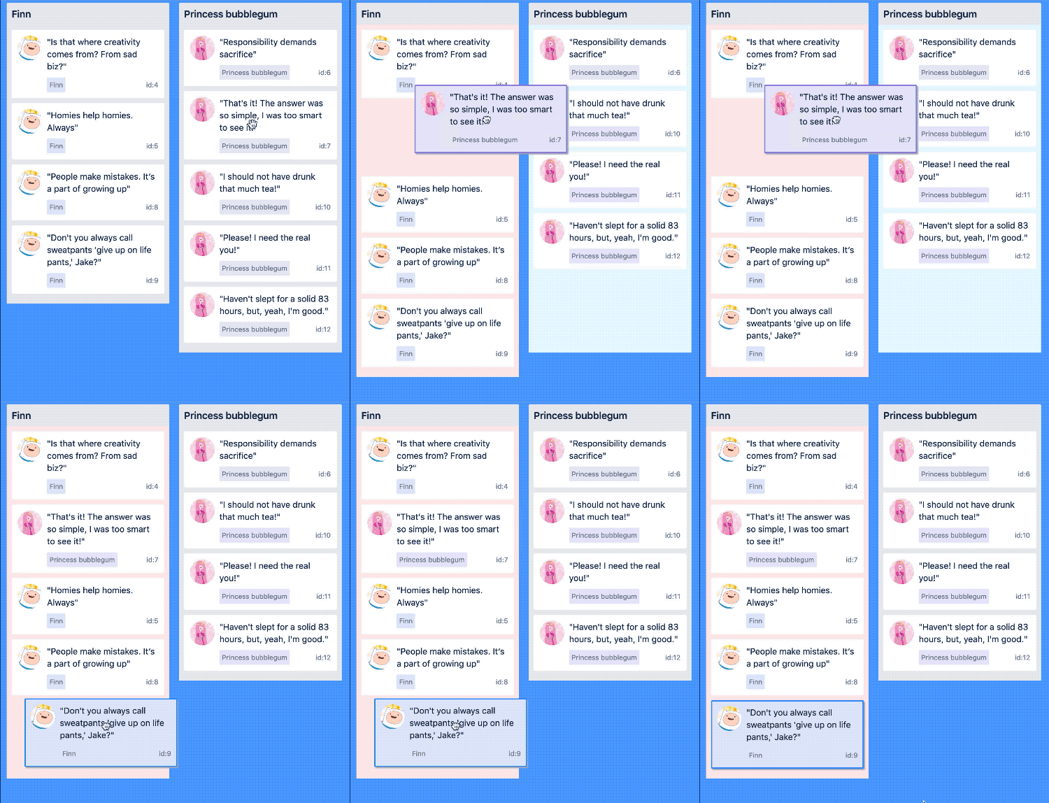
Flushing a drop animation and home placeholder collapse when starting a new drag
Generally, a user is unlikely to run into this scenario as the drop animations run quite quickly. However, it is important to be deliberate and thoughtful about every possible interaction.
Tradeoffs
This might seem like a strange section to finish on, given how intensely I have been chasing the removal of snapping. I wanted to show that it is worthwhile to chase beautiful animations, but knowing when to make tradeoffs, and what interests you are balancing is important too.
I think the new animation pattern looks and feels stunning

I hope you have found this journey of crafting elegant and robust drag and drop animations insightful. It was a much longer and more complicated journey than I was expecting, but I think the results are worth it.
If you want to leverage all of the hard work in this blog you are welcome to use [react-beautiful-dnd](https://github.com/atlassian/react-beautiful-dnd) in your own projects.

Thanks
Thank you to the many people who helped me work through this problem space, and others for their help putting this blog together: Jake Miller, Daniel Kerris, Jason Sheehy, Sean Curtis, and Daniel Del Core.