clip实现圆环进度条

怎么实现这样一个圆环进度条的效果呢,可以使用canvas、svg、GIF等等方式,今天我们来说下使用css3怎么来实现。
圆环很简单,一行cssborder-radius:50%即可实现,而且没有兼容性问题,什么,你说IE,让它滚...
我们这里需要三个圆环,一个整的,两个半的。大概画了下图
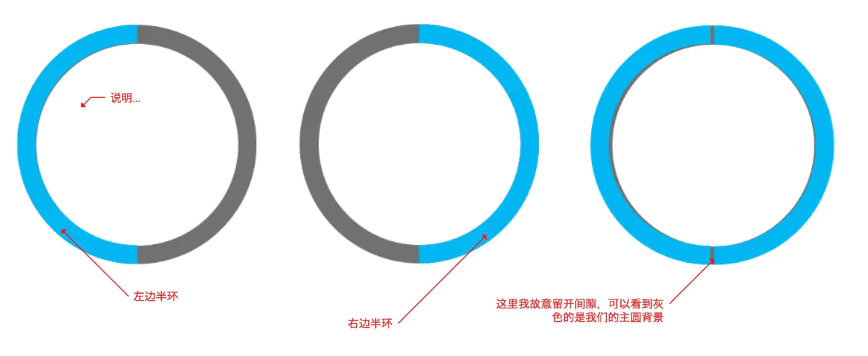
这里半圆环我使用了clip进行裁剪,主要代码如下,
.left{ width: 200px; height: 200px; border-radius: 50%; border: 10px solid lightblue; position:absolute; top: -10px; right: -10px; clip: rect(0 100px 200px 0); } 复制代码
右边类似只是裁剪位置改了
.right{ width: 200px; height: 200px; border-radius: 50%; border: 10px solid lightblue; position:absolute; top: -10px; /* 10的原因是因为边框是10个像素 */ right: -10px; clip: rect(0 200px 200px 100px); /* 位置更改,计算可以参考上图 */ }
复制代码

<!DOCTYPE html>
<html lang="en">
<head> <meta charset="UTF-8"> <meta name="viewport" content="width=device-width, initial-scale=1.0"> <meta http-equiv="X-UA-Compatible" content="ie=edge"> <title>Document</title> <style> div{ box-sizing: border-box; } .box{ width: 200px; height: 200px; position: relative; background-color: border-radius: 50%; left: 40%; top: 200px; } .num{ position: absolute; top: 50%; left: 50%; background: border-radius: 50%; width: 180px; height: 180px; transform: translate(-50%, -50%); text-align: center; line-height: 180px; font-size: 32px; } .clip{ width: 200px; height: 200px; position: absolute; border: 10px solid border-radius: 50%; clip: rect(0, 200px, 200px, 100px); } .left{ width: 200px; height: 200px; position: absolute; border: 10px solid lightblue; border-radius: 50%; clip: rect(0 100px 200px 0); top: -10px; left: -10px; } .right{ width: 200px; height: 200px; position: absolute; border: 10px solid lightblue; border-radius: 50%; clip: rect(0 200px 200px 100px); top: -10px; left: -10px; } .width-none{ width: 0; } .auto{ clip: auto; } </style>
</head>
<body> <div class="box"> <div class="clip"> <div class="left"></div> <div class="right width-none"></div> </div> <div class="num"> </div> </div> <script > let clip = document.querySelector('.clip'), left = document.querySelector('.left'), right = document.querySelector('.right'), num = document.querySelector('.num'), rotate = 0; let loop = setInterval(() => { if(rotate >= 100){ rotate = 0; right.classList.add('width-none'); clip.classList.remove('auto'); } else if(rotate > 50){ right.classList.remove('width-none'); clip.classList.add('auto'); } rotate++; left.style.transform = 'rotate('+ 3.6*rotate + 'deg)'; num.innerHTML = `${rotate}%` },100) </script>
</body>
</html> 复制代码
简单说下上面的代码
1、首先隐藏了右半圆,这是因为我们需要旋转的是左半圆,我们可以等左半圆转到右边圆的位置再显示右 边,就是等到旋转到180度的时候。
2、同时我们看到主圆添加了clip: rect(0, 200px, 200px, 100px);裁剪样式,这是因为默认我们 进度是0%的,我们只显示右边的话才能隐藏左边,但是我们右边不是隐藏的吗?那显示它干嘛呢,因为 旋转左边的时候就看到转到右边的圆了。稍微有点绕,请结合代码,多多理解
3、等到左边旋转了180我们需要将右边显示出来,并且将box元素的裁剪设置为默认值,就是不裁剪,这 这样才能显示完整的左右两个圆。
4、最后我们使用js来控制旋转角度并将百分比显示在页面上
如果上面的解释看不明白,索性就不要看了,把代码放在本地调试下,自己去理解。
别钻牛角尖,代码是最好的语言。
使用clip才实现圆环进度还是很简单的,还不需要考虑兼容性,关于clip可以看张鑫旭大神的日志